
Art Direction · Fashion
Bateeq
A long-term project on reframing Indonesian batik brand through fashion collections, imagery and cultural narrative.
Project Overview
Developing a more fashion-forward direction for a product-led batik label.
Context
Bateeq was a contemporary batik brand within Dan Liris Group, operating on multiple product lines and retail collections, through out different seasonal launches, runway shows, licensings and collaborations. On this case study, we are focusing on its runway collections. This product line evolution has given clearest visibility on the brand's shift towards the contemporary fashion direction.
My Role
I joined as Head of Design and gradually took on an expanded creative role across collection development, textile direction, campaign imagery, runway presentation and the coordination of teams working between Jakarta branch office and Surakarta headquarter. I was entrusted with much of the seasonal creative groundwork, from initial concept development to the final execution.
The Shift
Throughout successive seasons, the work moved beyond simply applying batik to garments. Collections became vessels for stories, cultural references, material experiments and increasingly distinct visual worlds.
01 · Before the Shift
The brand already had reach.
The question was what kind of fashion language it wanted to express.
%20--%3e%3cdefs%3e%3cstyle%3e%20.st0%20{%20fill:%20%23fff;%20stroke:%20%23000;%20stroke-miterlimit:%2010;%20stroke-width:%20.5px;%20}%20%3c/style%3e%3c/defs%3e%3cg%20id='Layer_1-2'%3e%3cpath%20class='st0'%20d='M31.2,35.5s-11.3-2-19.2-11.3S0,3.8.4,0C.4,0,14.3,3.2,24.8,13.2c10.4,10,10.6,17.7,10.6,17.7h.9c0-.1.5-9.6,11.8-19.6S71.4.6,71.4.6c0,0-3.9,13.3-11.7,23.2-10.1,12.7-19.6,11.7-19.6,11.7v.9s9.2.2,18.9,10.6c9.7,10.4,11.4,20.9,12.4,24.8,0,0-16-5.2-23.8-12.5-11.7-10.8-11.3-19.5-11.3-19.5h-.4s-3.8,13.8-12,20.5C11,70.8,0,71.3,0,71.3c0,0,4.3-14.1,11.9-23,10-11.8,19.2-12,19.2-12v-.9h.1Z'/%3e%3c/g%3e%3c/svg%3e)
Bateeq was already an established contemporary batik label, with a broad retail presence, runway shows and an active commercial audience.
The visual language was still largely product-led. Campaigns relied on polished studio imagery and straightforward layouts, while batik was often treated as a printed surface patterns and applied them across garments.
My role at this stage was to understand where the fashion language could become more specific. I started with silhouette and textile development, then gradually pushed the styling and image direction further.
%20--%3e%3cdefs%3e%3cstyle%3e%20.st0%20{%20fill:%20%23f0e2c7;%20}%20%3c/style%3e%3c/defs%3e%3cg%20id='Layer_1-2'%3e%3cpath%20class='st0'%20d='M31.2,35.5s-11.3-2-19.2-11.3S0,3.8.4,0C.4,0,14.3,3.2,24.8,13.2c10.4,10,10.6,17.7,10.6,17.7h.9c0-.1.5-9.6,11.8-19.6S71.4.6,71.4.6c0,0-3.9,13.3-11.7,23.2-10.1,12.7-19.6,11.7-19.6,11.7v.9c0,0,9.2.2,18.9,10.6s11.4,20.9,12.4,24.8c0,0-16-5.2-23.8-12.5-11.7-10.8-11.3-19.5-11.3-19.5h-.4s-3.8,13.8-12,20.5C11,70.8,0,71.3,0,71.3c0,0,4.3-14.1,11.9-23,10-11.8,19.2-12,19.2-12,0,0,.1-.9.1-.9Z'/%3e%3c/g%3e%3c/svg%3e)
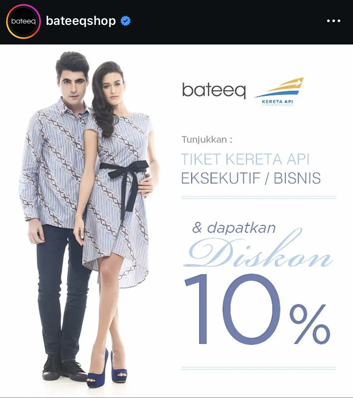
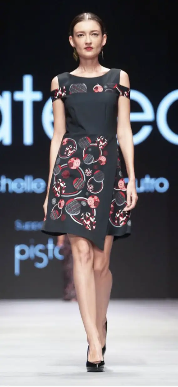
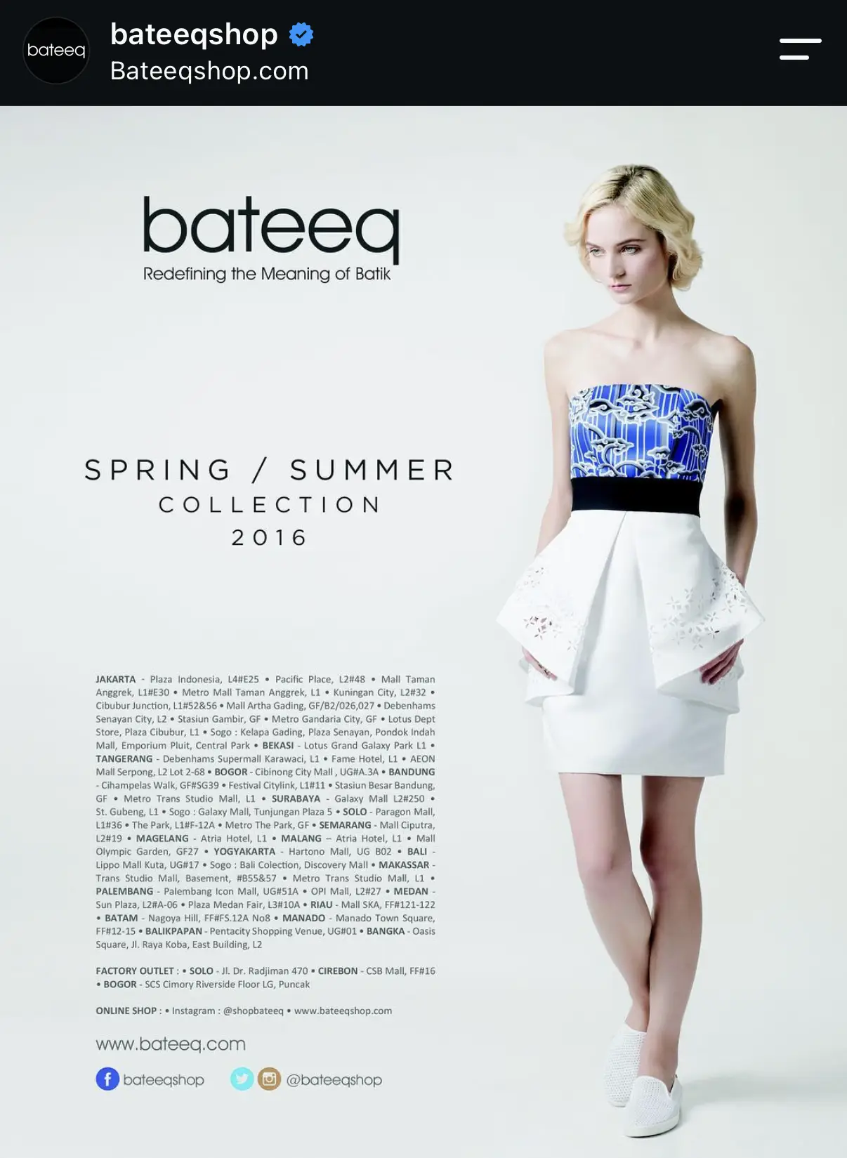
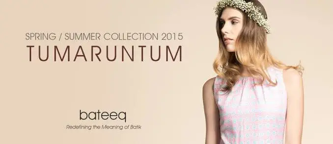
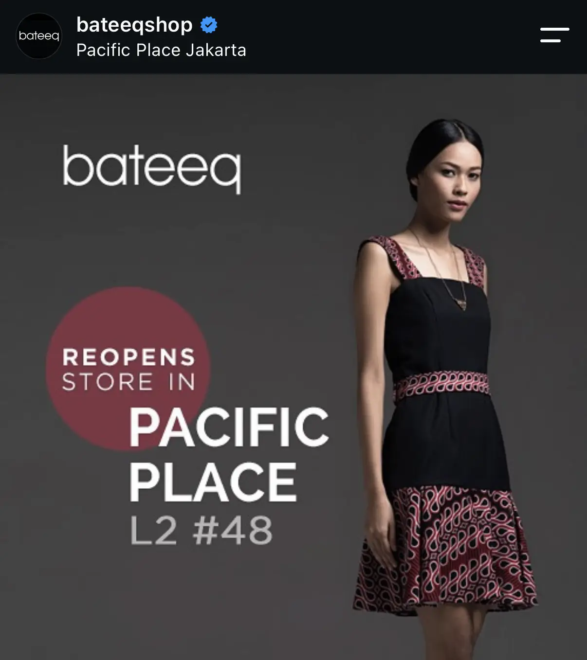
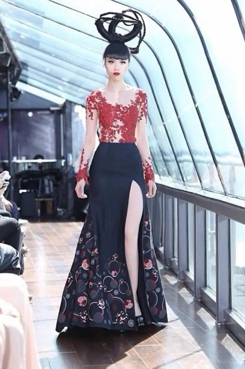
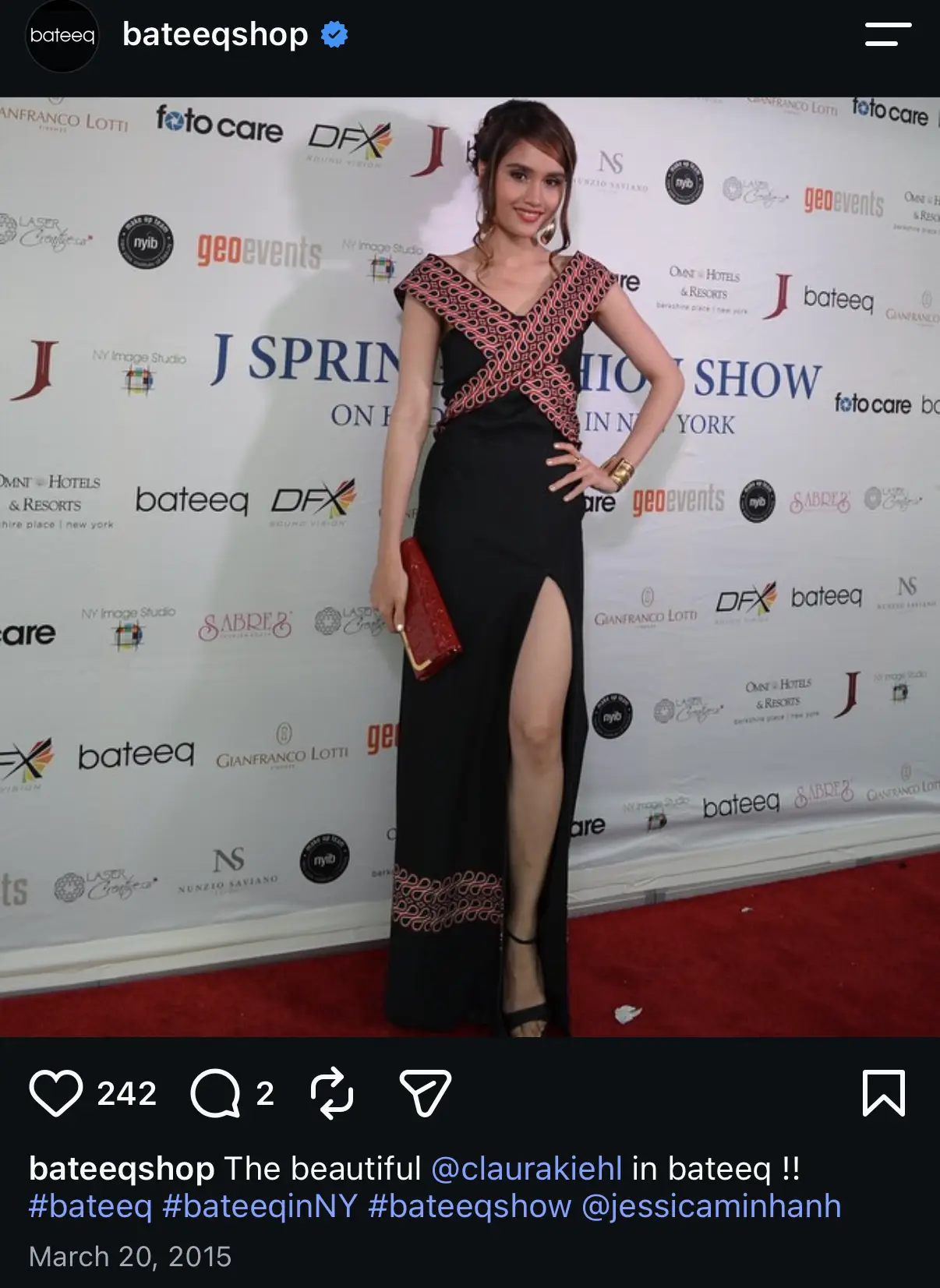
Archival Bateeq imagery shown for context. I was not involved in the creation of these images.
Changing the product
The shift began with the clothes.
Moving beyond treating batik as printed decoration applied to conventional silhouettes, the collections began to explore garment construction more actively using proportions and modular principle. Batik motifs were also deconstructed and given edge through richer colour selection, more experimental styling and culturally informed storytelling.
Product Direction
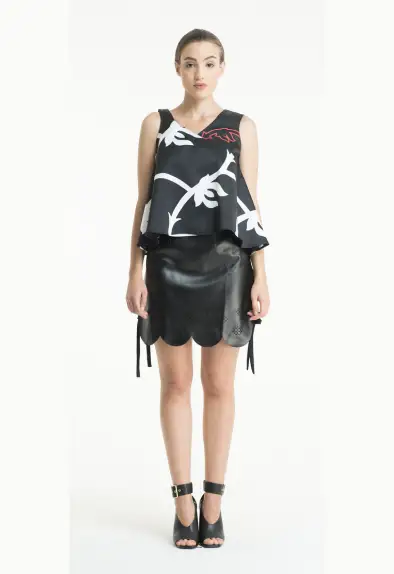
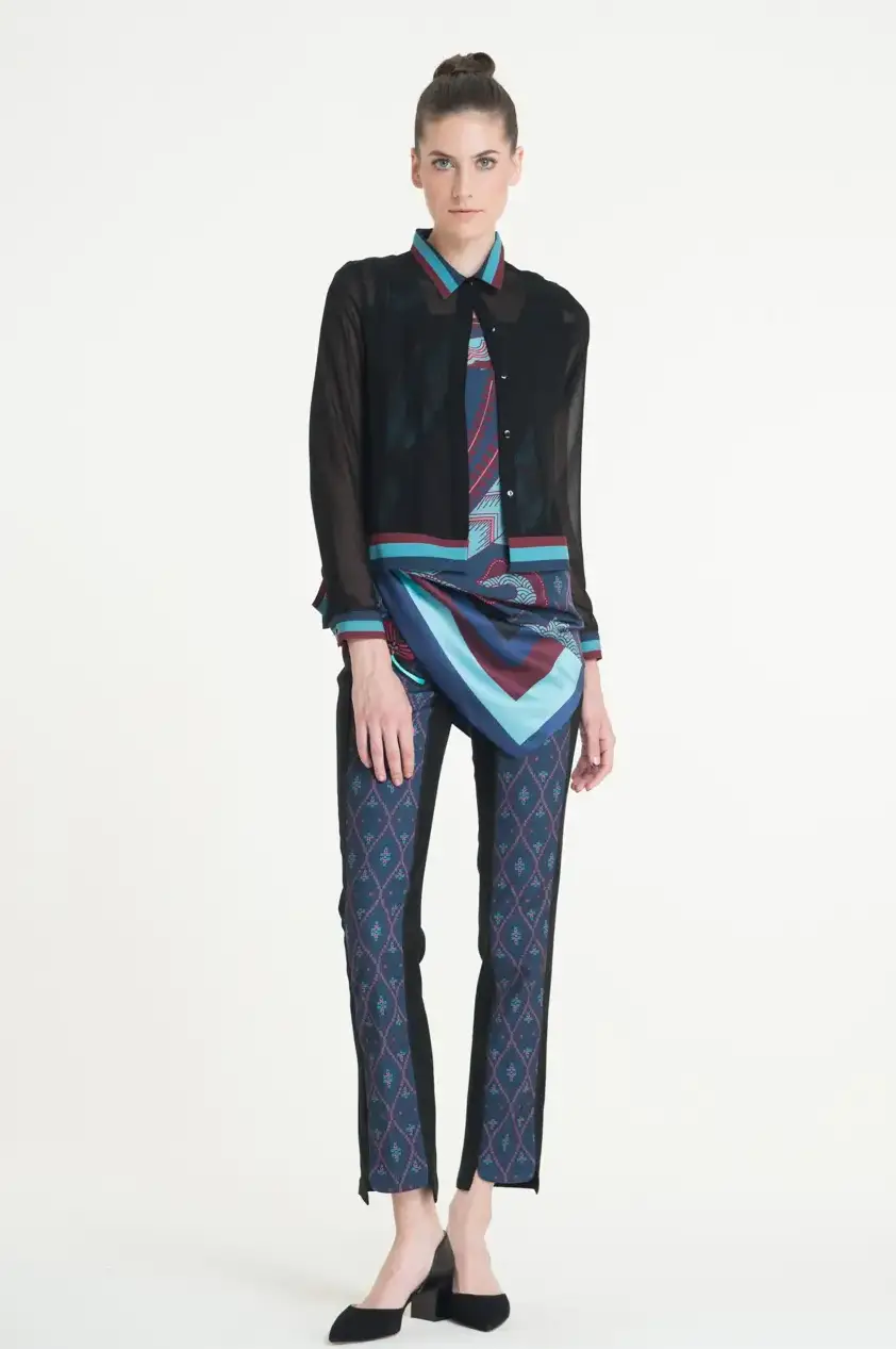
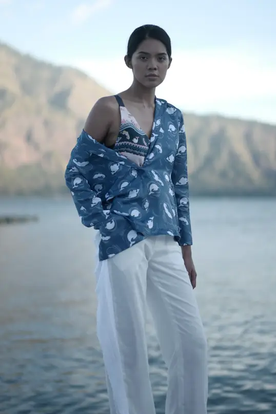
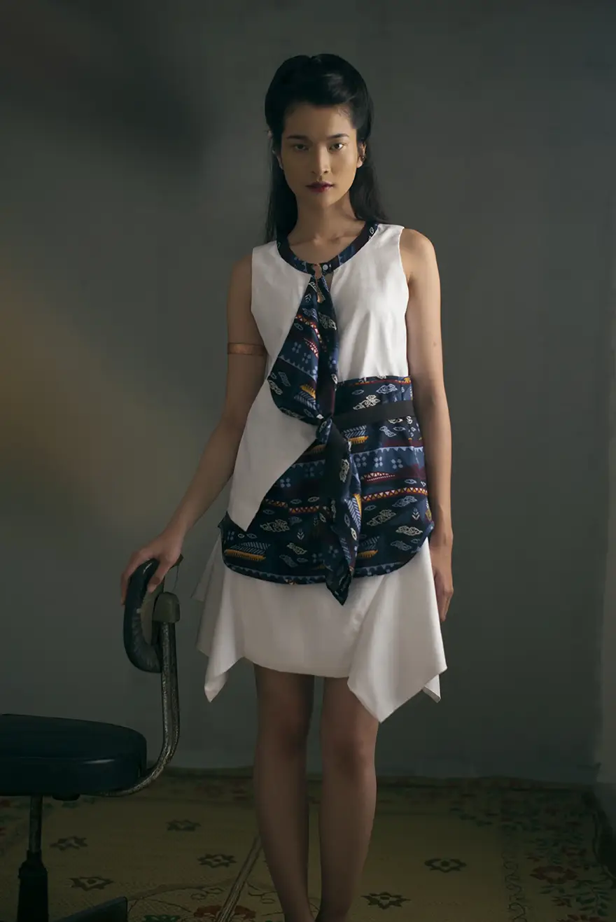
These pieces are examples I designed directly while establishing a more fashion-led product direction for Bateeq.
I also used this approach to guide and edit the work of the wider design team across silhouette, construction, textile placement and styling.
World building: Collections
From collection logic to image-making.
This chapter traces the thinking behind five collections; from design logic and garment development to campaign art direction and production. Enter a collection to explore the process in depth, or continue scrolling for the wider brand story.
Catena
Original lineup

Original palette
Inherited direction
I joined Catena after the collection had already begun to take form. Its early direction was driven largely by silhouette shape and colour contrast combined with bold geometric cuts.
Selected design development
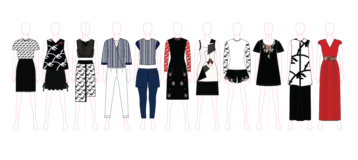
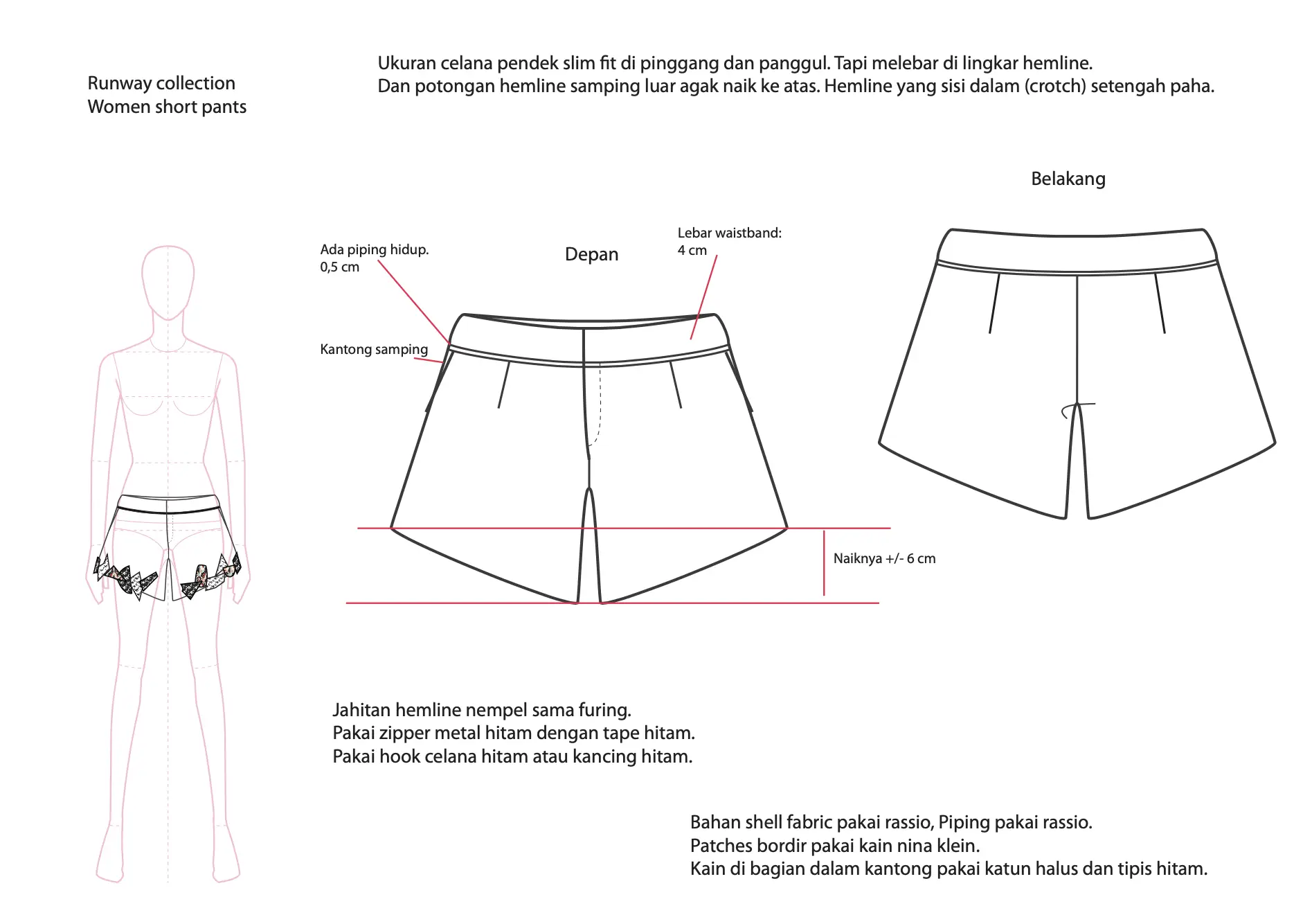
My intervention was first done by giving the half-developed collection a theme and a title. Then later, it involved editing and continue developing the existing collection, tightening the lineup and removing pieces that no longer supported the direction. I then pushed the remaining designs further through garment construction, textile placement and detailing.
Refined palette
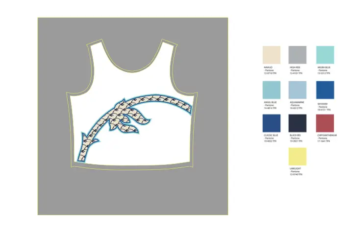
The working palette became quieter and more concentrated, moving toward blue, grey, black and softened neutrals, with red retained as a stronger accent.
Detail as design
Coming from menswear, I was accustomed to working within relatively familiar garment archetypes, where proportion, construction and detail carry much of the identity. I began bringing that way of thinking into Catena.
Textile development
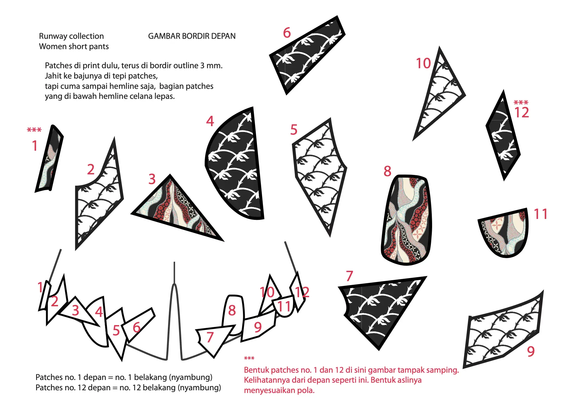
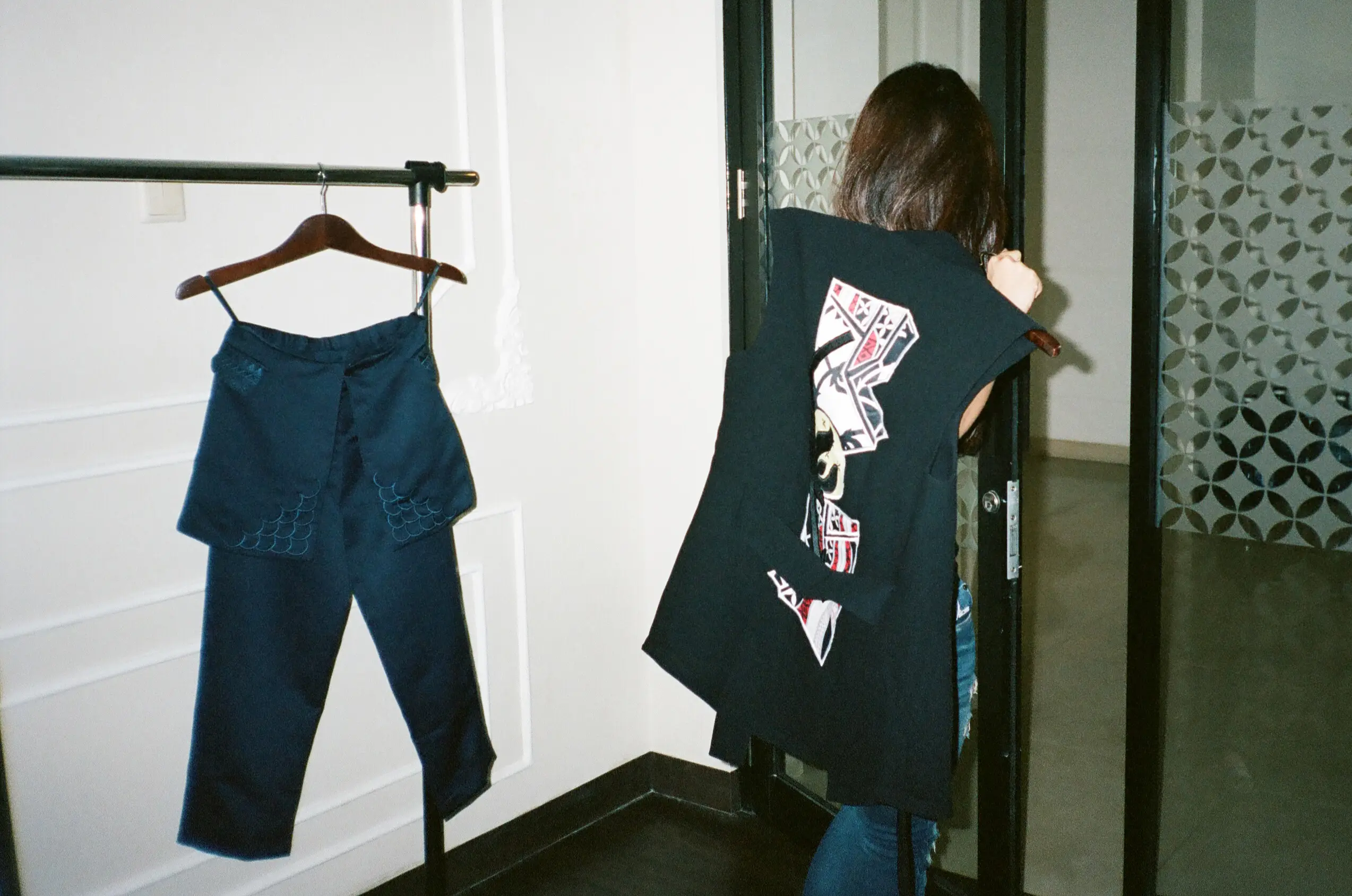
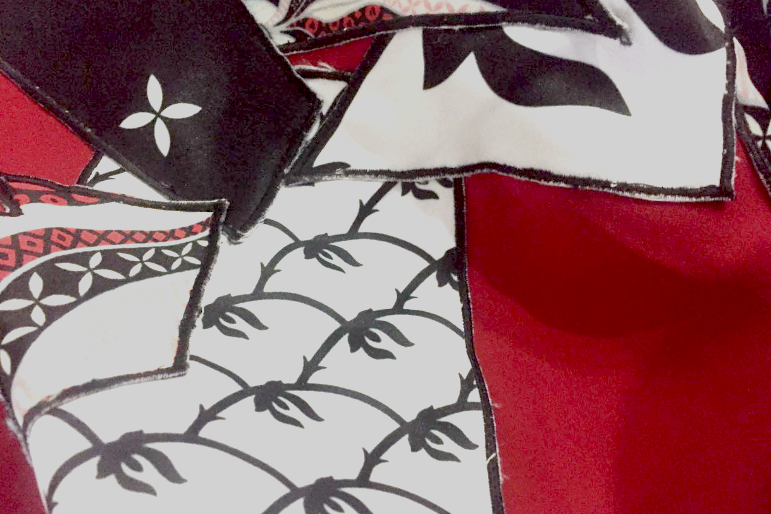
Textile development became another level of construction: motifs were tested through scale, placement, repetition and various applications (embroidery, laser cut, different print technique) to study the relationship between surface and garment structure.

Behind the scenes
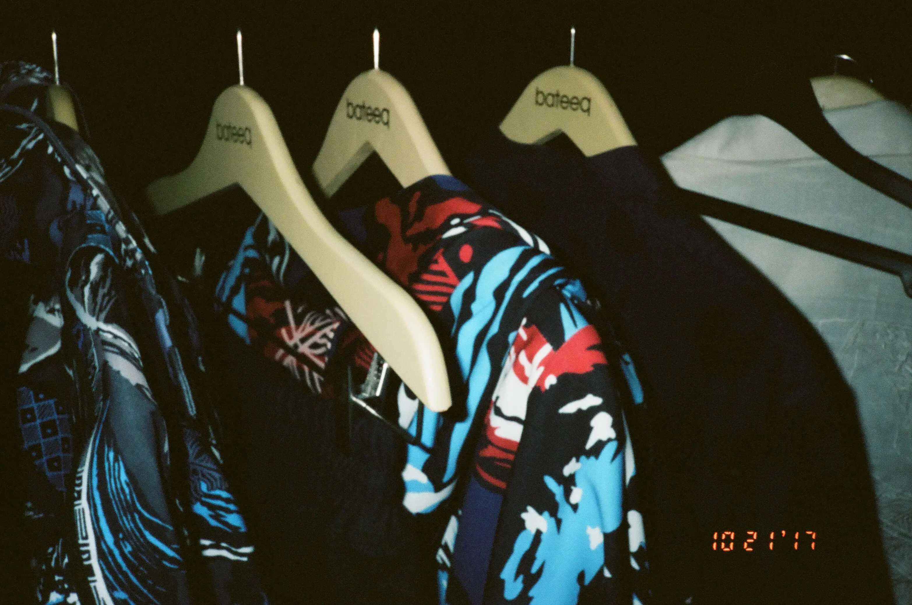
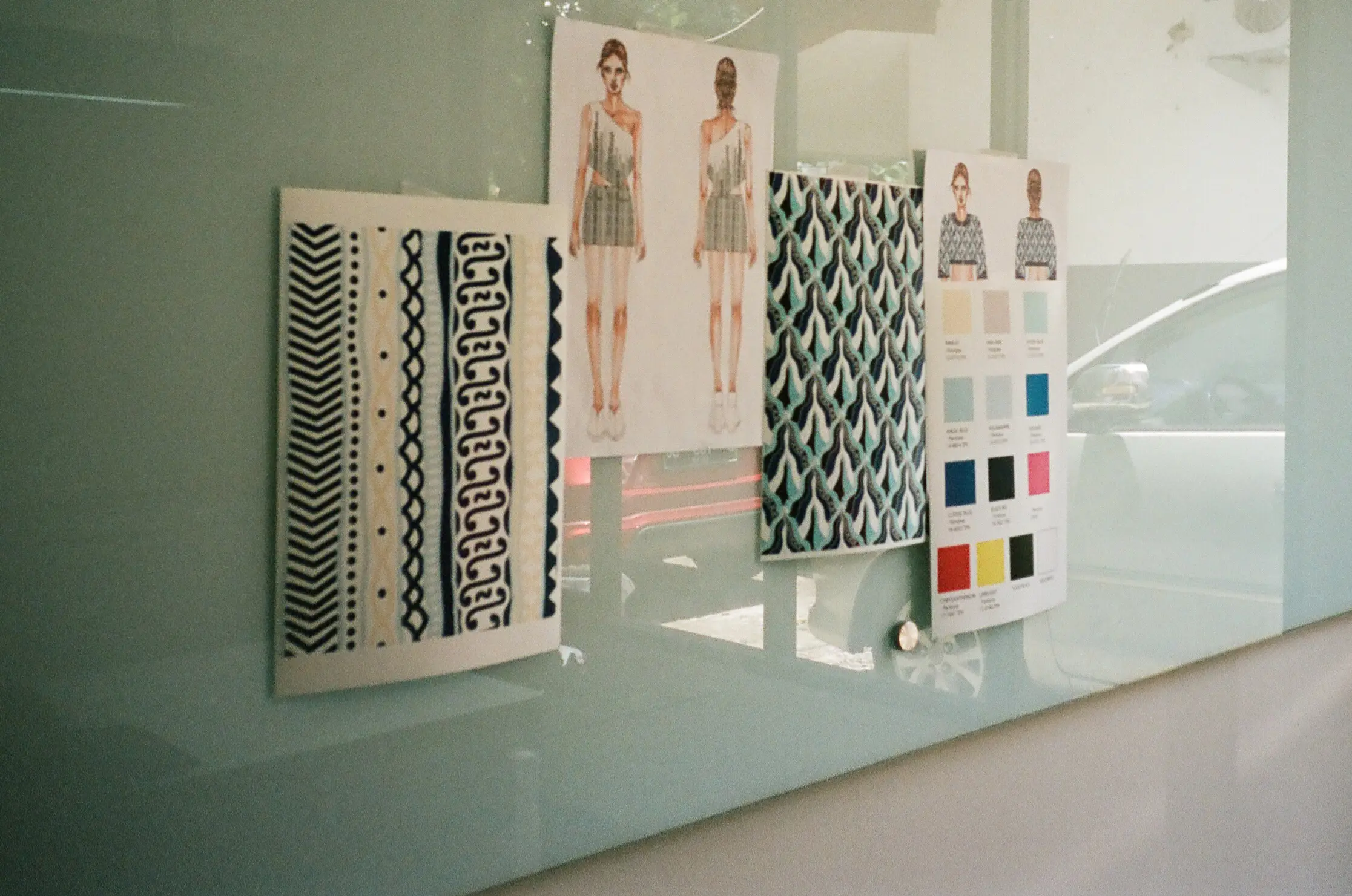
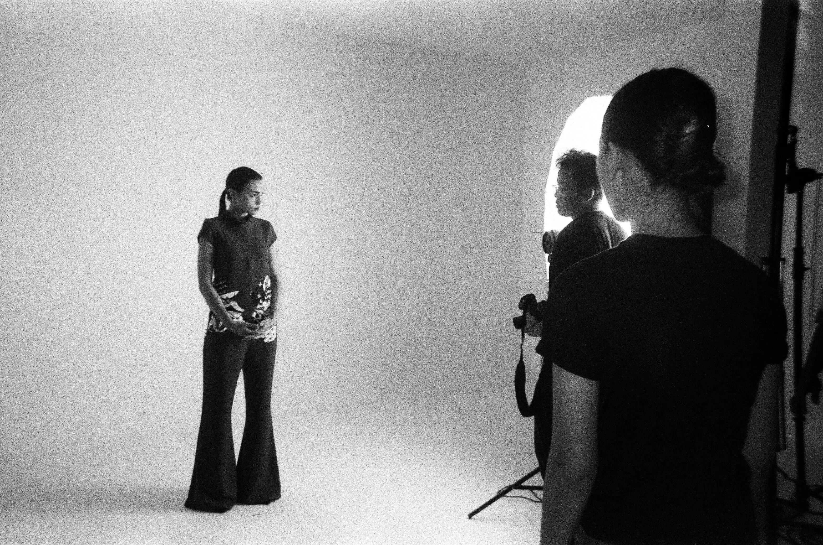
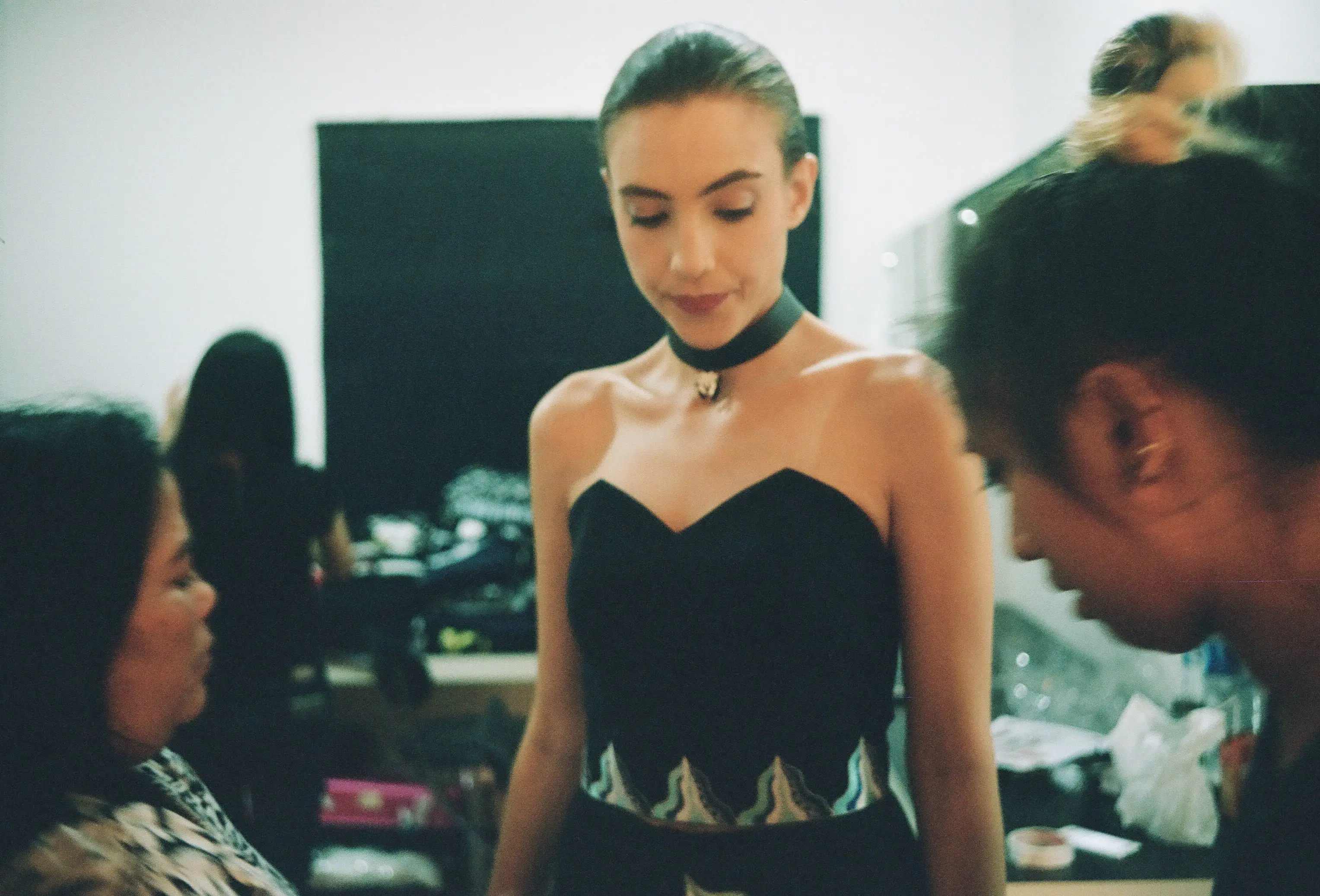
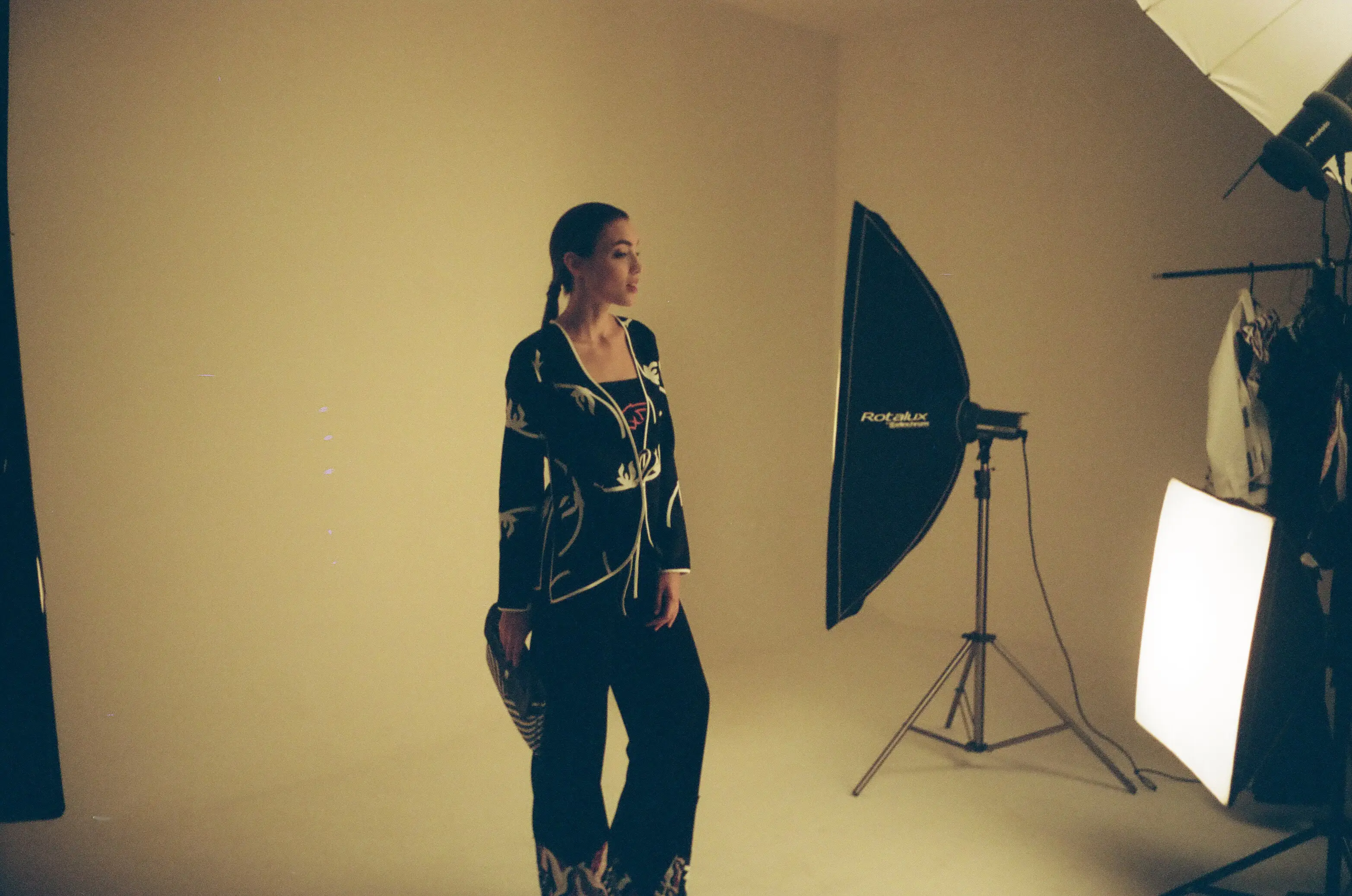
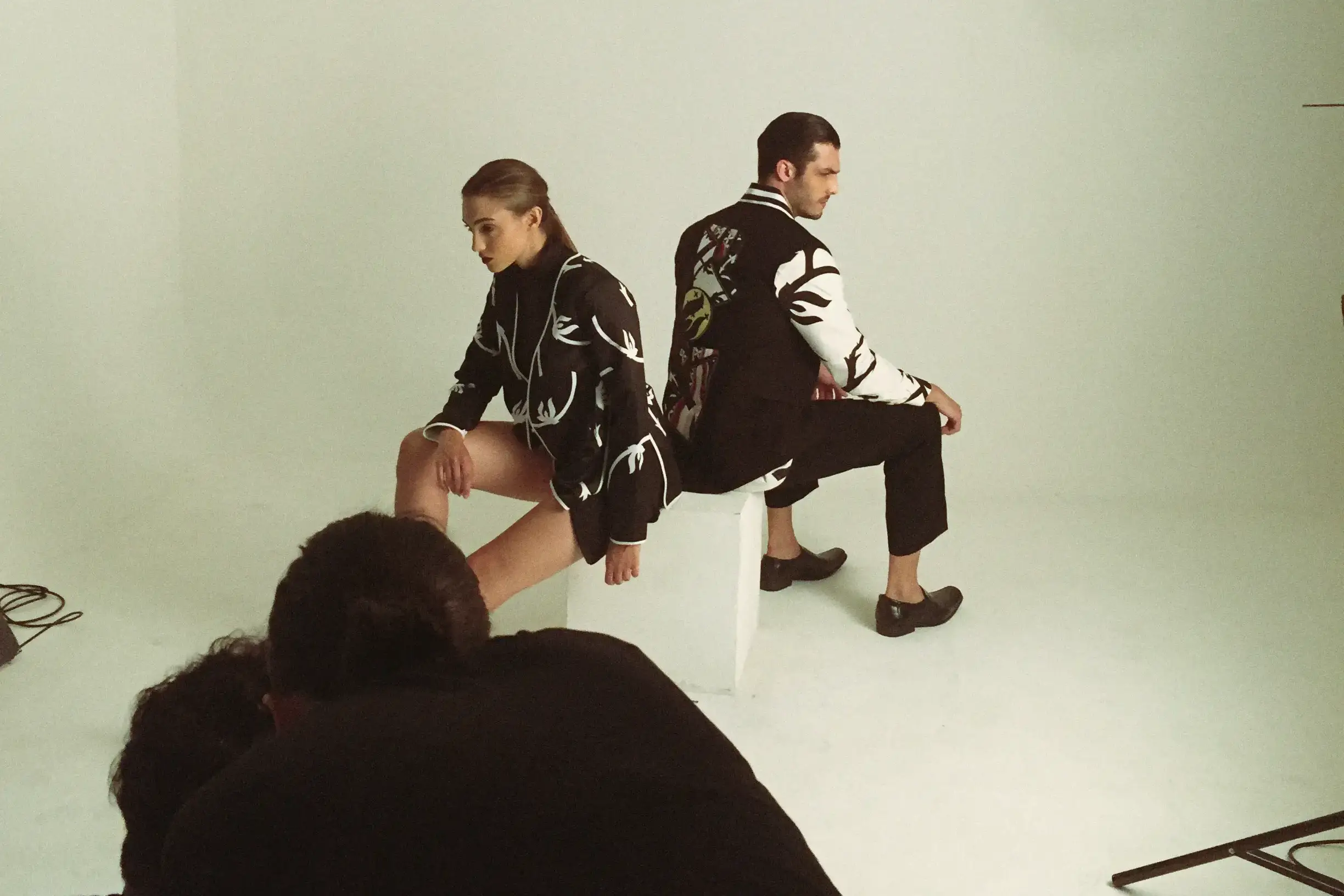
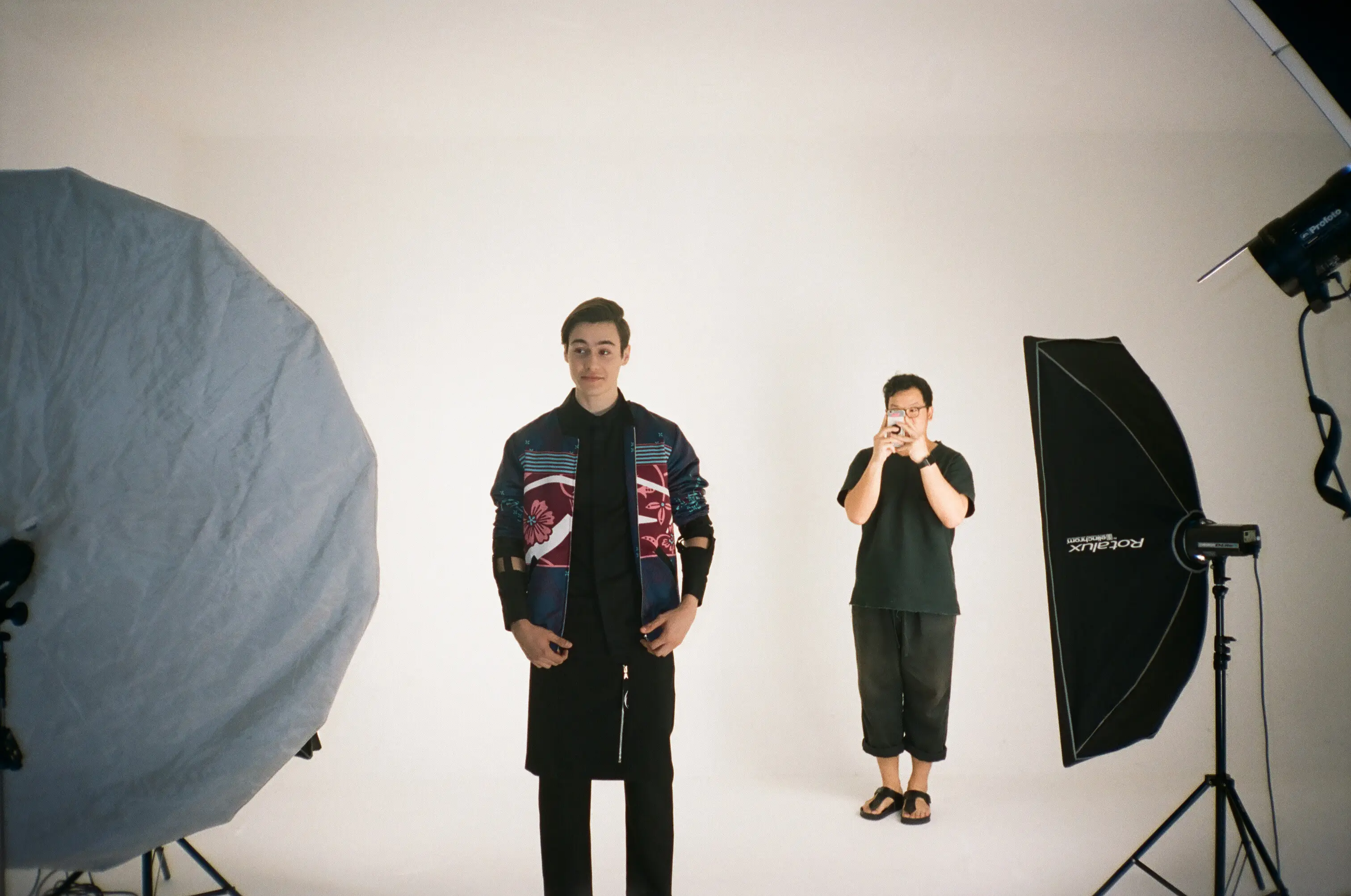
Once the textile and garment development reached its final form, the collection moved into image-making stage. I took these 35mm photographs during the campaign and catalogue shoot as a record of that transition.
Heroïne
The proposition
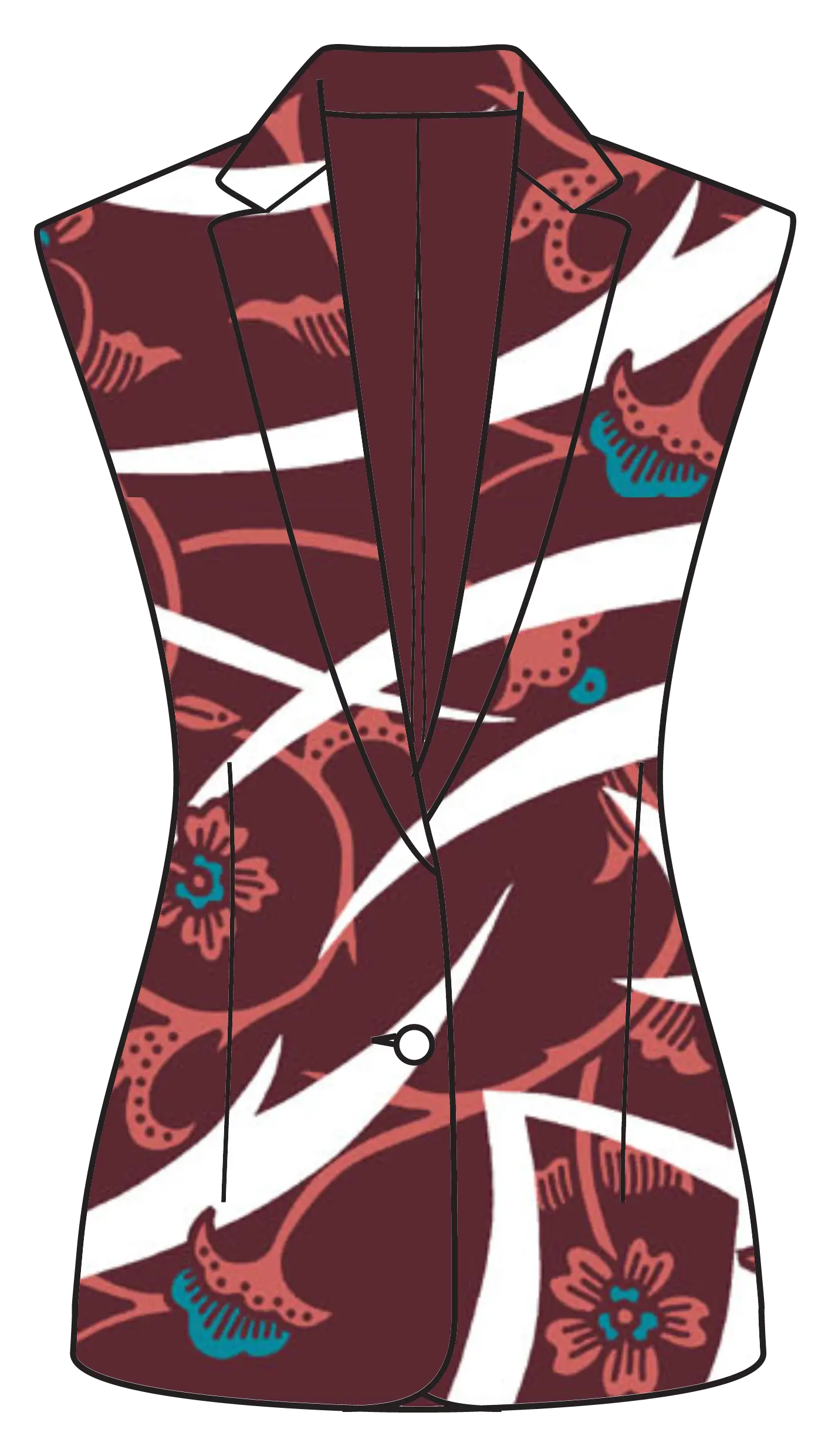
Heroïne was built through tension: softness and strength, feminine and masculine, decoration and utility. The collection was conceived around the idea that these seemingly conflicting qualities could coexist within the same visual direction.
Feminine / armour
both
at once
Masculine / softness
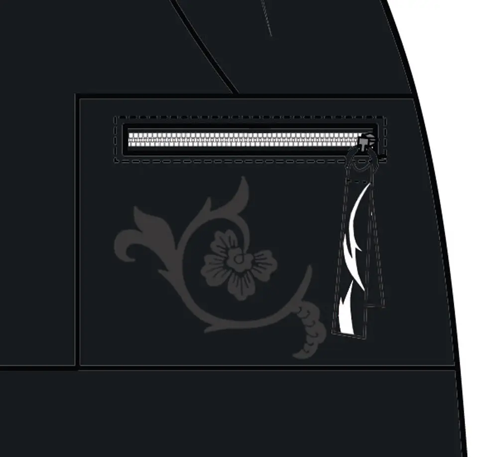
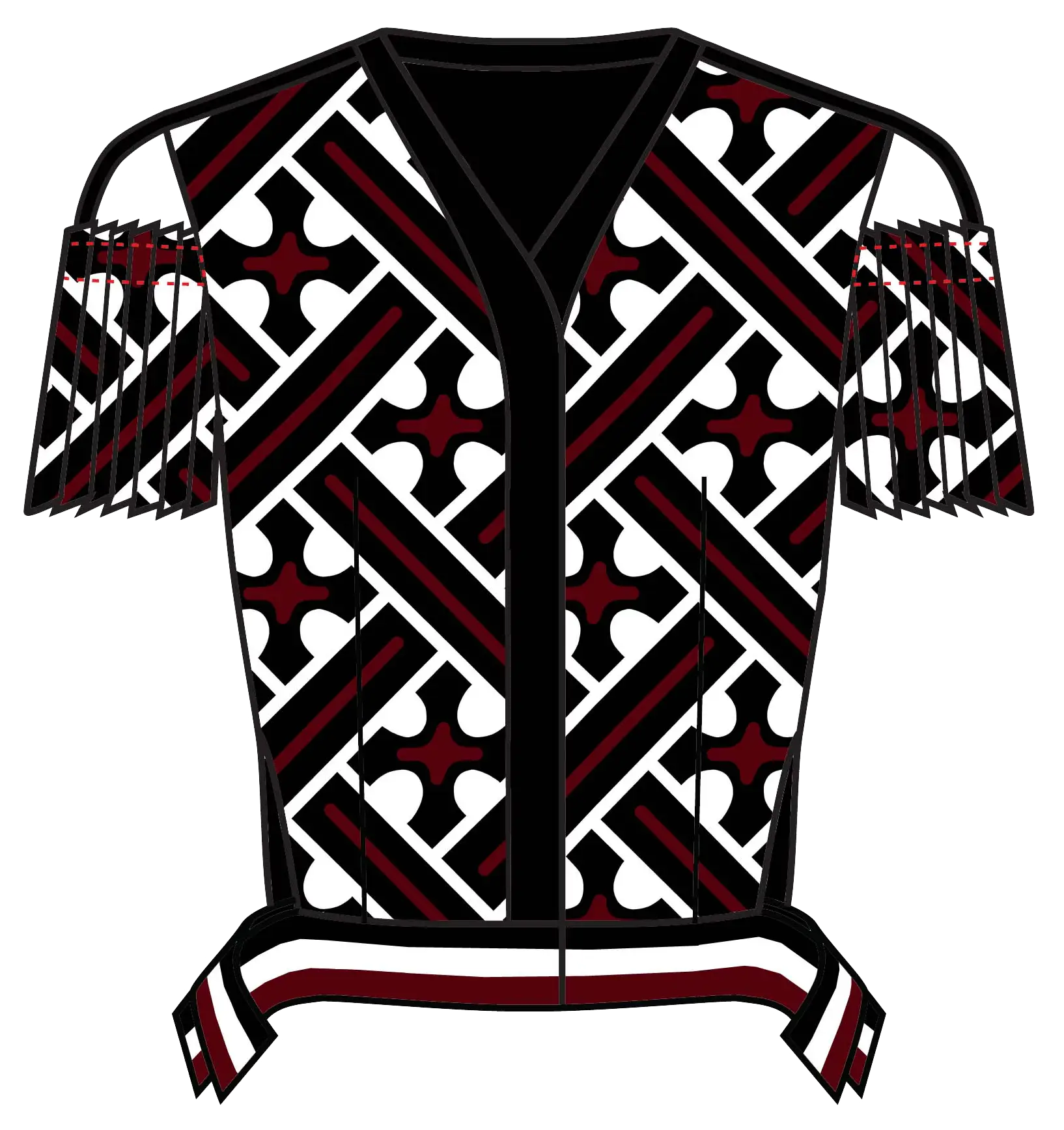
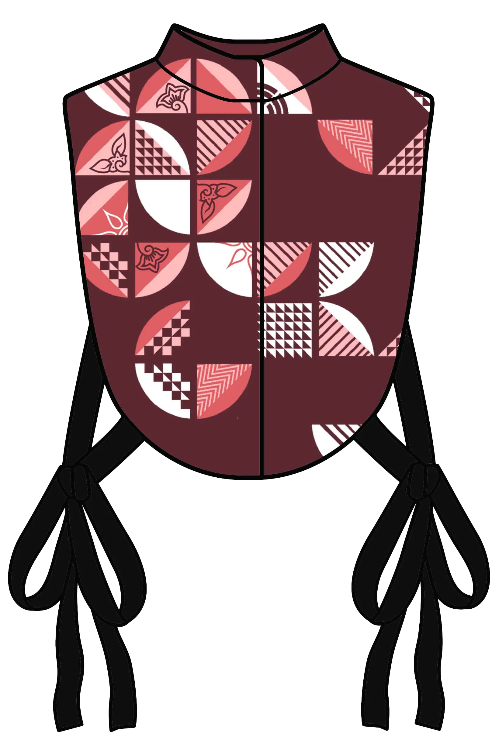
Tension was the first word to describe the collection. A blazer could function as a kind of modern armour, then be softened by pink florals and white thunder motifs. A chest piece inspired by protective gear became a red-pink bib layered over a shirt, while a heavy-duty pocket with a metal zipper was embroidered with flowers. Even the cut-out top, which has print with masculine undertone and rebellious feels, was balanced by a close-body feminine silhouette.
The lineup
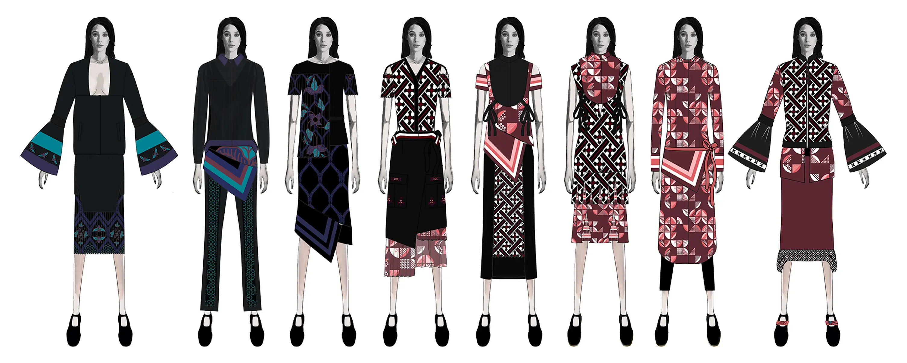
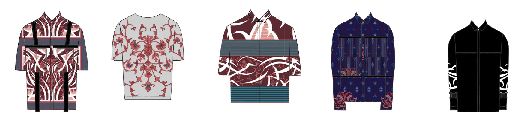
The collection developed these contradictions across a complete lineup, using garment shape, textile treatment, motif placement, layering and styling to keep softness and strength in conversation. Womenswear and menswear were edited together so the same Heroïne language carried across both.
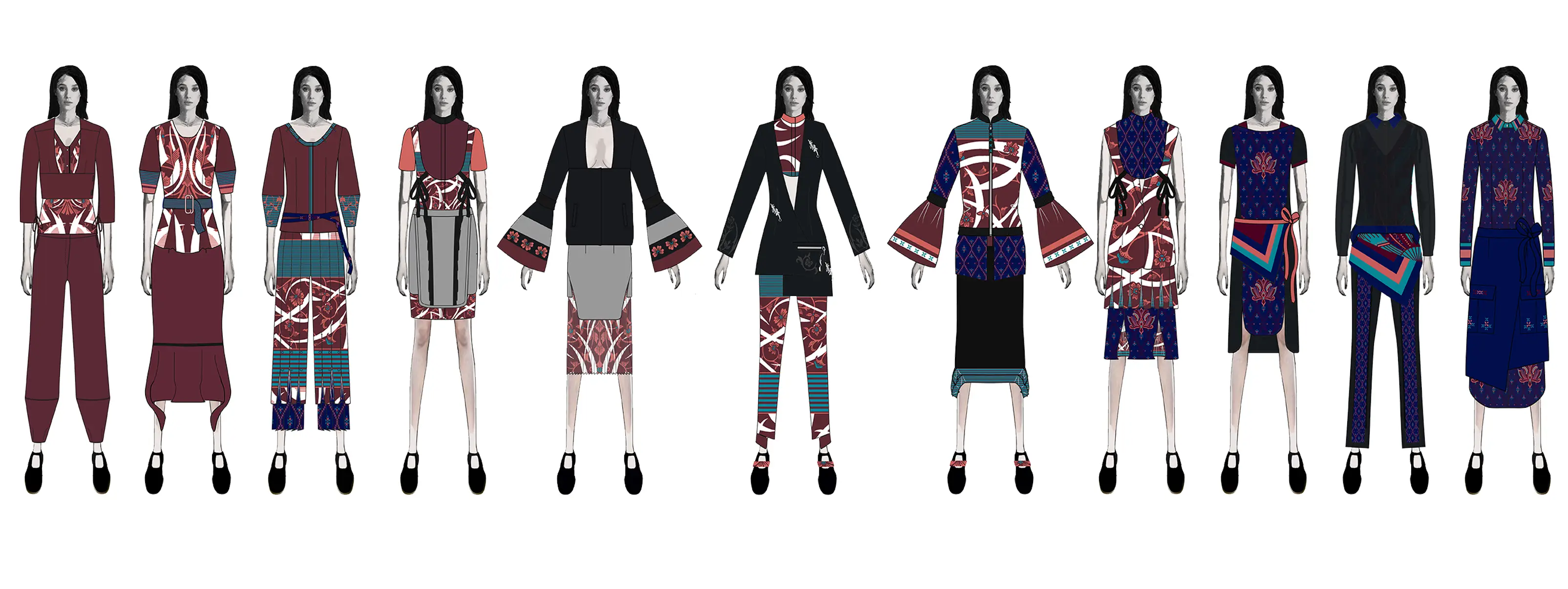
Redeveloped pieces
The inherited womenswear designs included a bell-sleeve jacket later expanded into four SKUs, an asymmetrical blazer and a red mermaid skirt. They are combined with new pieces that I designed to achieve the desired result in the collection.
Menswear direction
Menswear was designed by the menswear designer. I directed and edited the work, refining the styling and overall balance of the looks to make them coherence with the womenswear ones.
Pisang Bali
Textile became another way of carrying the collection’s tension between softness and structure into surface, placement and detail.
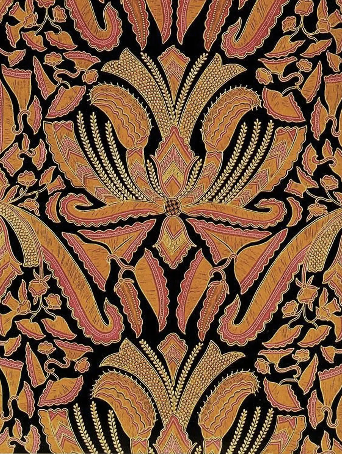
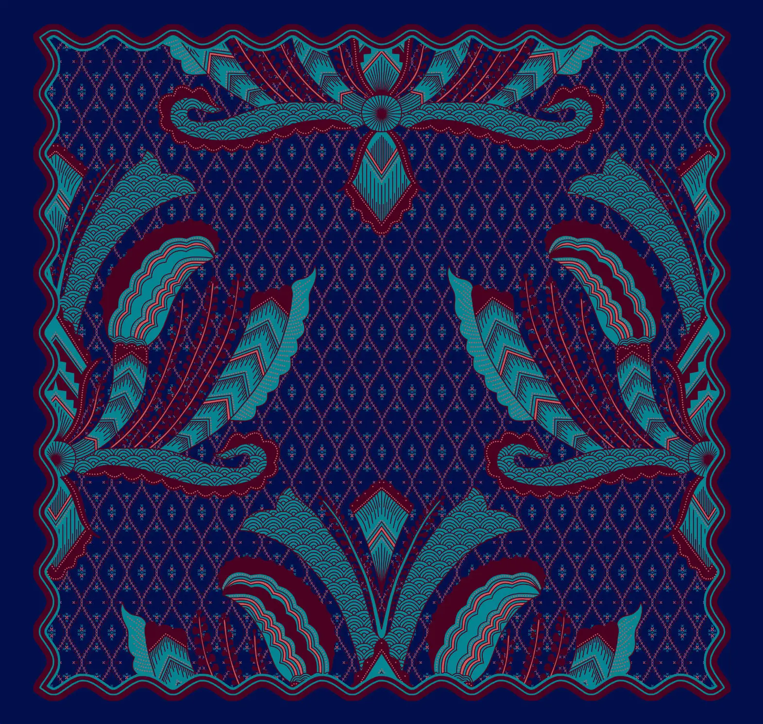
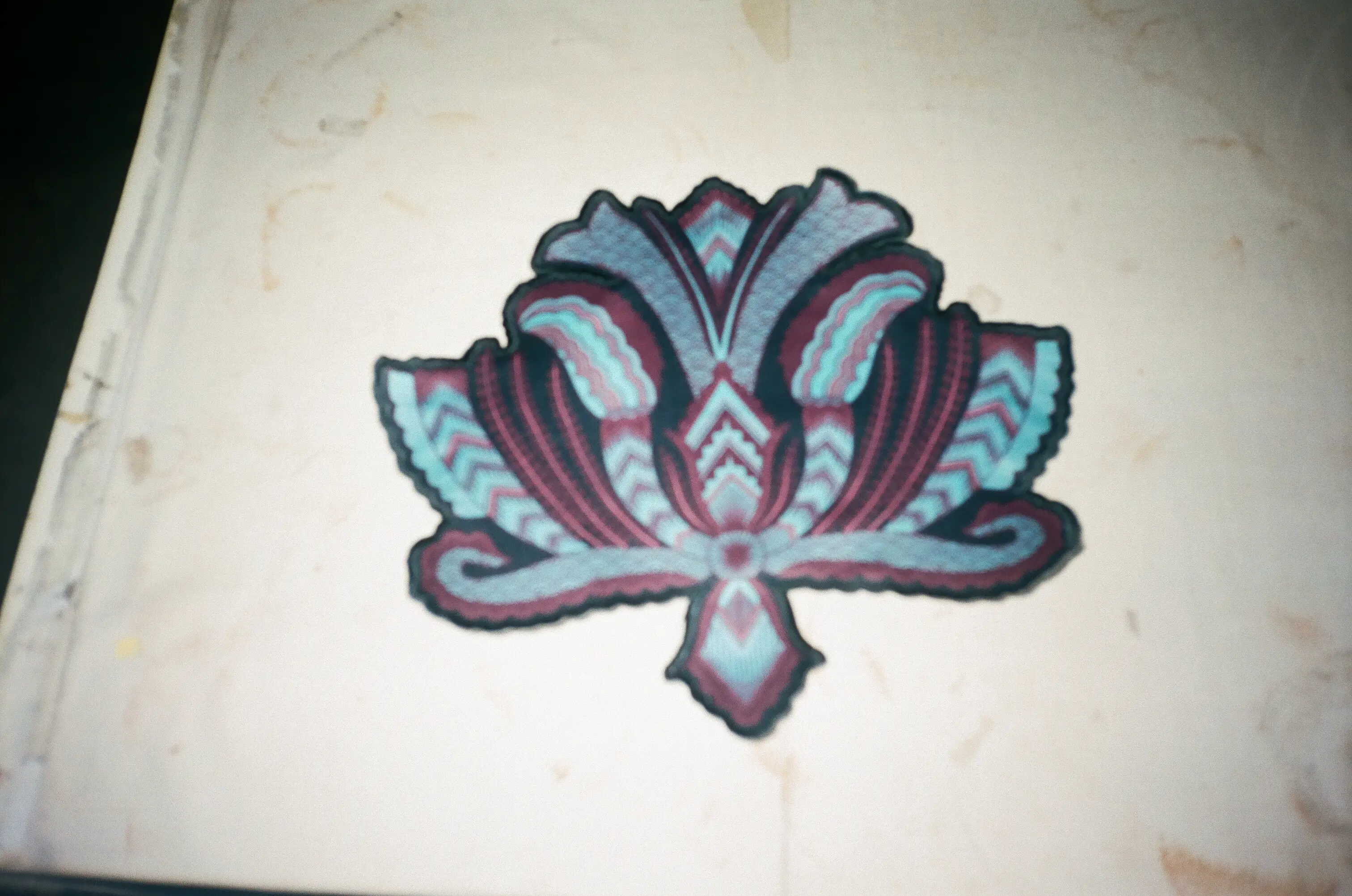
Collaborative textile development
The Pisang Bali direction was proposed by our textile designer after archival research in Bateeq's HQ in Surakarta. I selected it for Heroïne and brought it into the wider collection direction, working with the team on placement, embroidery and how the motif would live on the garments.
Protection & return
Collection research connected the motif with a gift for a loved one leaving on a long journey, while versions of the motif are also recorded in Javanese temple carving from around the 9th century. That history of departure, protection and hoped-for return resonated strongly with Heroïne's warrior narrative.
Sample development
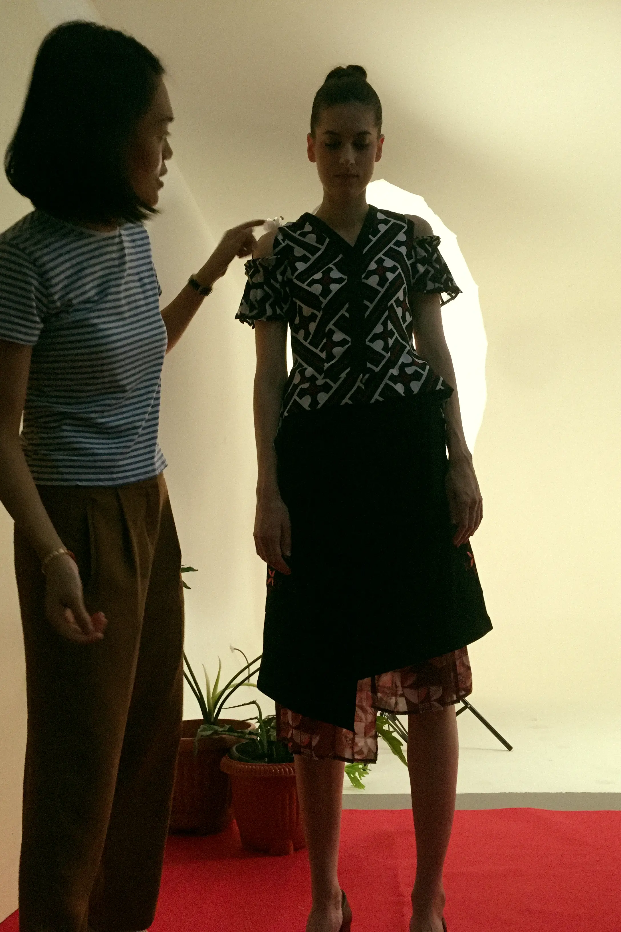
The drawings moved into the sample room, where proportion and construction were worked out on the garment itself. Details were still open to change here, whether that meant correcting, simplifying or pushing them further.
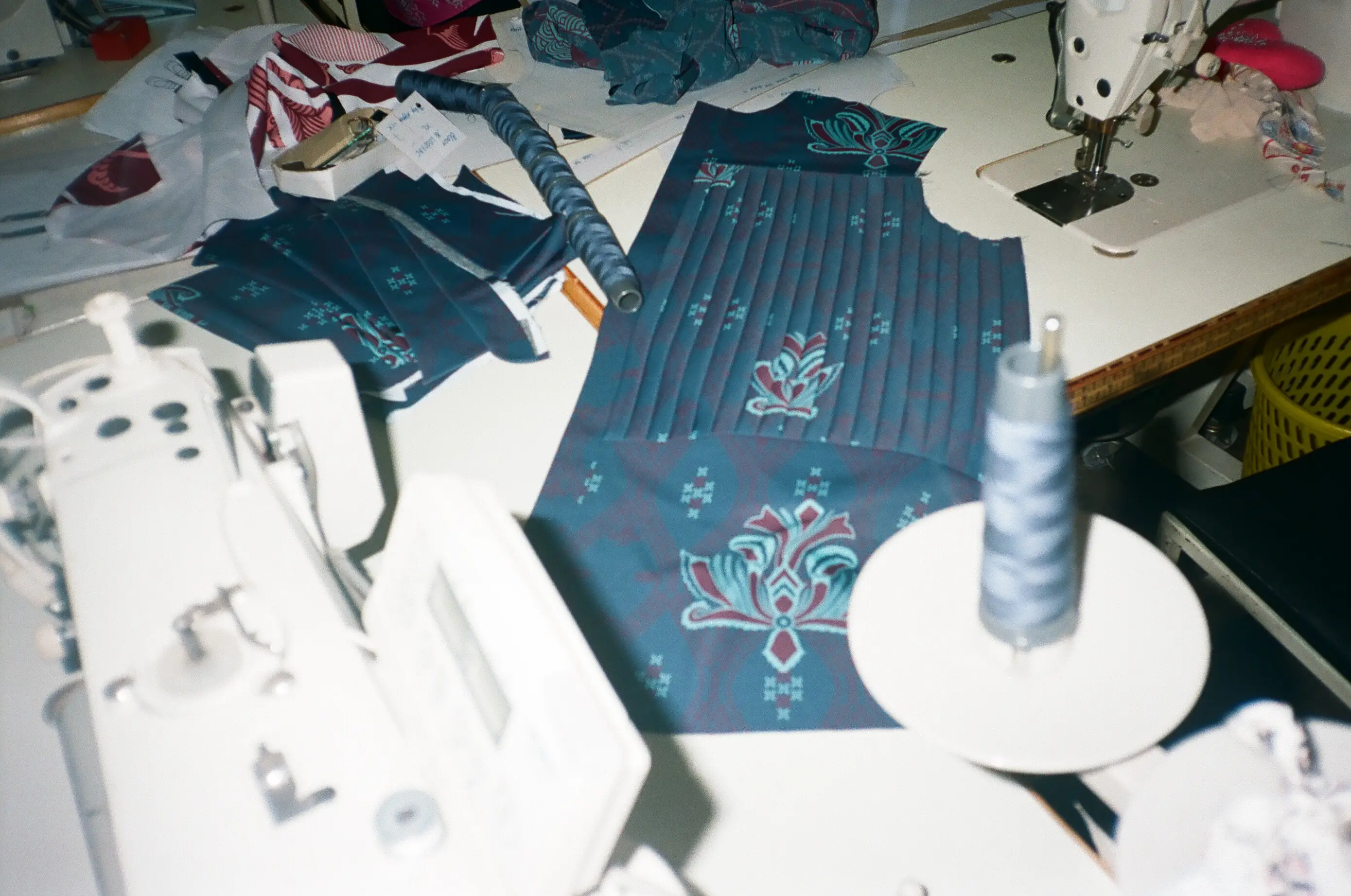
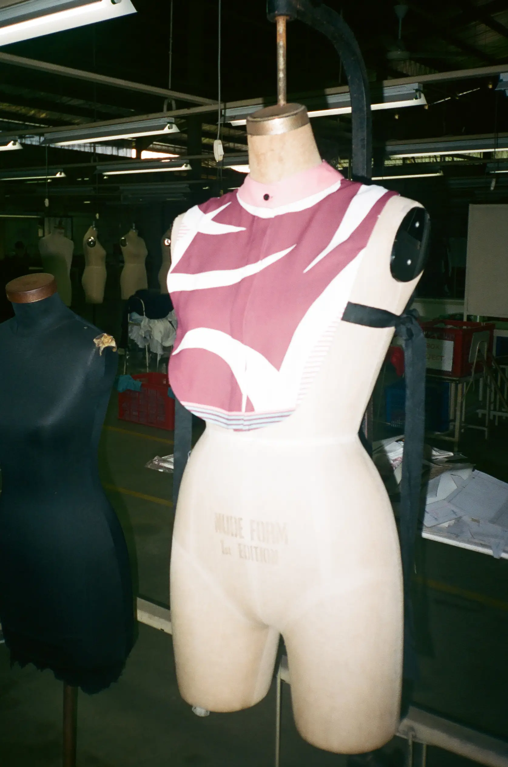
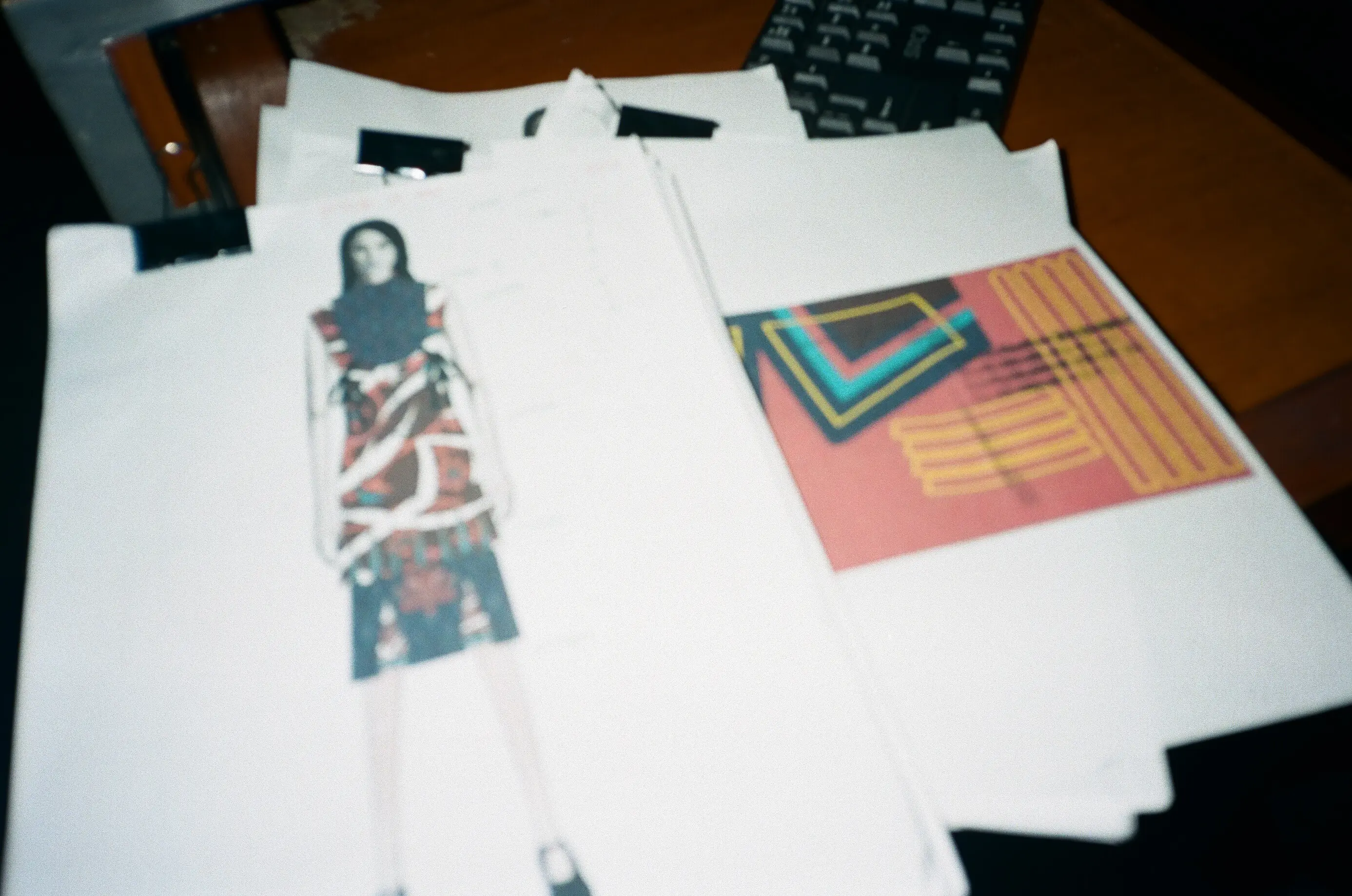
Working samples, textile tests and garment corrections during development.
Building the image world
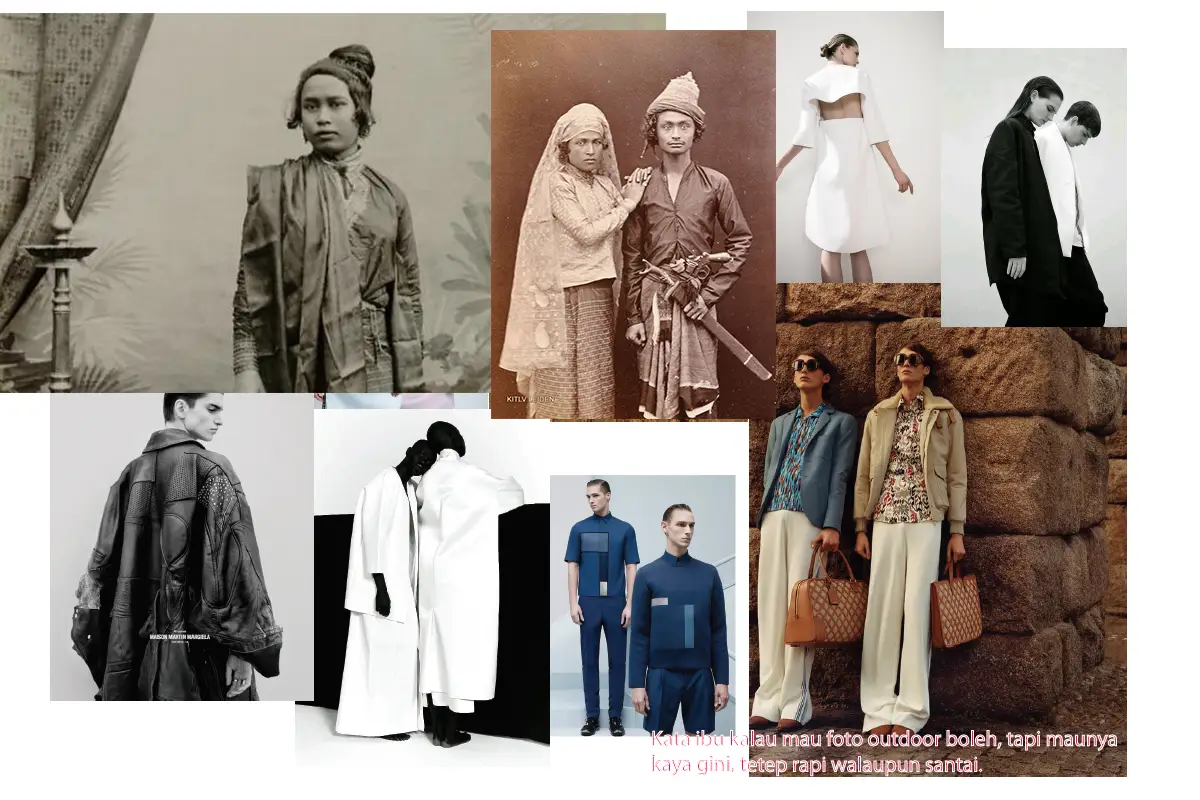
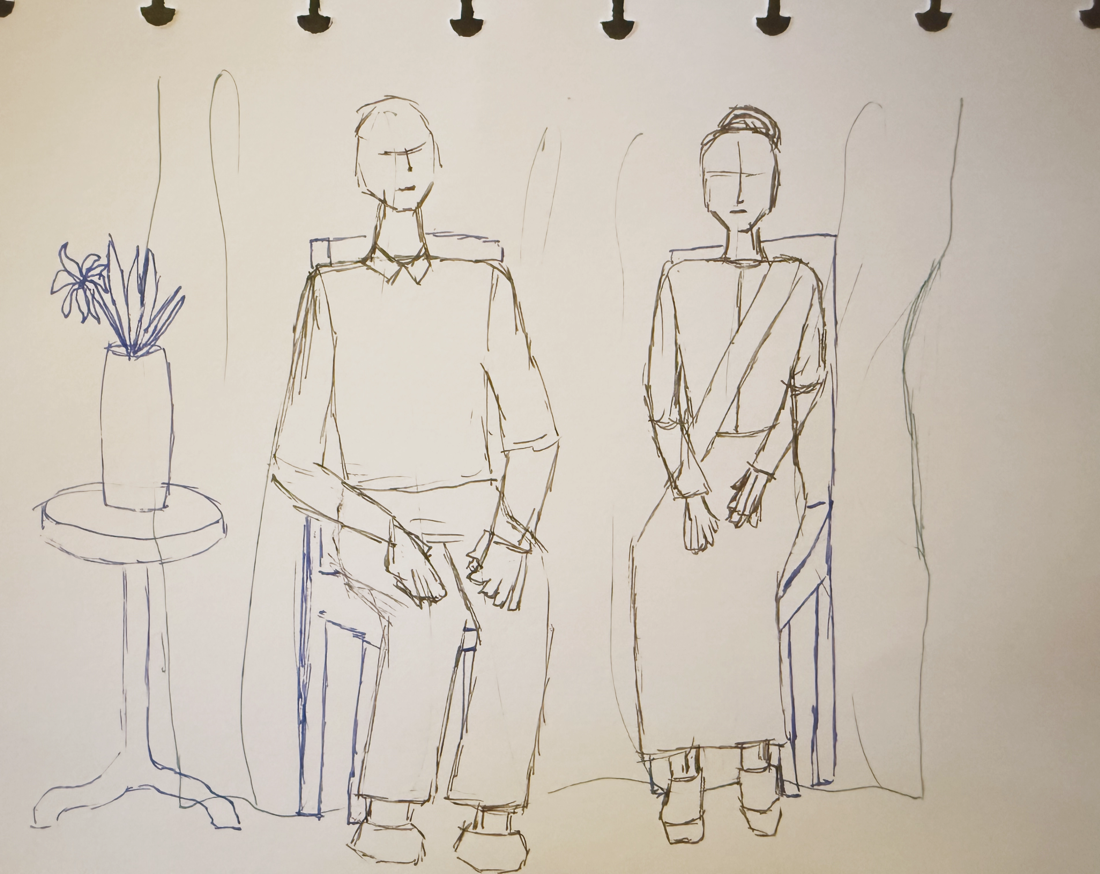
The image direction took inspirations from vintage formal portraiture; paired figures and restrained composition. I translated those references into framing studies, then carried the direction into the shoot itself.
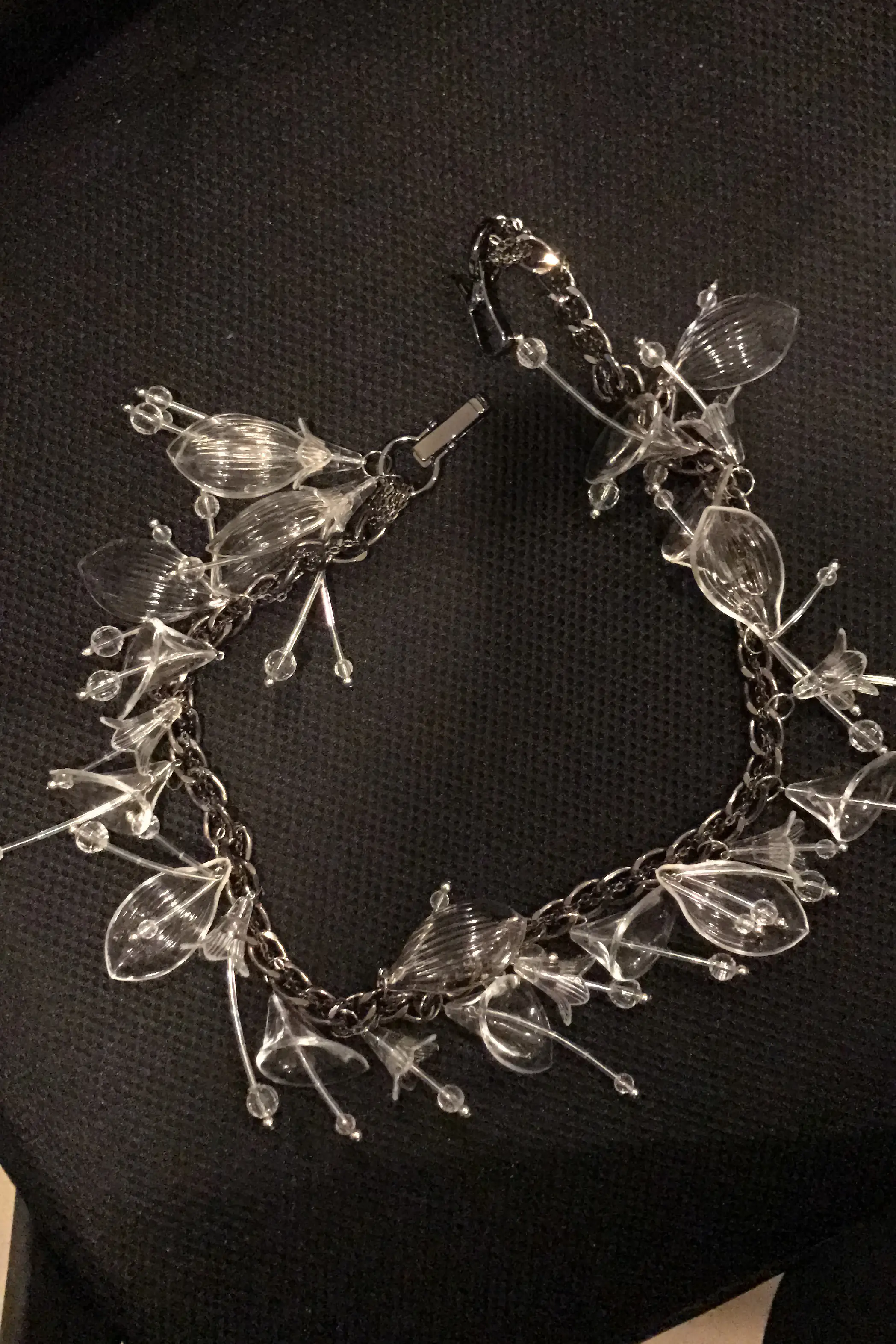
Collaborative direction
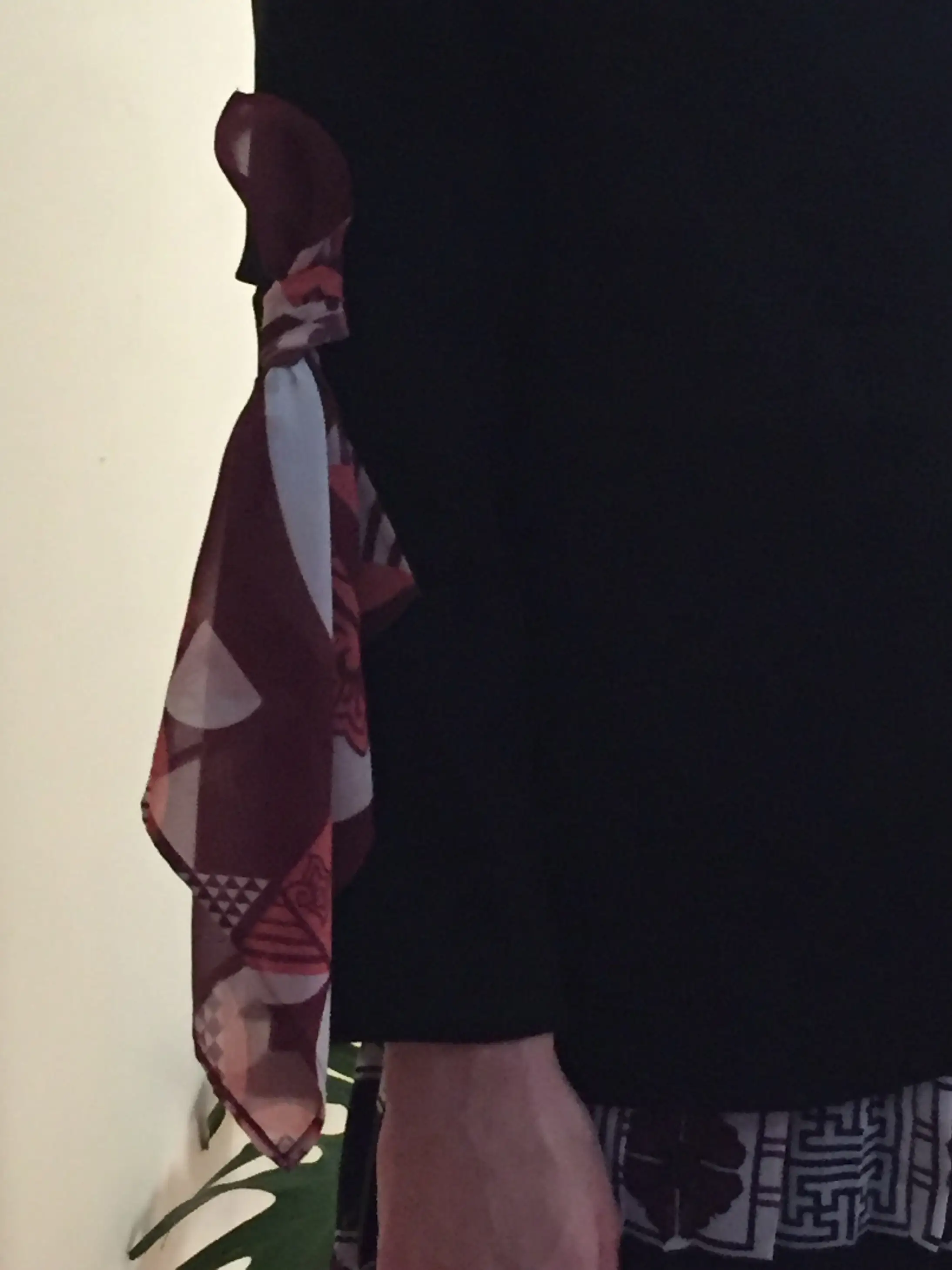
I worked with the stylist, photographer and jewelry designer to align accessories, overall looks, body language and framing with the collection world.
Padusan
The premise
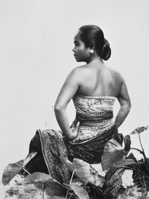
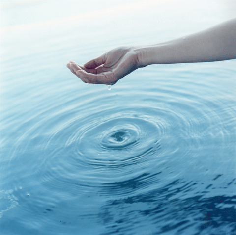
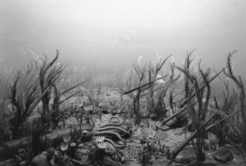
Padusan was developed into a broader visual world around bathing rituals, rivers, flowing water and underwater ecosystems. Those ideas then shaped the garments, textile treatments and atmosphere direction across the collection, from campaign imagery and runway sound to smaller physical details made around the launch.
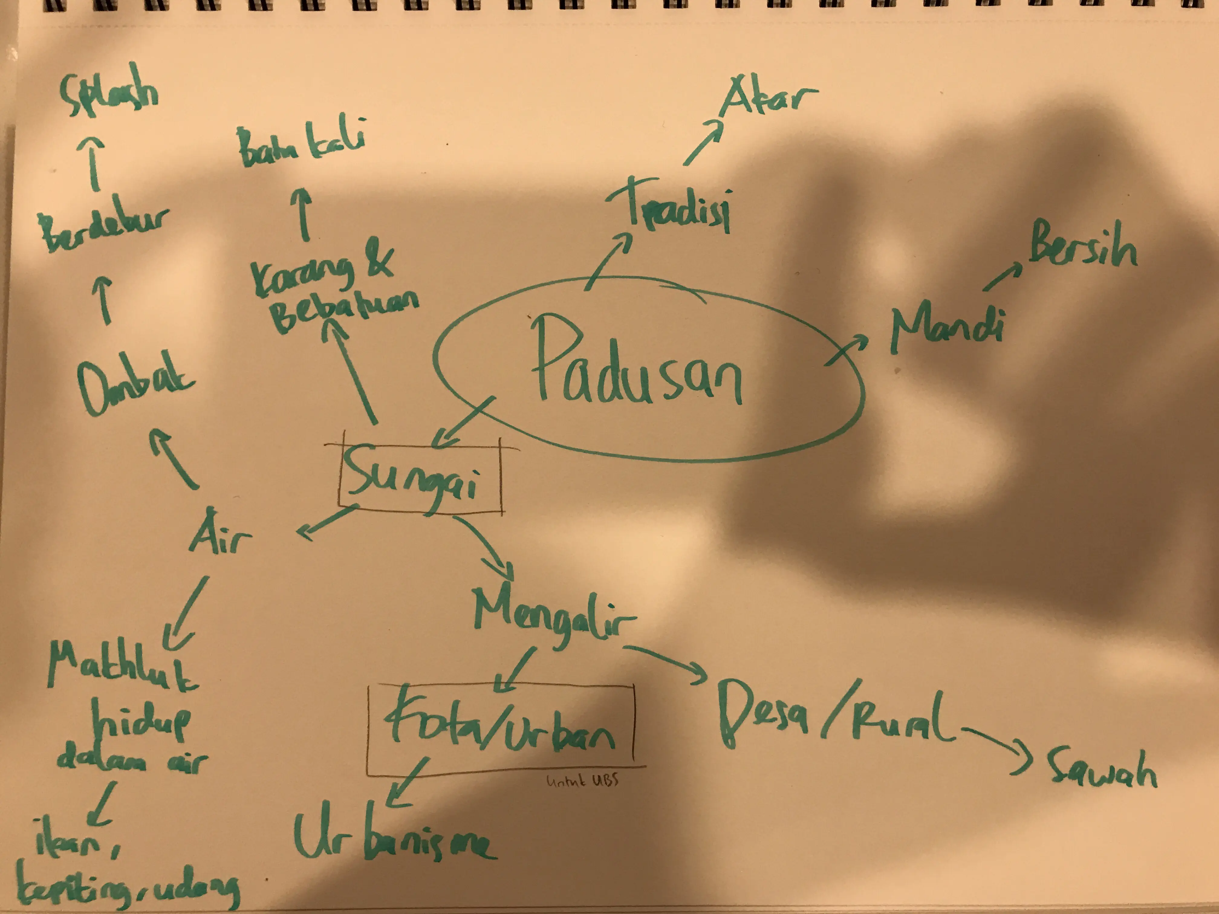
Padusan was one of the theme names proposed by the menswear designer; concept developed further from that starting point through research and collection direction.
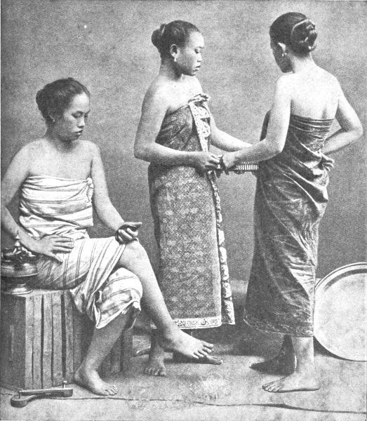
Product logic
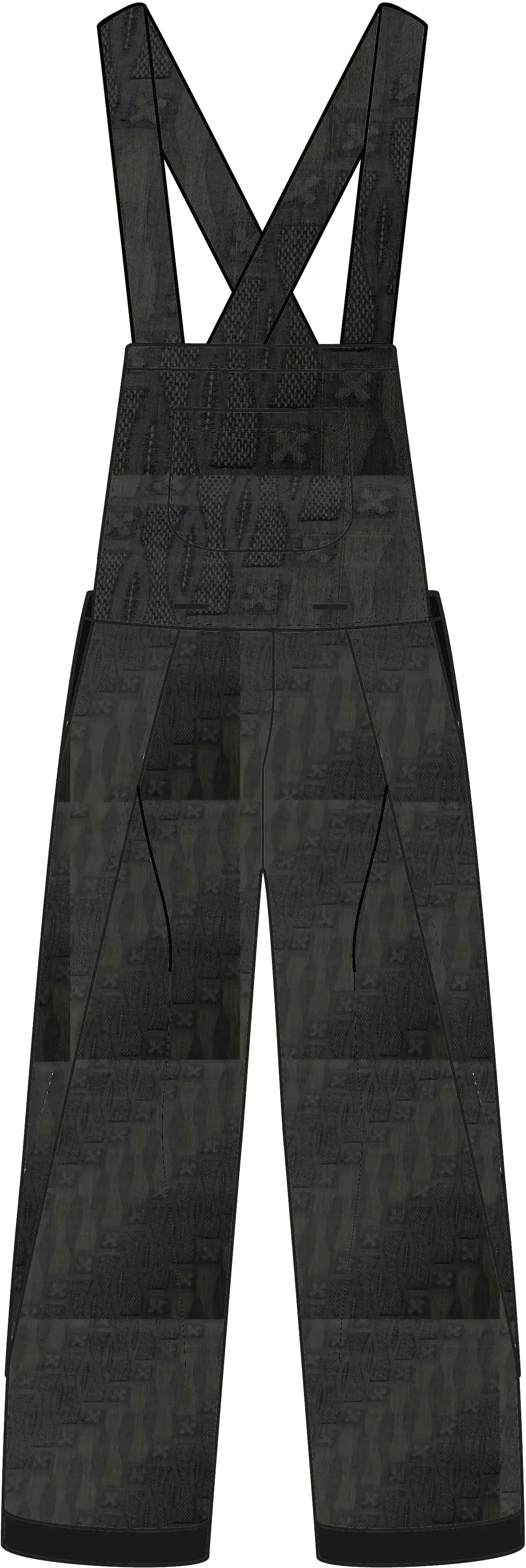
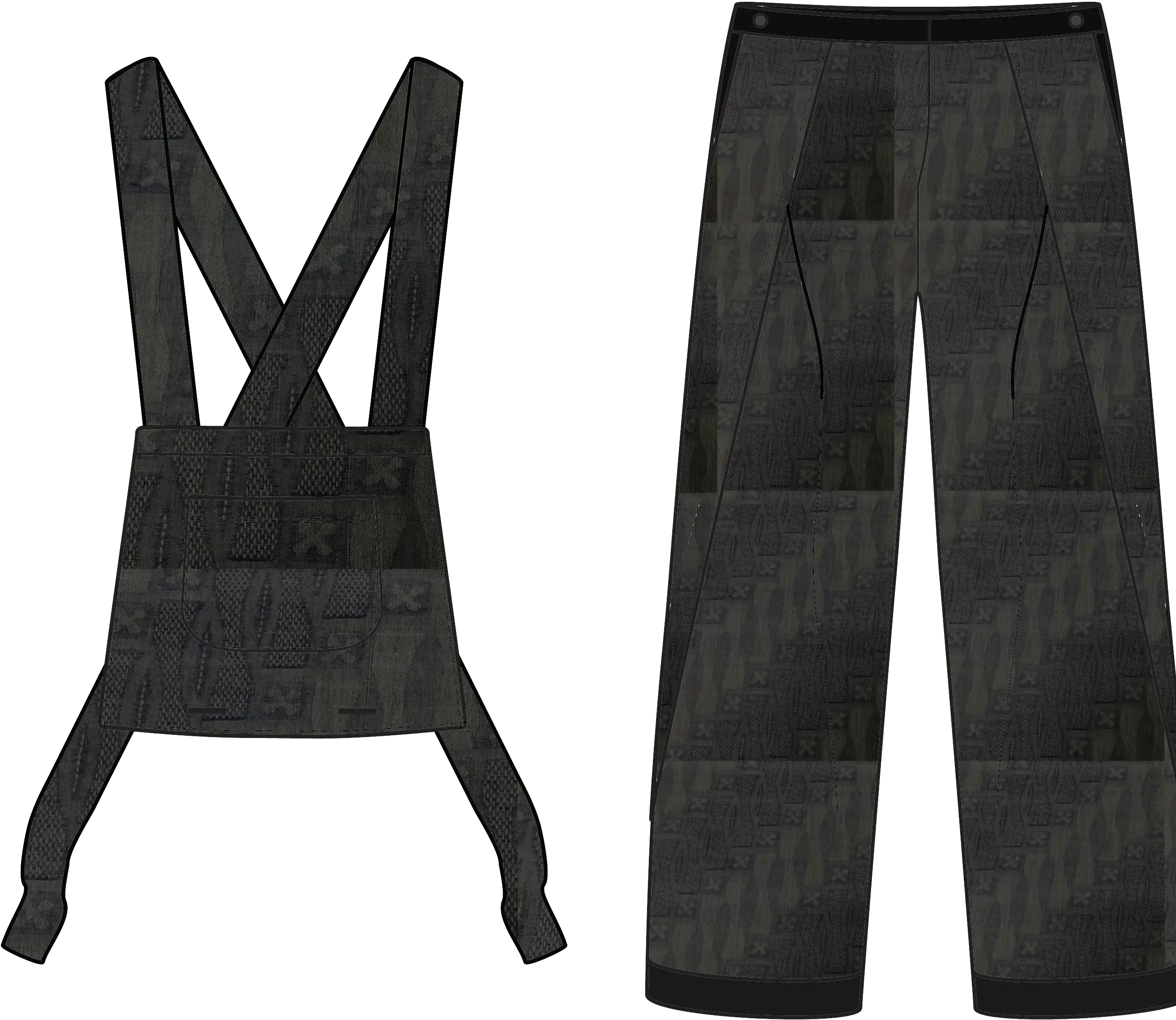
The garment construction takes its starting point from the act of undressing. Pieces are designed to look as if they are caught mid-reveal, opening, slipping or releasing from the body. It turns bathing into a product design logic and adds a deeper layer to the collection storytelling.
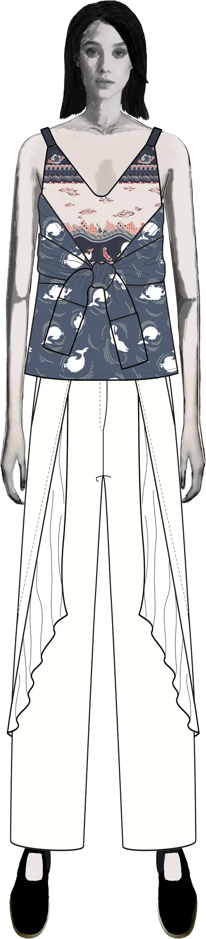
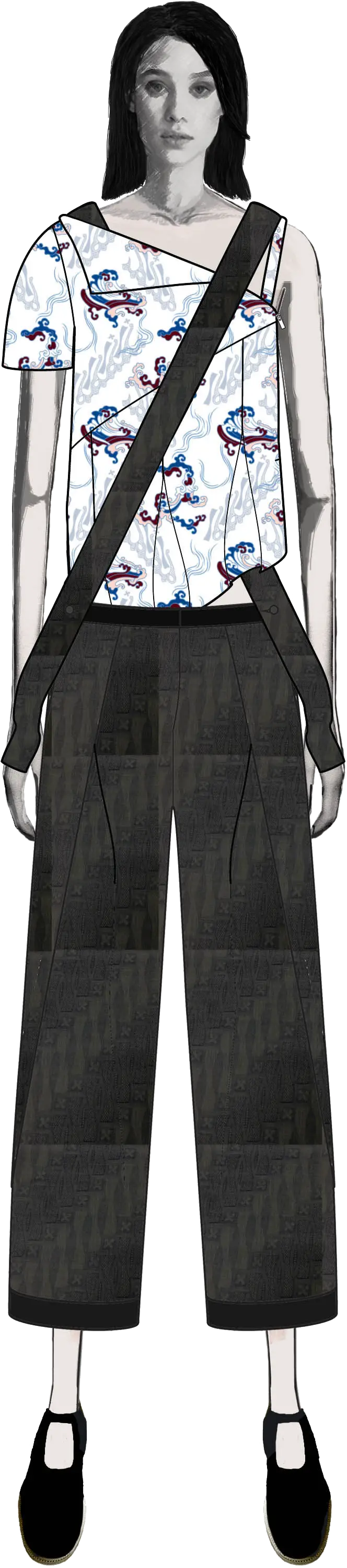
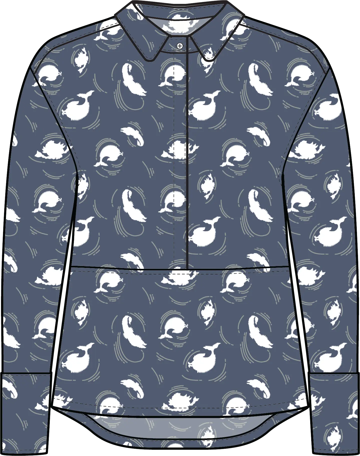
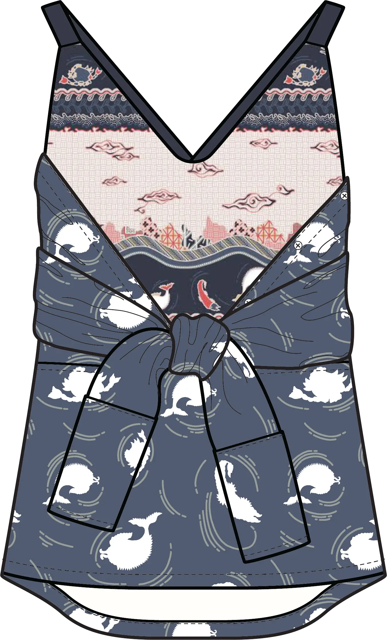
Transformation
This experiment had a longer afterlife. The idea of garments that could shift, open or be worn in different ways helped define Bateeq’s later multi-occasional design principle and carried into other the collections that followed.
Textile development
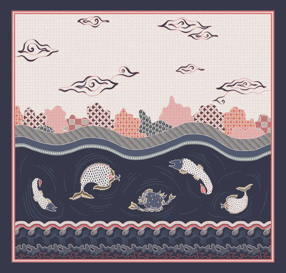
The textile direction began with traditional batik pesisir (coastal style batik). I developed the first fish print by simplifying the marine creatures traditional print. Then passed it to the textile designer with a sketch to explain the envisioned print layout, along with references for underwater flora, layered environments and coral-like forms. She expanded it into the more detailed Mega Mendung Fish pattern.
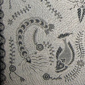
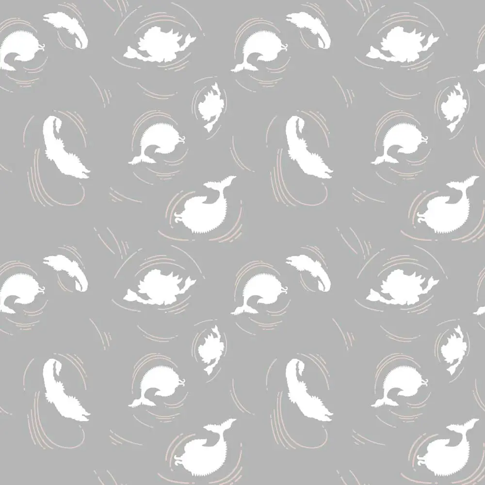
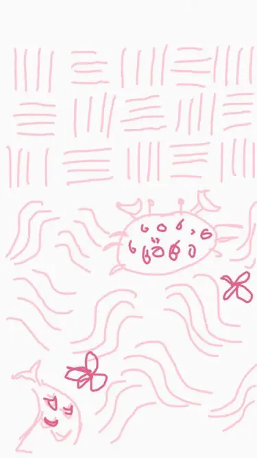
Image references:
Marimekko, Hokusai, African batik
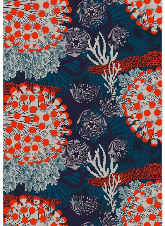
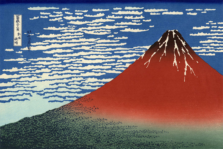
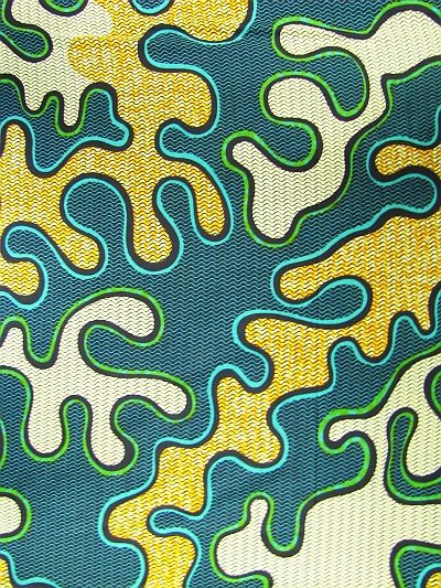
Reference
First iteration
Direction packet
Developed version
Campaign planning
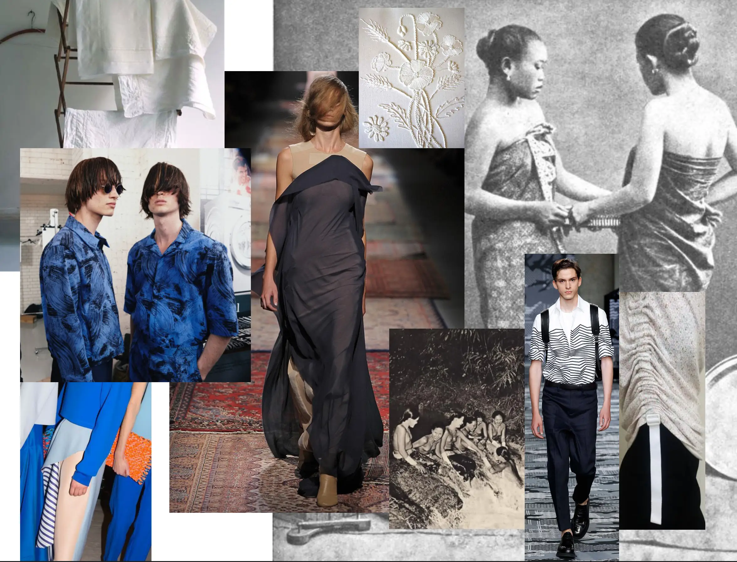
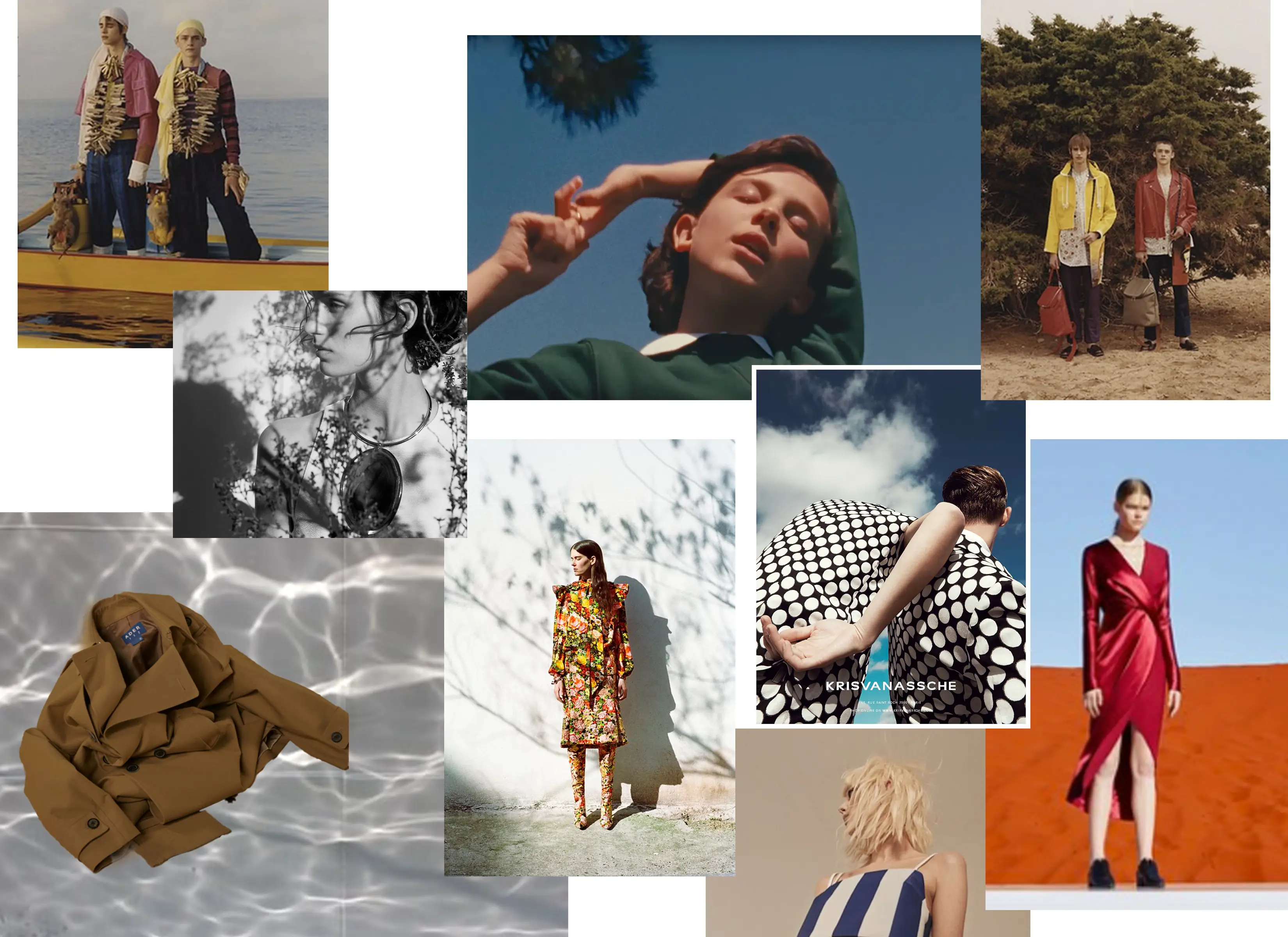
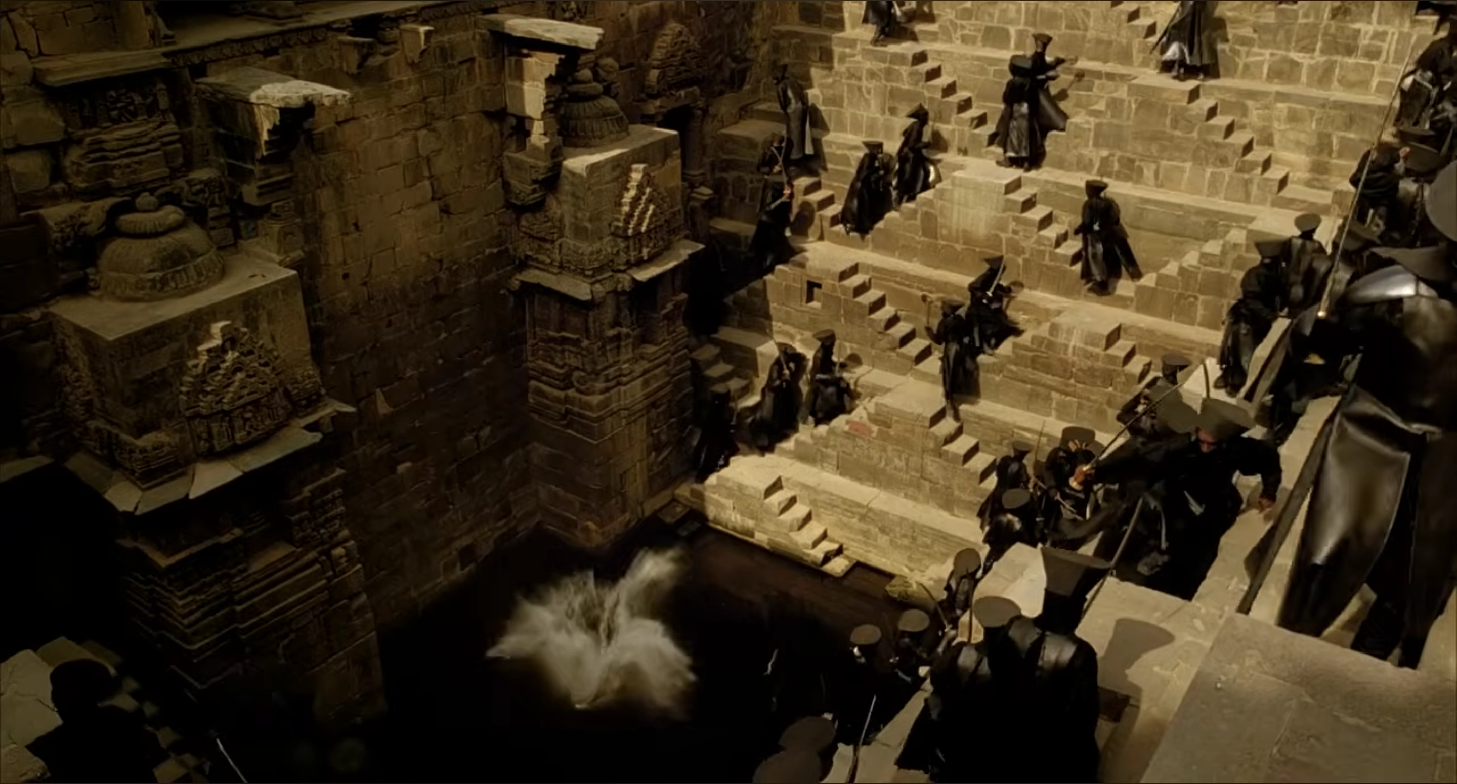
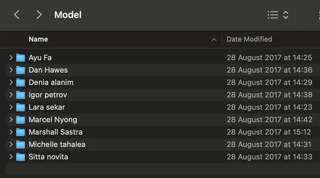
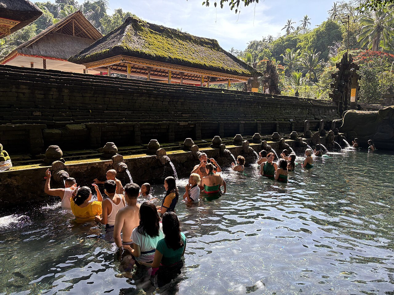
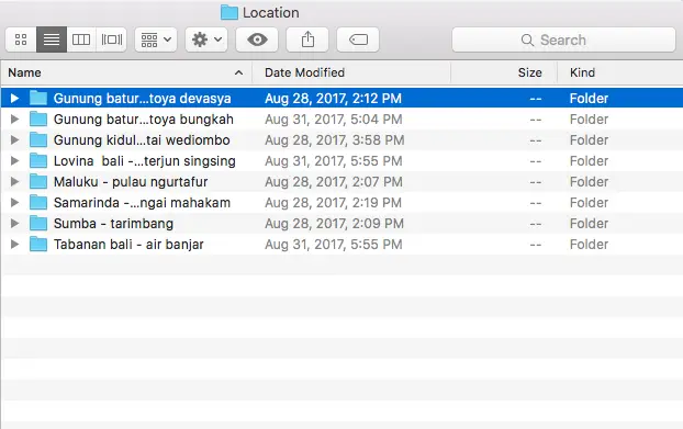
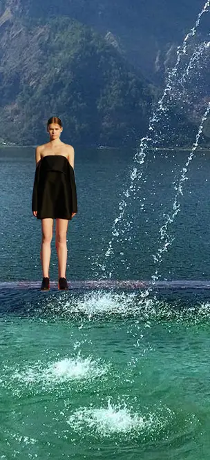
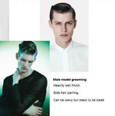
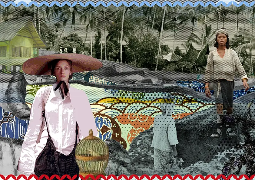
The campaign direction was shaped through several steps including image research, model selection and location scouting. I built the main moodboard, reviewed shortlist options for cast and settings, then used a Lake Batur planning collage to align the shoot before production.
From fitting to shoot
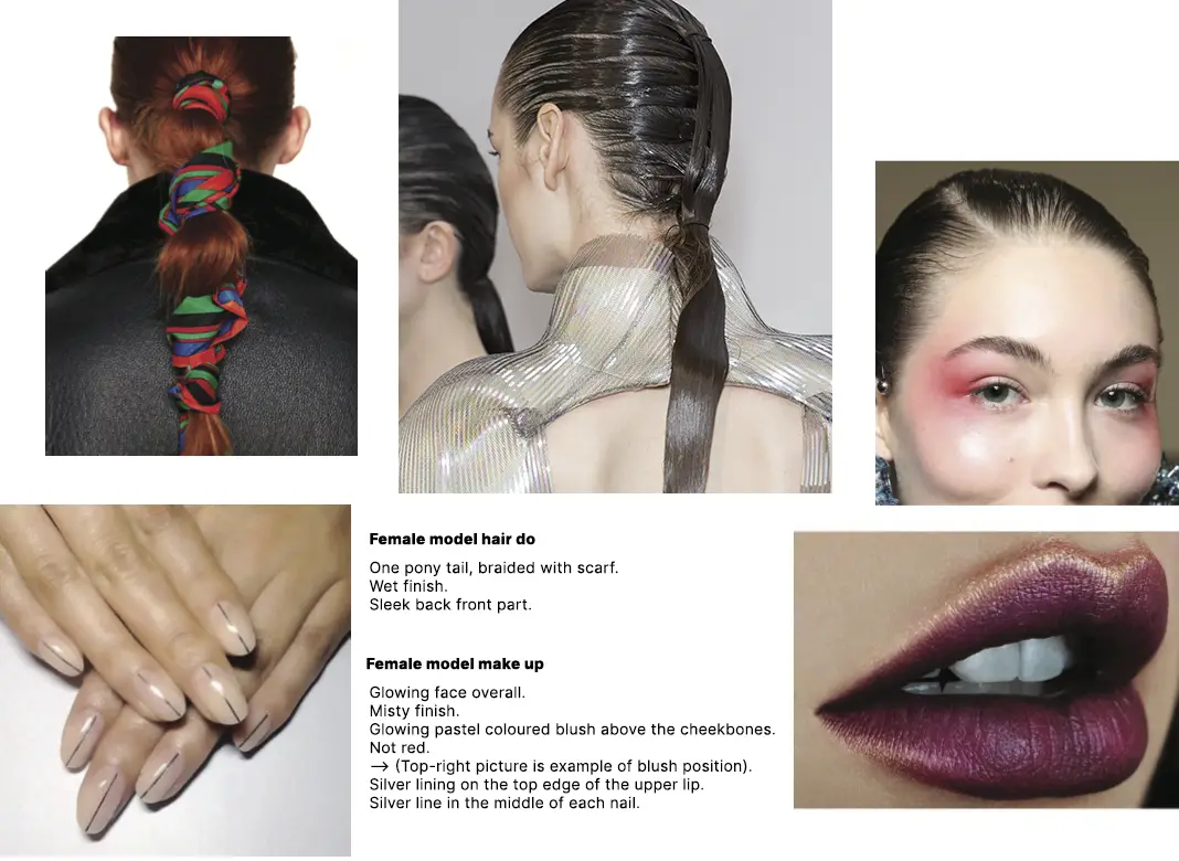
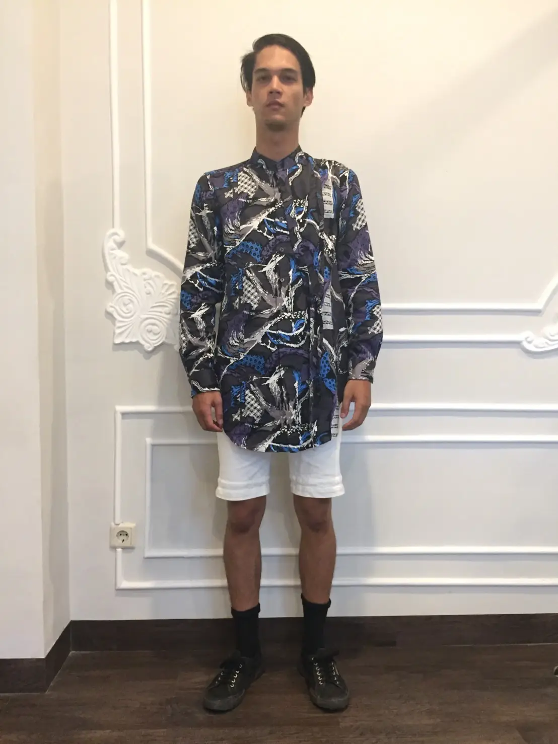
Hair, makeup and grooming were developed alongside fittings before the collection moved onto shooting location. The campaign then brought those decisions into the landscape with a body of water and physical movement of the shoot.
On location
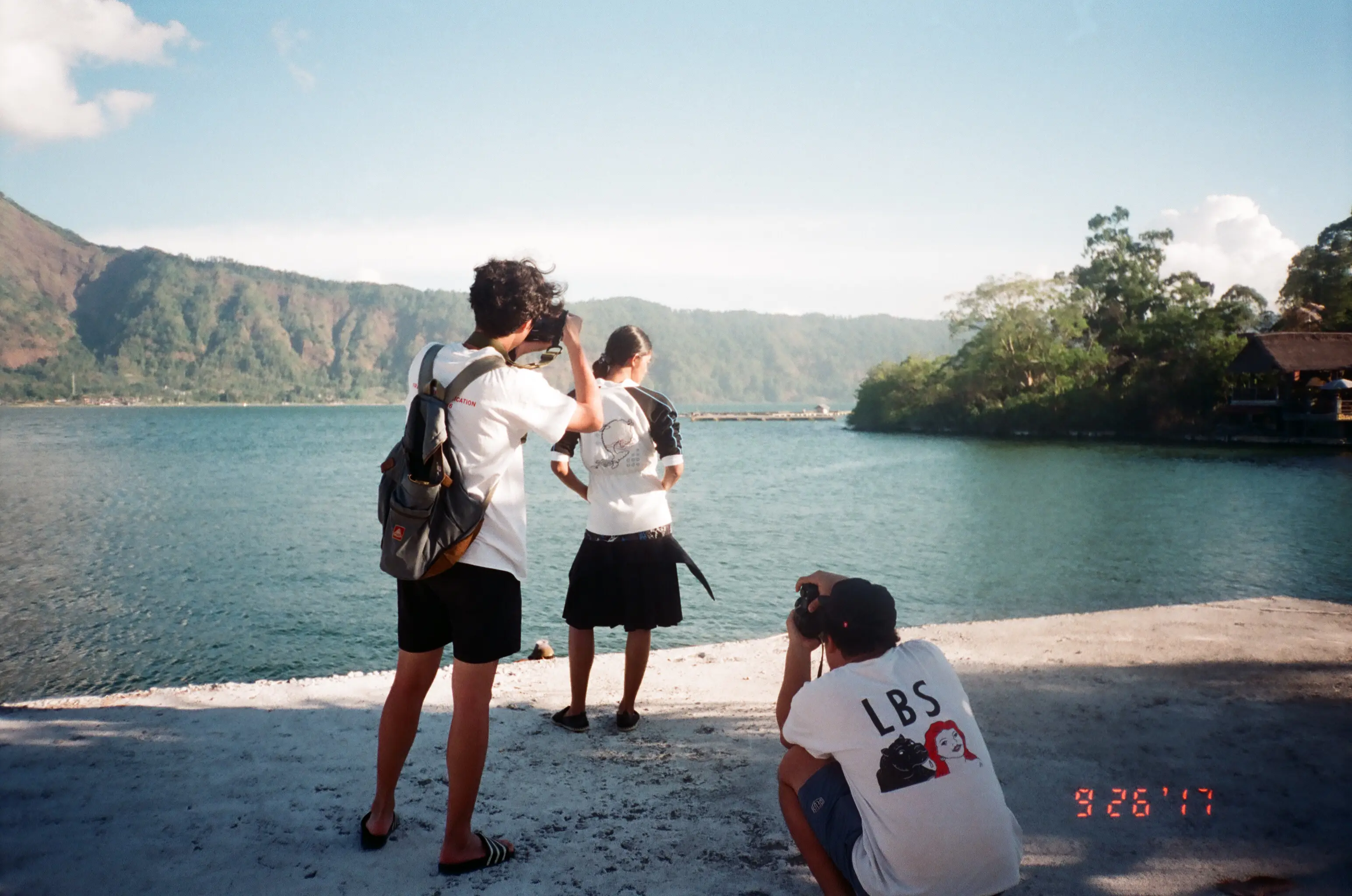
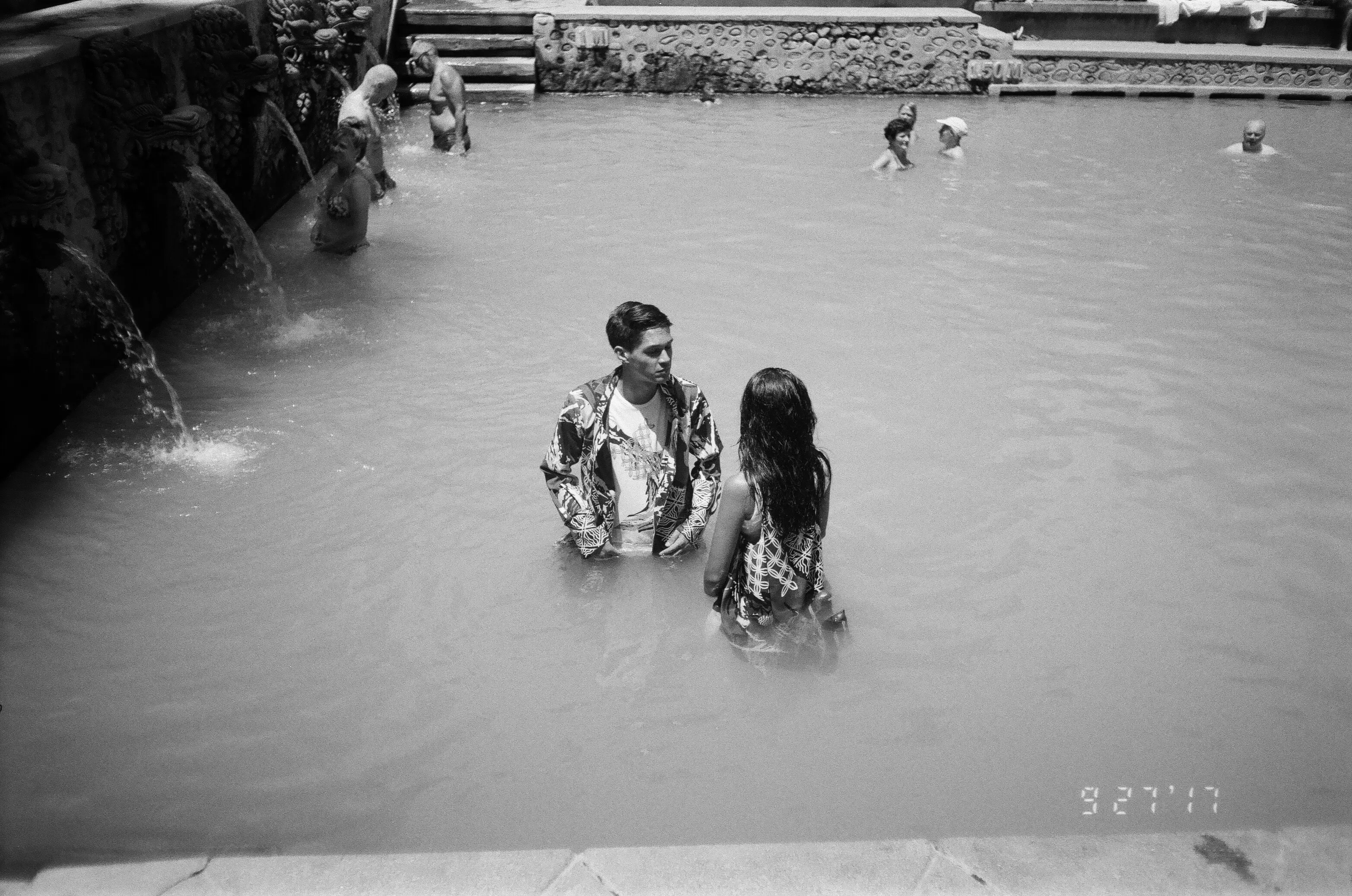
The final shoot moved between water, volcanic landscape and open lake, carrying the collection's bathing premise into the image world.
Kelir
Selected modular studies
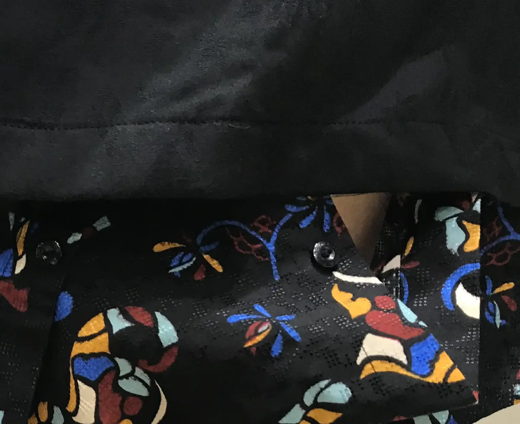
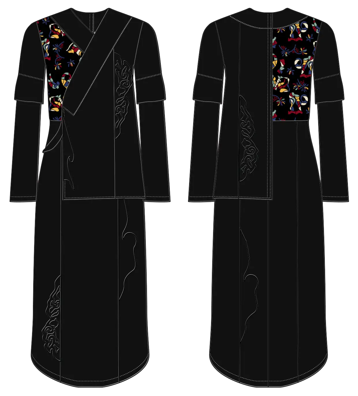
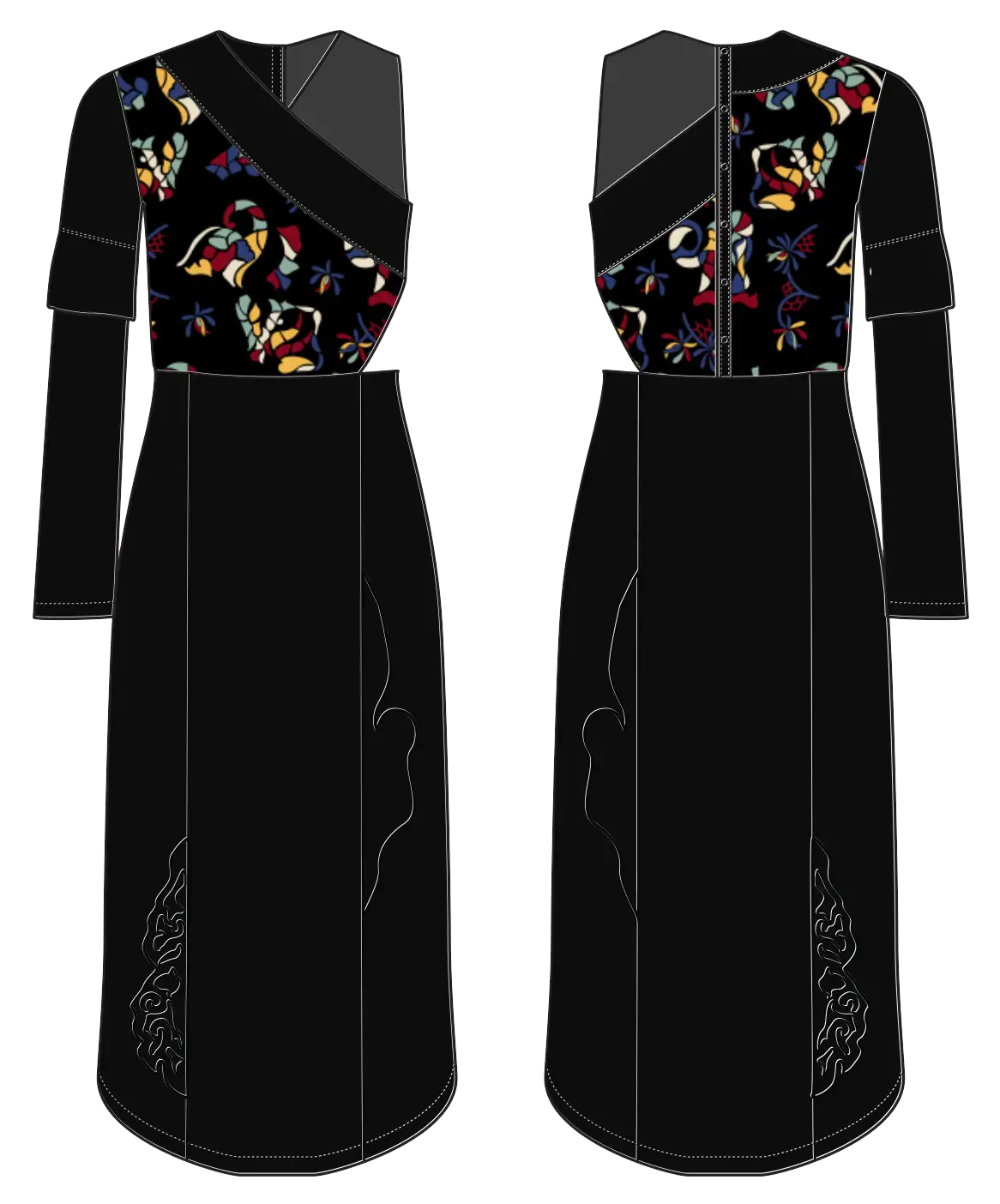
Detachable panels and layered components allowed silhouettes to shift while retaining the same underlying garment system. Different pieces used concealed button tabs and soffix-based attachment methods.
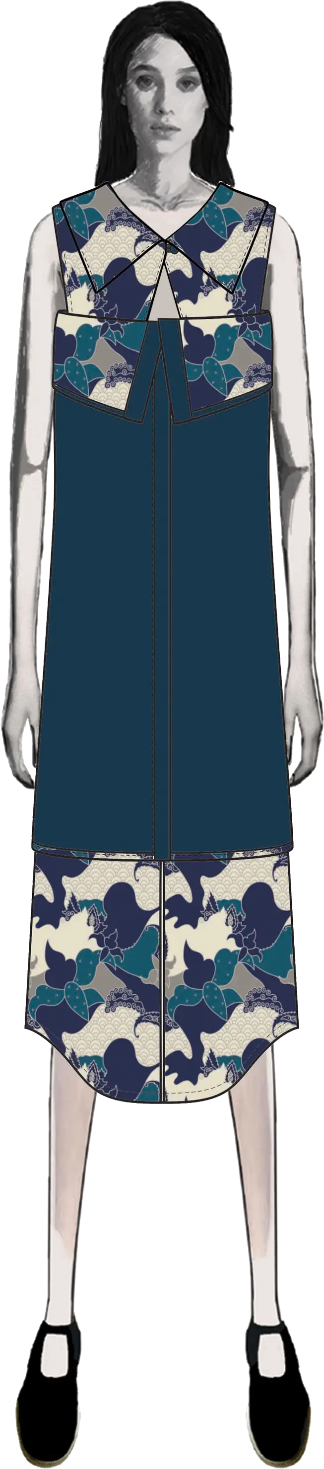
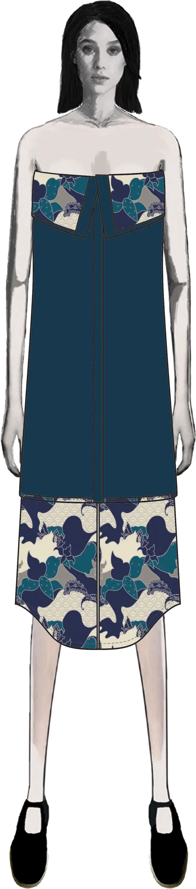
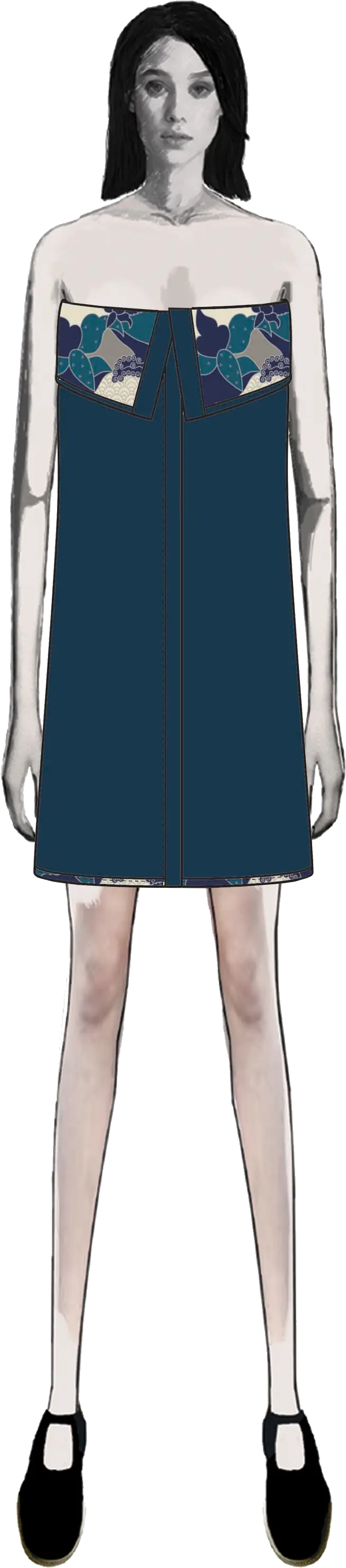
Shared attachment logic
The black dress used the same soffix-based system later explored further in the Tara jacket.
Pattern development
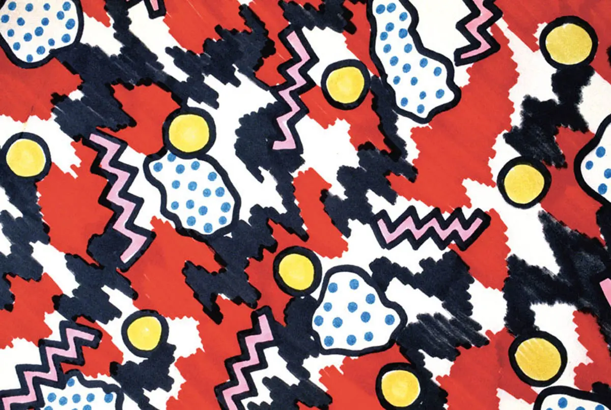
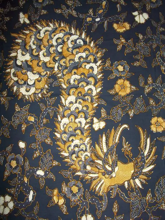
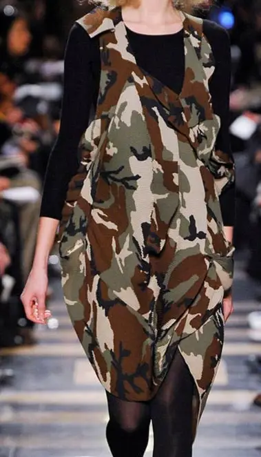
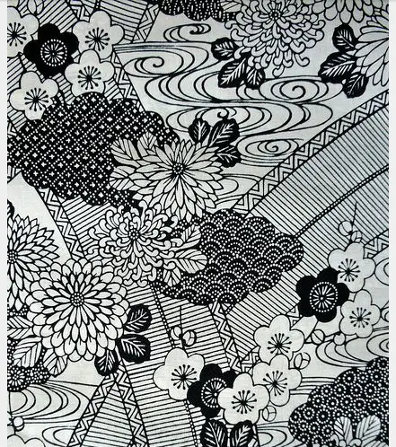
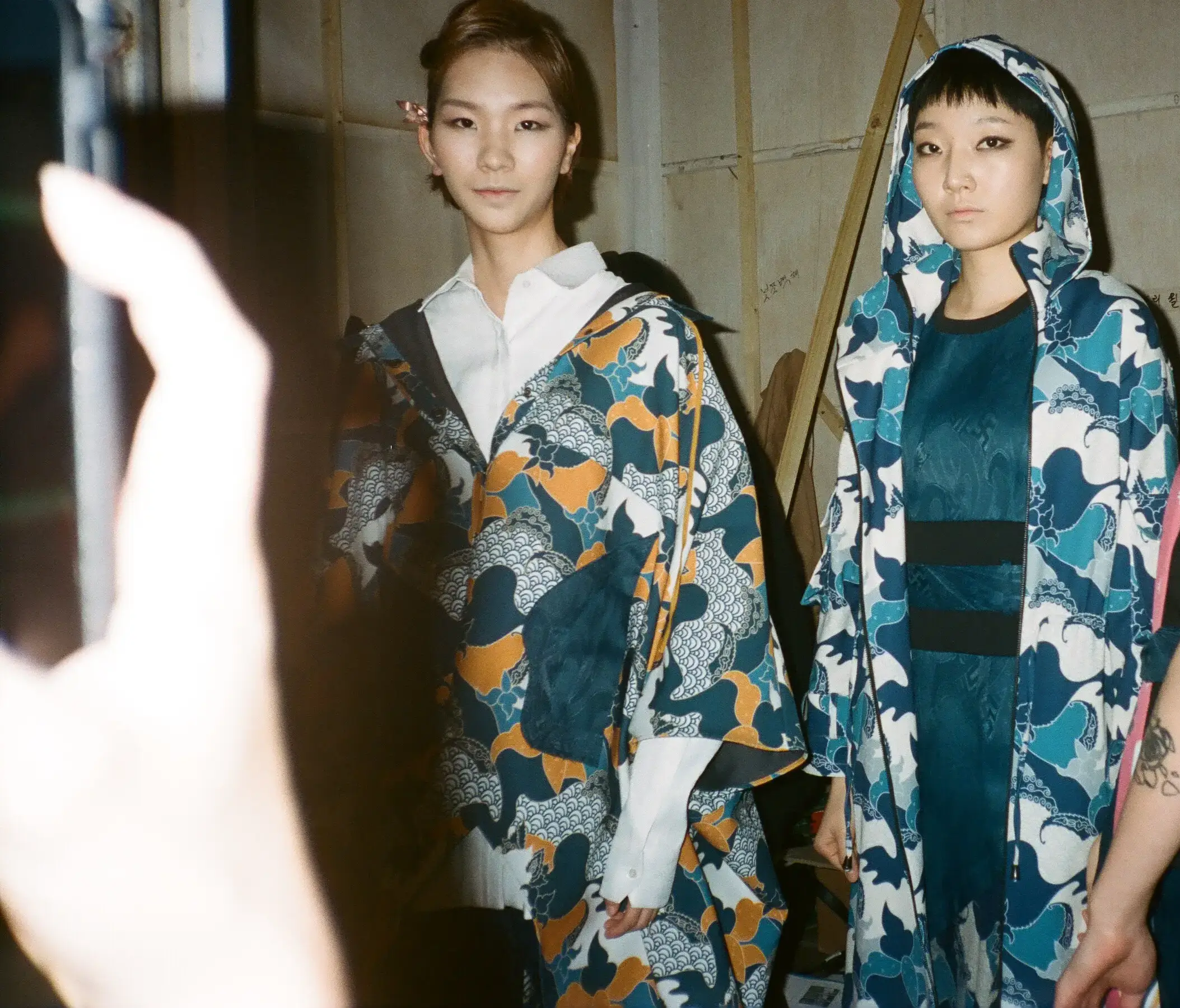
I directed the print toward a graphic language that could connect wayang-derived forms with bolder yet more familiar references, such as camouflage. A pattern designer translated that direction into the final repeat, which was then developed in two colourways across the collection.
Visual references
Developed print
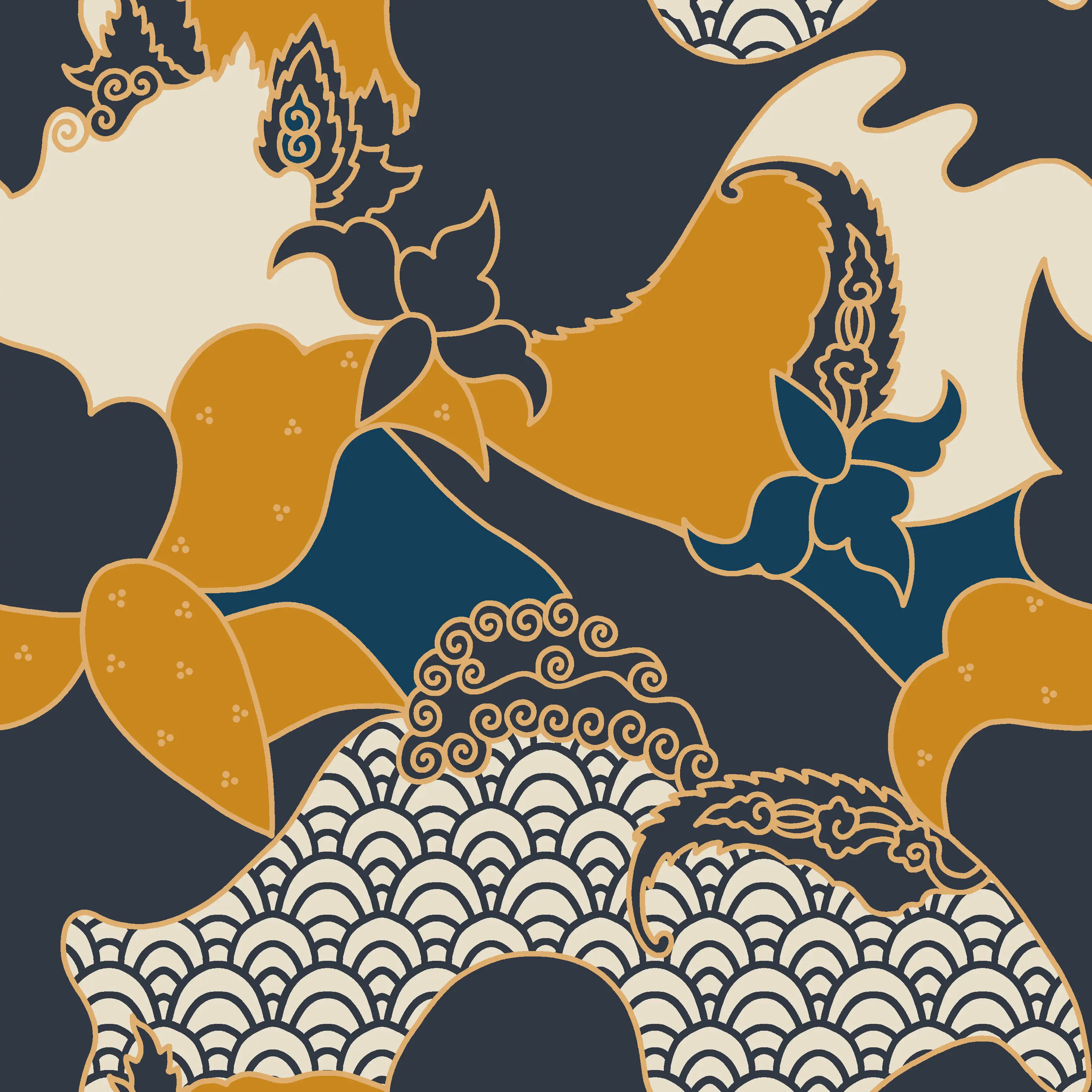
Two colourways
Kampong
Theme and print origin
Kampong began with a recurring sentiment voiced during the early brainstorming sessions, which was a shared longing for the slower, simpler atmosphere of provincial life.
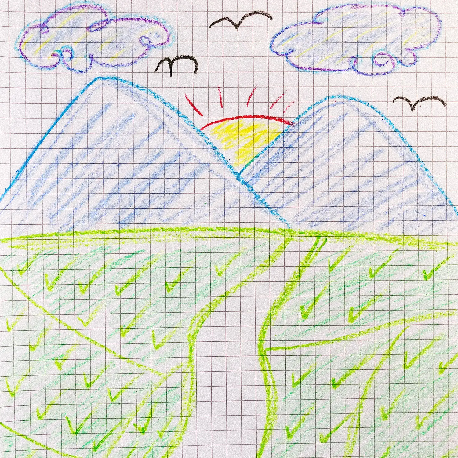
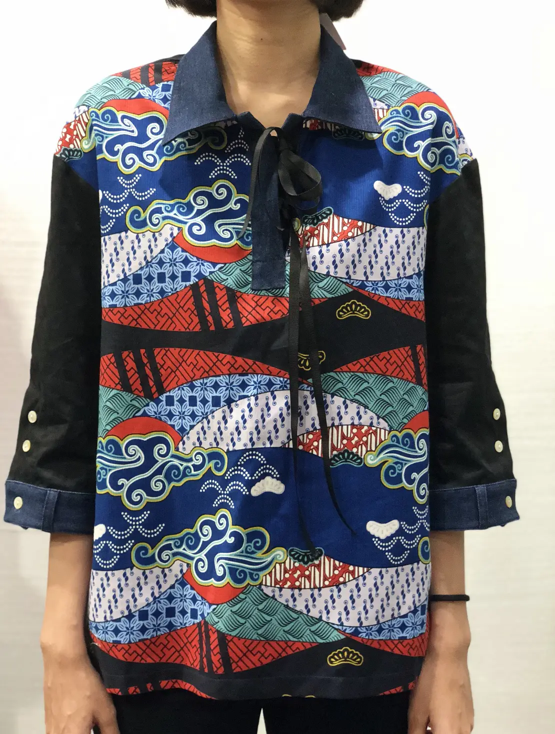
Although the team had grown up in different parts of Indonesia, one image kept returning across those memories: the familiar children's drawing of two mountains, a sun rising between them, rice fields below, clouds above, and birds drawn as wide “M” shapes.
A shared childhood image
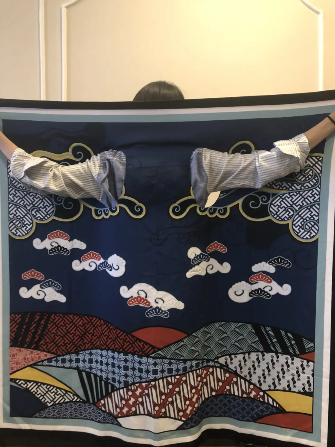
I used that collective visual memory as the starting point for the mountain print, moving from a hand sketch into a print direction for this square format and different garment applications within this collection.
Proportion and familiar textiles
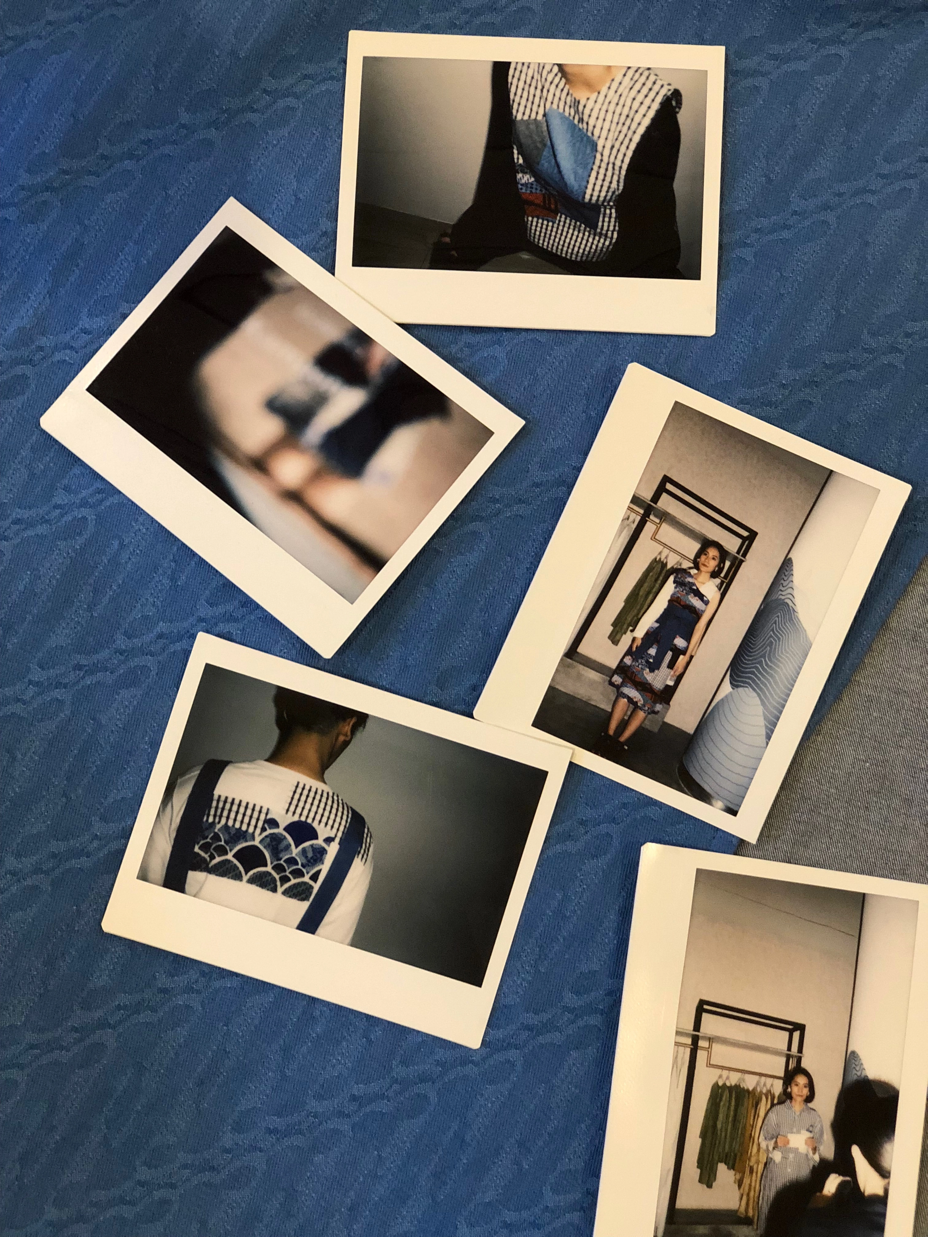
The collection's nostalgia also entered the clothes themselves. Oversized proportions, patchworked surfaces and familiar checks gave the silhouettes a slightly childlike quality. I selected white, black and blue, particularly to be the gingham colors that we developped with Dan Liris, bringing it into Kampong's cooler colour spectrum while retaining its association with familiar school-uniform checks.
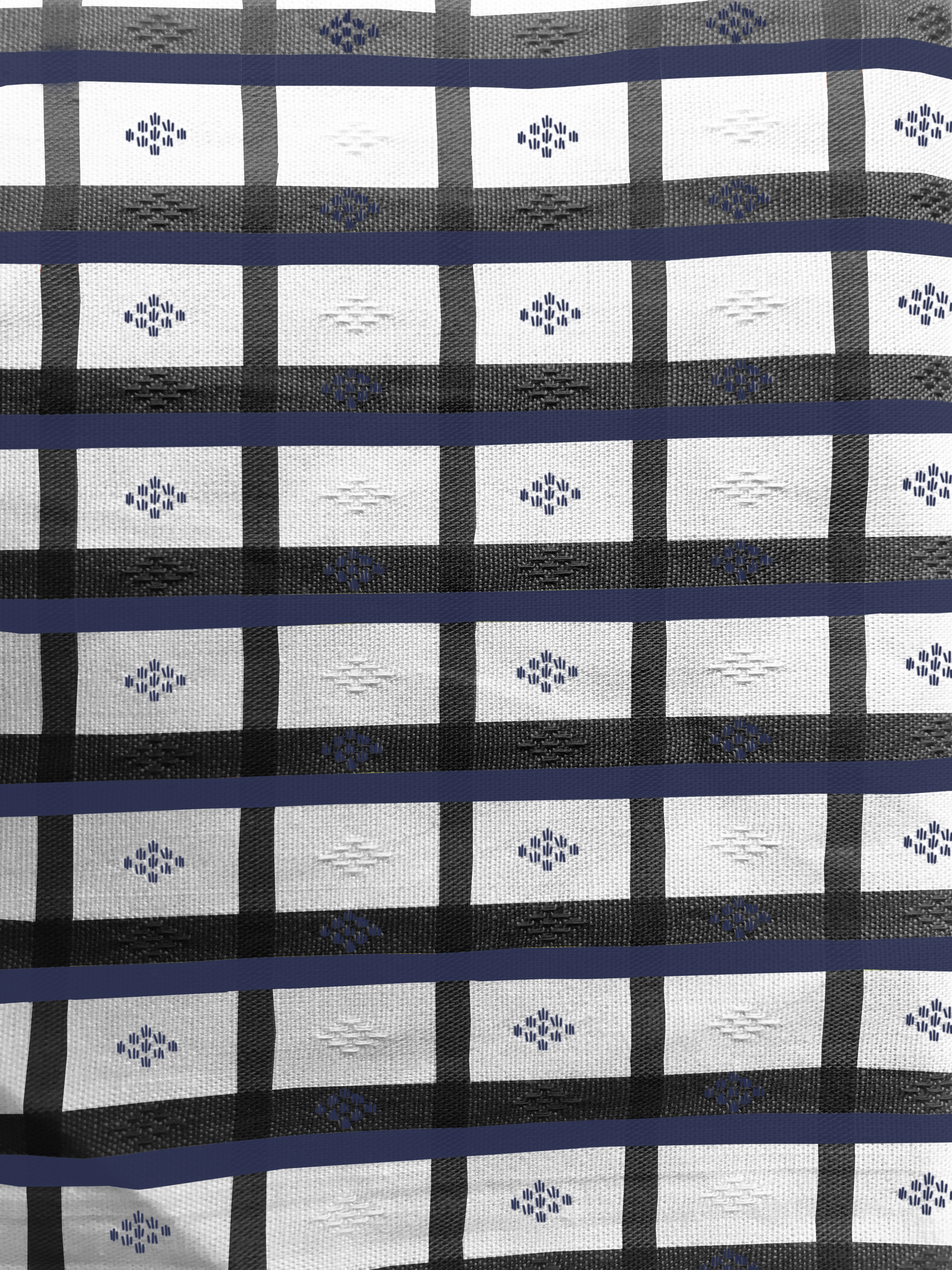
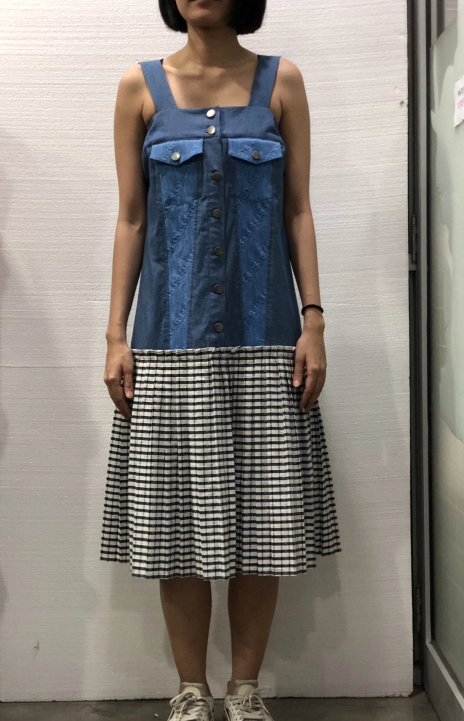
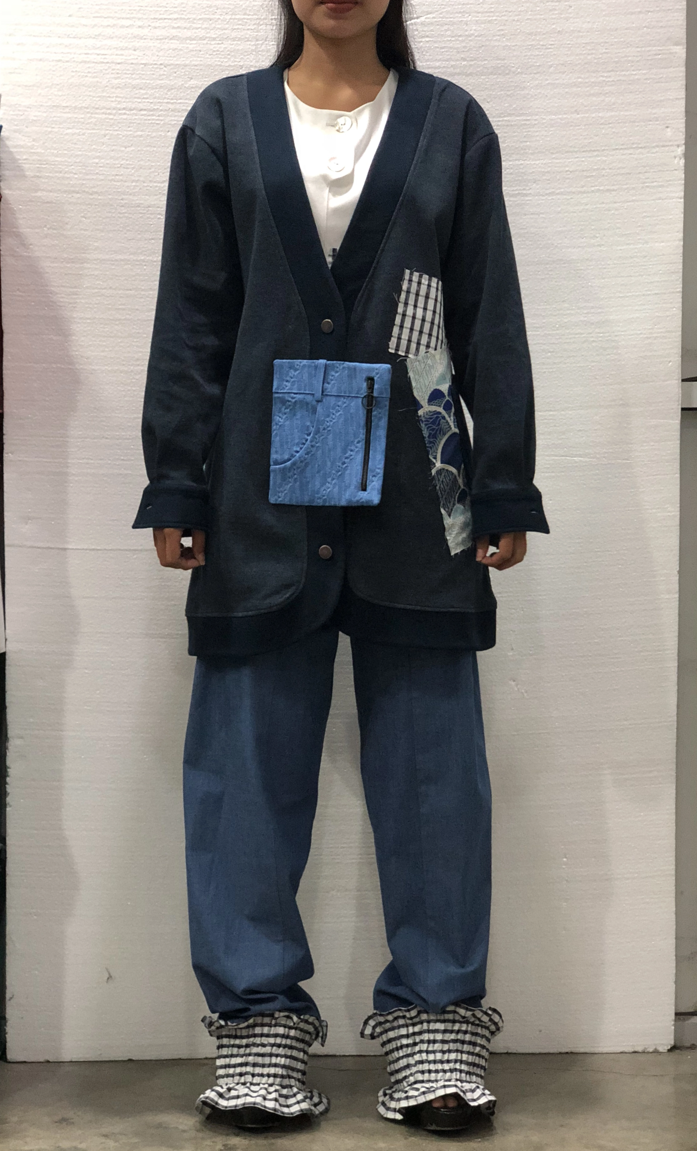
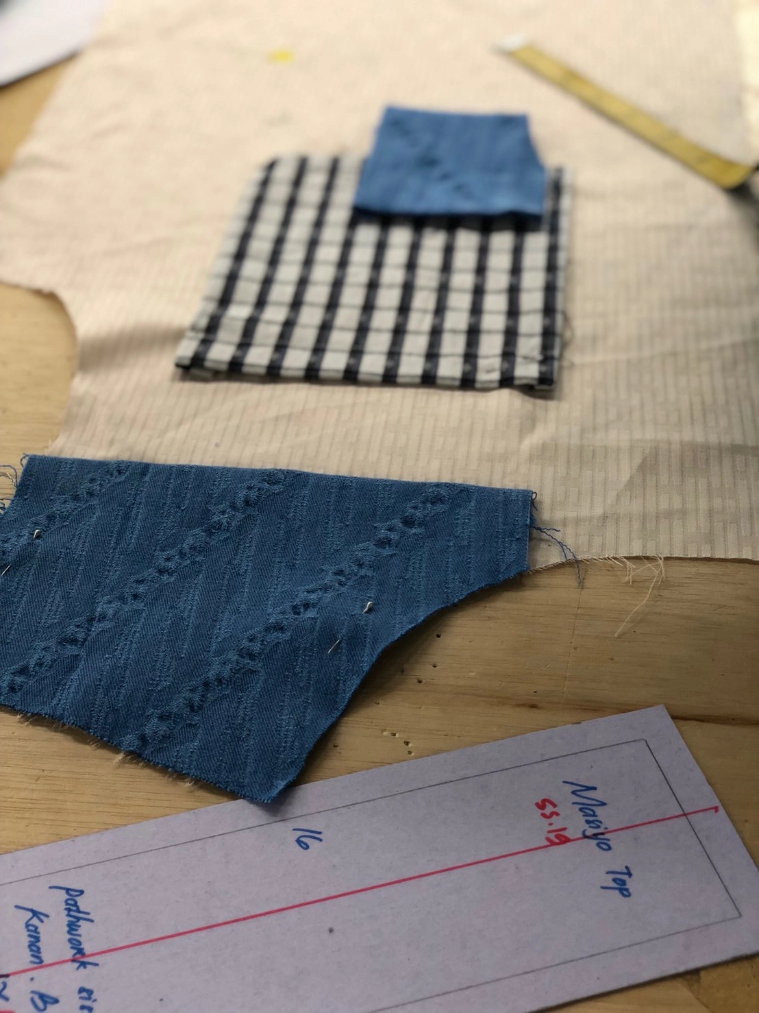
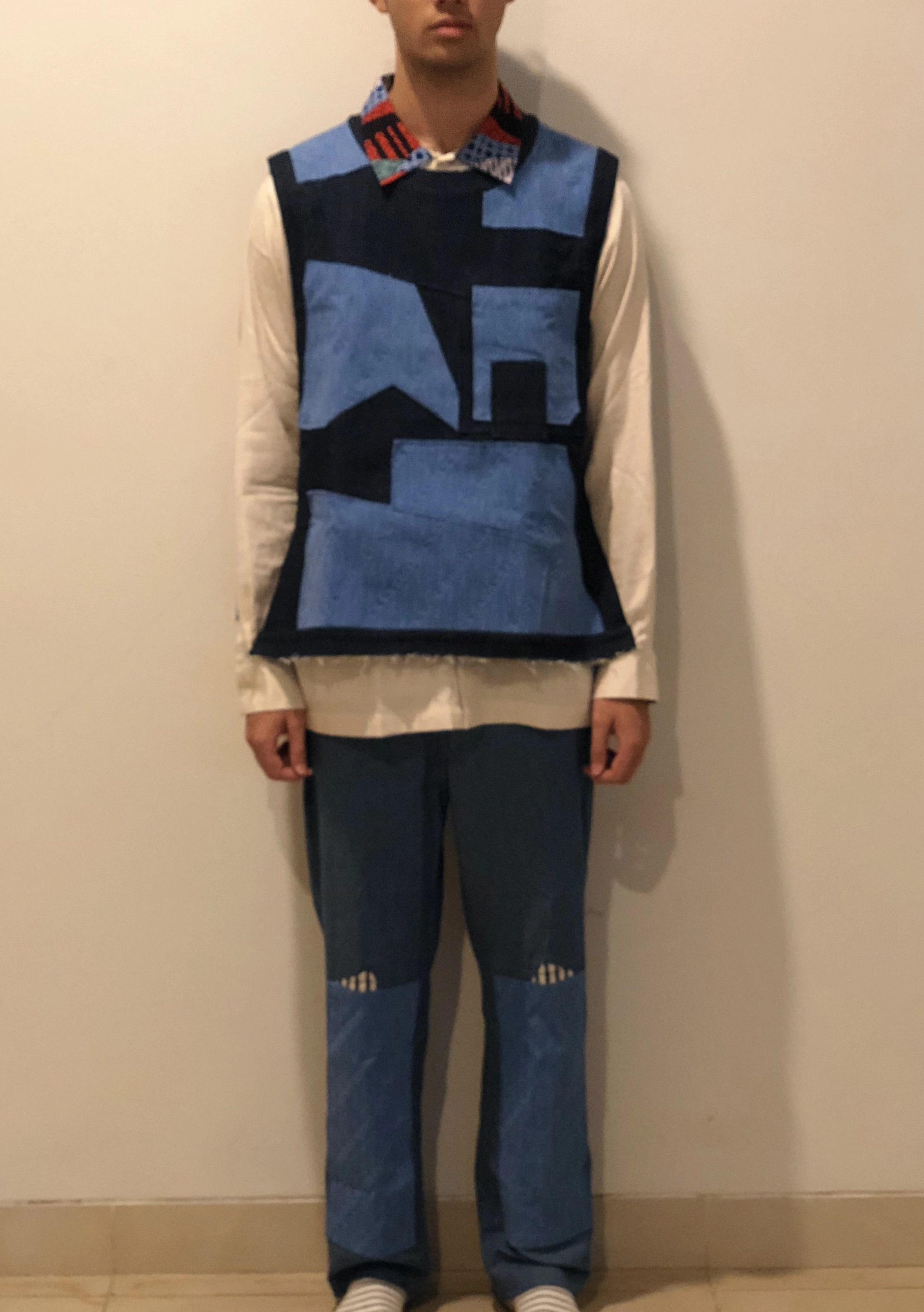
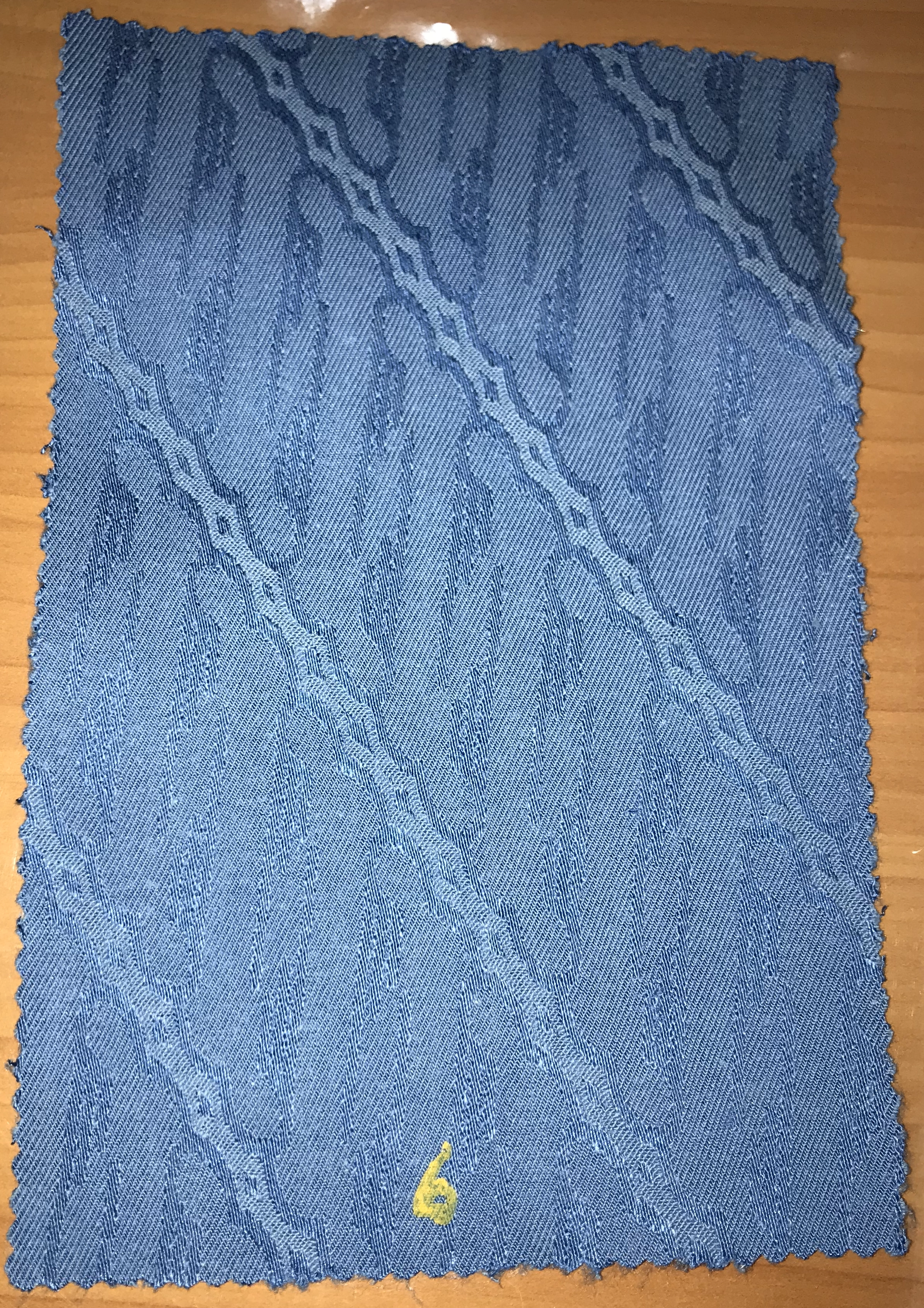
Familiarity through material
A custom denim jacquard carrying a parang motif added another woven layer to the collection, alongside gingham, classical denim and patchworked fabric combinations.
Campaign Direction
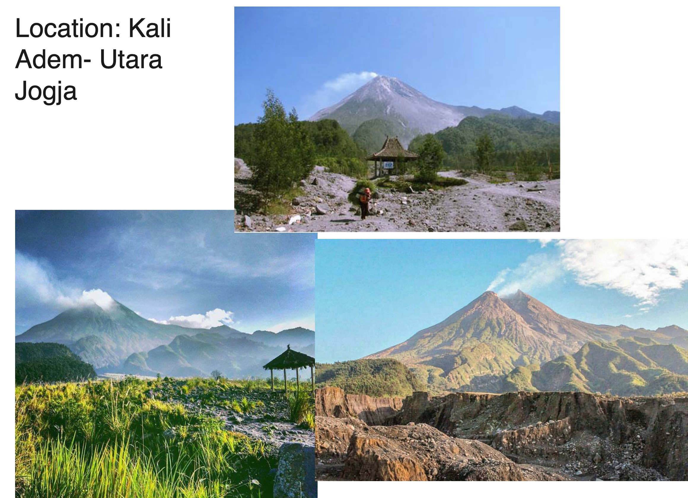
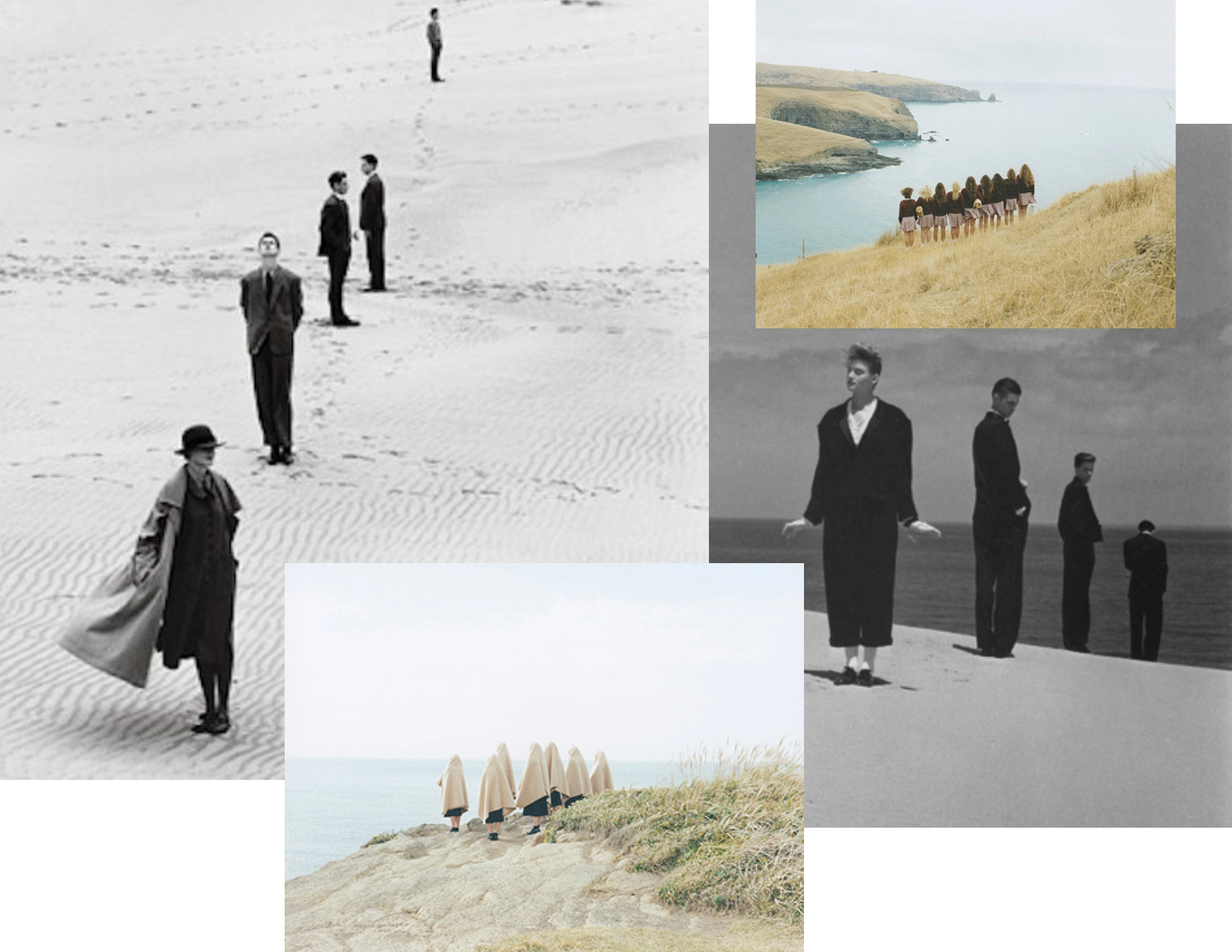
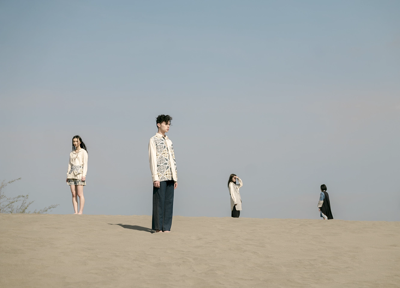
The campaign extended Kampong’s nostalgic landscape into a more open, cinematic image world. I shortlisted locations around Yogyakarta and developed the visual direction through references to distance, repetition, stillness and figures dispersed across the landscape. Gumuk Pasir was ultimately selected, giving the collection a dry, almost abstract terrain in which the clothes could feel slightly displaced from everyday life.
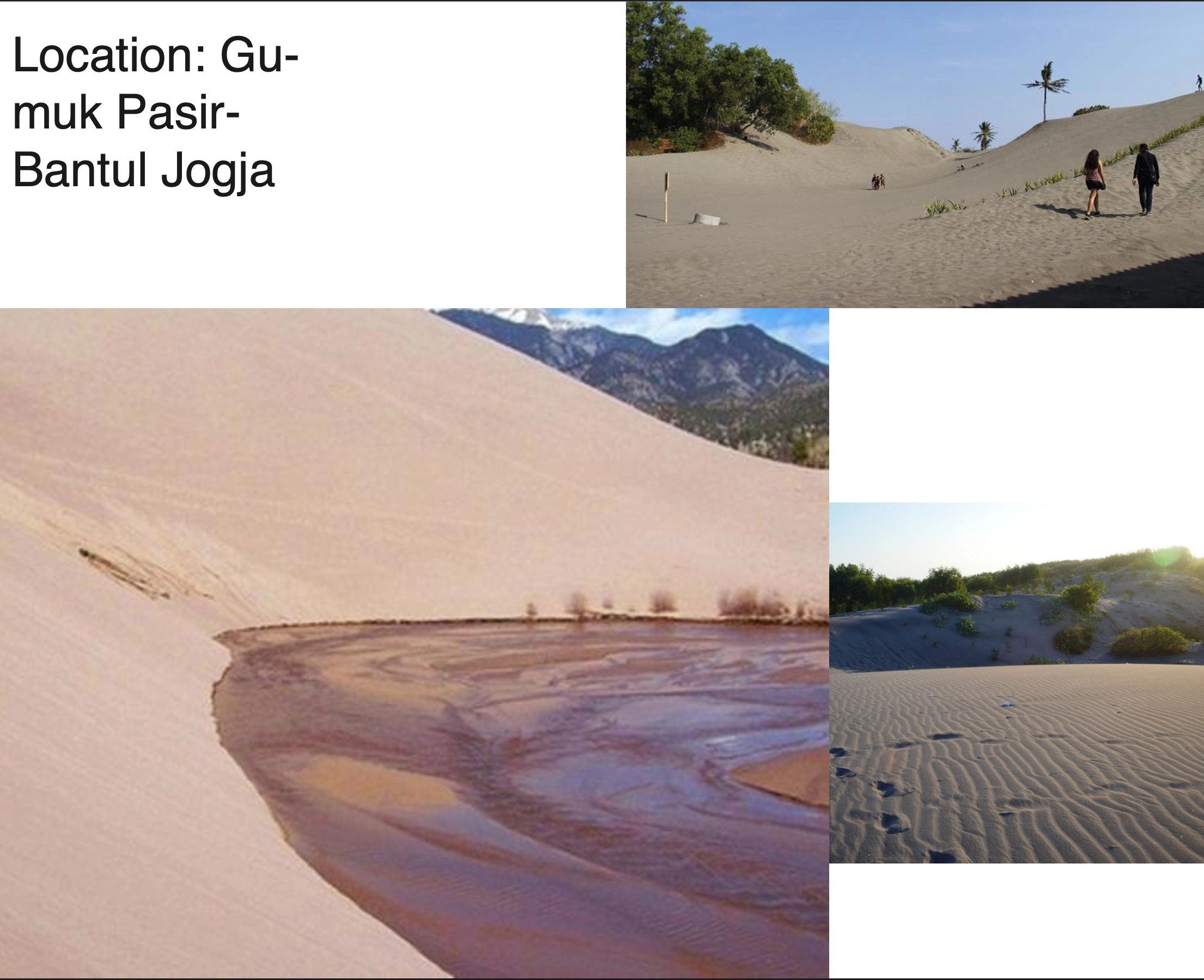
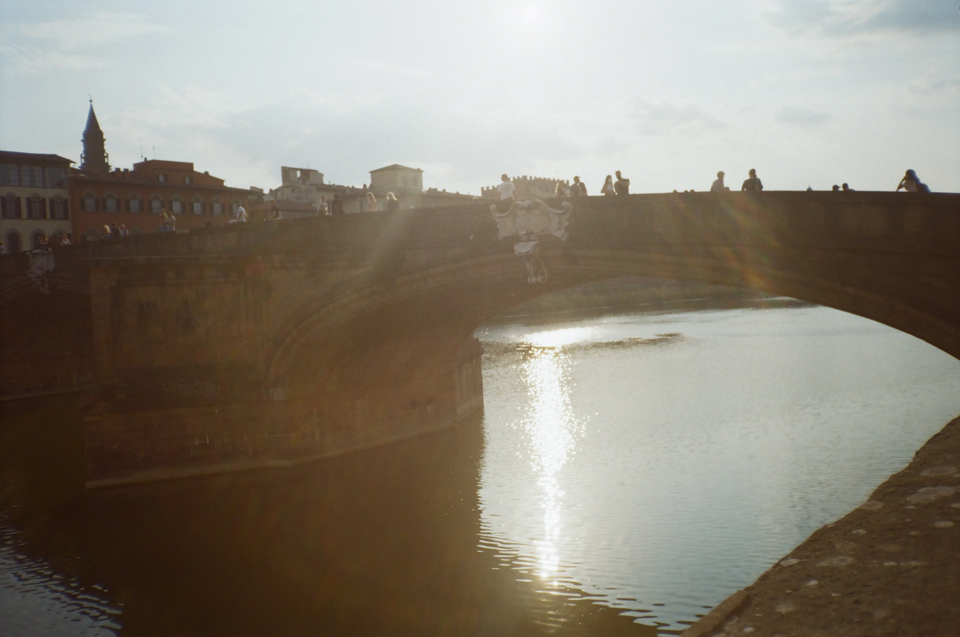
Kodak Gold 200
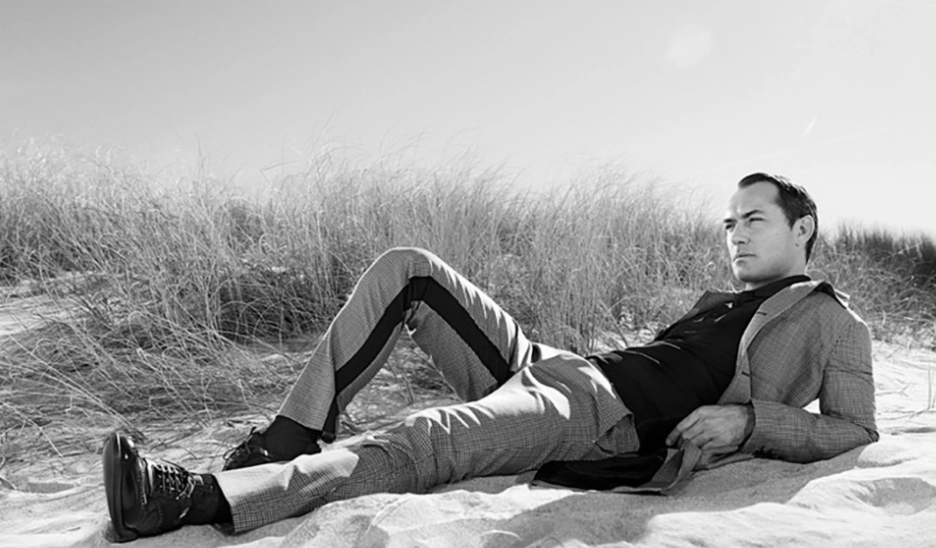
Composing with natural landscape and negative space
The figures were placed with more distance, letting the quiet landscape become a dominant part of the image composition and giving the garments a more accentuated presence.
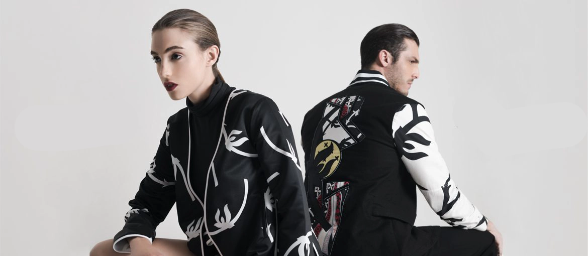
Catena
Catena marked an early shift away from product-led campaign image territory. The more editorial styling and framing began to signal a contemporary fashion brand positioning. It is allowing the collection to read as more than a presentation of individual products.
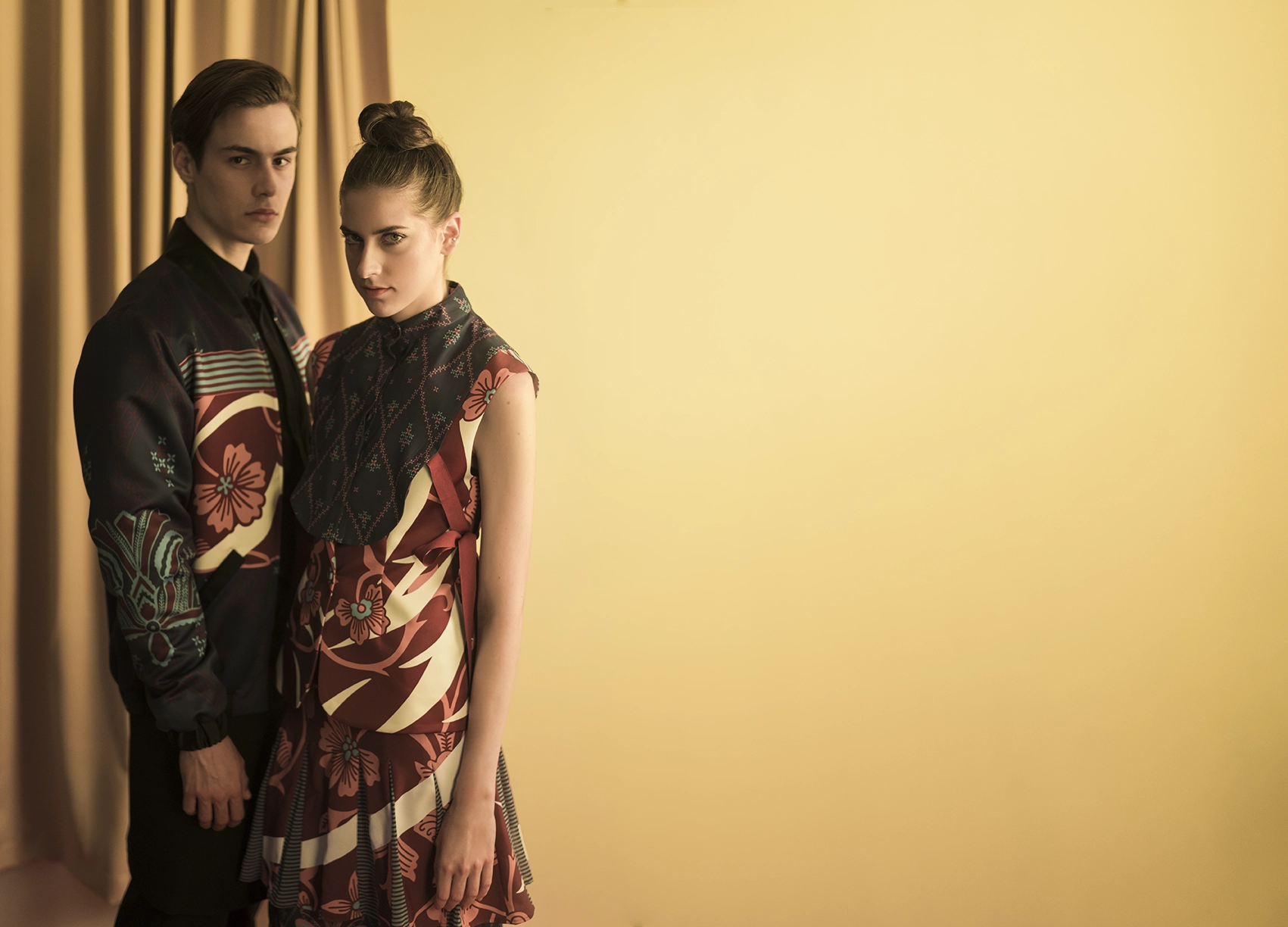
Heroïne
Heroïne collection moved the campaign language further from product presentation and closer to narrative. It helped Bateeq build a more distinct fashion point of view, with the imagery creating a recognizable world around the collection.
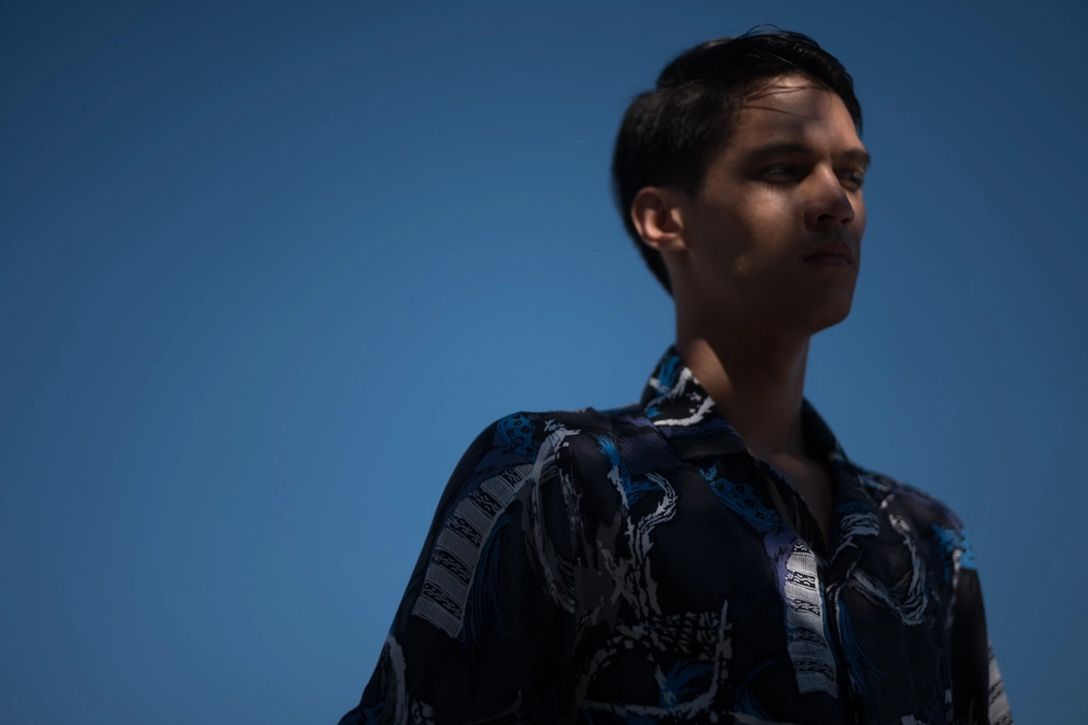
Padusan
Padusan, with its dense blue skies and bodies of water, brought Bateeq’s early association with travel and leisure back into focus, this time in a more elevated way. The campaign showed the clothes in a setting where they could feel natural, desirable and easy to imagine wearing on holiday, opening a clearer path toward a resortwear audience.
Kelir
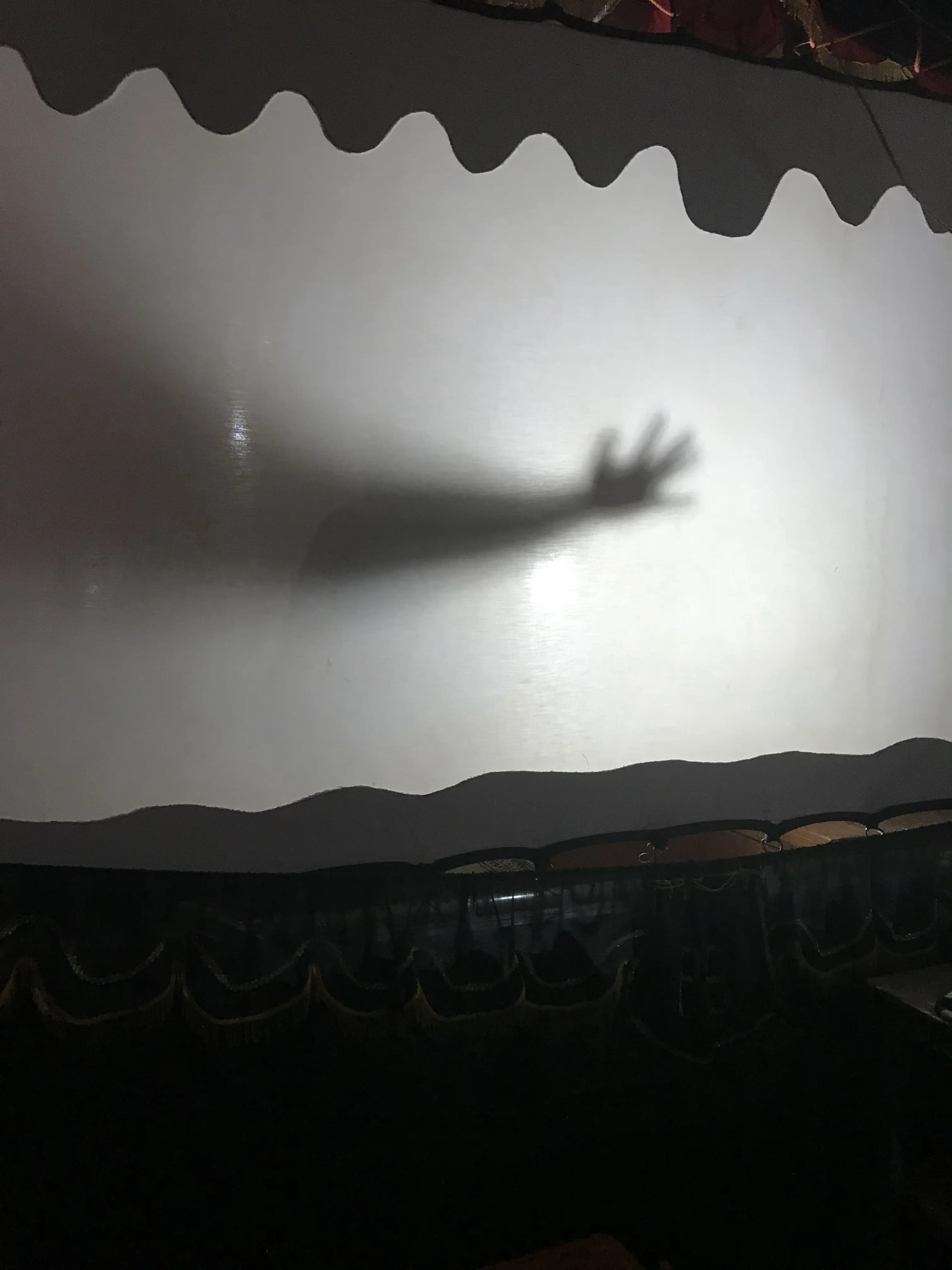
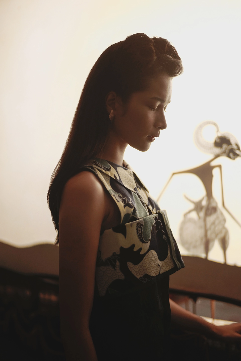
Kelir carried the collection concept into the campaign environment. Shadow, interior architecture, staged stillness and slightly rigid pose gave the imagery a theatrical quality rooted in the world of wayang. The collection also showed a growing confidence in bringing Indonesian cultural references into Bateeq’s contemporary fashion language.
Kampong
Kampong made the brand feel younger and more relaxed. By this point, Bateeq was comfortably expressing itself in a narative-led contemporary fashion language, which gave the campaign more freedom to experiment and play. That sense of ease became part of the image itself, presenting the brand as something expressive and liberated. It is turning the campaign into an invitation for the audience to imagine life inside the Bateeq world.
%20--%3e%3cdefs%3e%3cstyle%3e%20.st0%20{%20fill:%20%231f1017;%20}%20.st1%20{%20fill:%20url(%23linear-gradient2);%20}%20.st2%20{%20fill:%20url(%23linear-gradient1);%20}%20.st3%20{%20fill:%20url(%23linear-gradient3);%20}%20.st4%20{%20fill:%20url(%23linear-gradient);%20}%20%3c/style%3e%3clinearGradient%20id='linear-gradient'%20x1='960'%20y1='699.2'%20x2='960'%20y2='1080'%20gradientTransform='translate(0%201080)%20scale(1%20-1)'%20gradientUnits='userSpaceOnUse'%3e%3cstop%20offset='0'%20stop-color='%231f1017'/%3e%3cstop%20offset='1'%20stop-color='%235b2935'/%3e%3c/linearGradient%3e%3clinearGradient%20id='linear-gradient1'%20x1='-2488.4'%20y1='3633.8'%20x2='-2488.4'%20y2='4014.7'%20gradientTransform='translate(-1528.4103%20-2934.6501)%20scale(-1%201)'%20gradientUnits='userSpaceOnUse'%3e%3cstop%20offset='0'%20stop-color='%231f1017'/%3e%3cstop%20offset='1'%20stop-color='%235b2935'/%3e%3c/linearGradient%3e%3clinearGradient%20id='linear-gradient2'%20x1='-2166.4'%20y1='631.3'%20x2='-2166.4'%20y2='1308.3'%20gradientTransform='translate(1308.2831%20-1626.3673)%20rotate(-90)%20scale(1%20-1)'%20gradientUnits='userSpaceOnUse'%3e%3cstop%20offset='0'%20stop-color='%231f1017'/%3e%3cstop%20offset='1'%20stop-color='%235b2935'/%3e%3c/linearGradient%3e%3clinearGradient%20id='linear-gradient3'%20x1='638'%20y1='3547.3'%20x2='638'%20y2='4224.3'%20gradientTransform='translate(-2304.3445%20-97.9562)%20rotate(90)%20scale(1%20-1)'%20gradientUnits='userSpaceOnUse'%3e%3cstop%20offset='0'%20stop-color='%231f1017'/%3e%3cstop%20offset='1'%20stop-color='%235b2935'/%3e%3c/linearGradient%3e%3c/defs%3e%3cg%20id='Layer_1-2'%3e%3cpolygon%20class='st4'%20points='1243%20380.8%20677%20380.8%200%200%201920%200%201243%20380.8'/%3e%3cpolygon%20class='st2'%20points='677%20699.2%201243%20699.2%201920%201080%200%201080%20677%20699.2'/%3e%3cpolygon%20class='st1'%20points='677%20380.8%20677%20699.2%200%201080%200%200%20677%20380.8'/%3e%3cpolygon%20class='st3'%20points='1243%20699.2%201243%20380.8%201920%200%201920%201080%201243%20699.2'/%3e%3crect%20class='st0'%20x='677'%20y='380.8'%20width='566'%20height='318.4'/%3e%3c/g%3e%3c/svg%3e)
Staging the collection
FW17
Heroïne
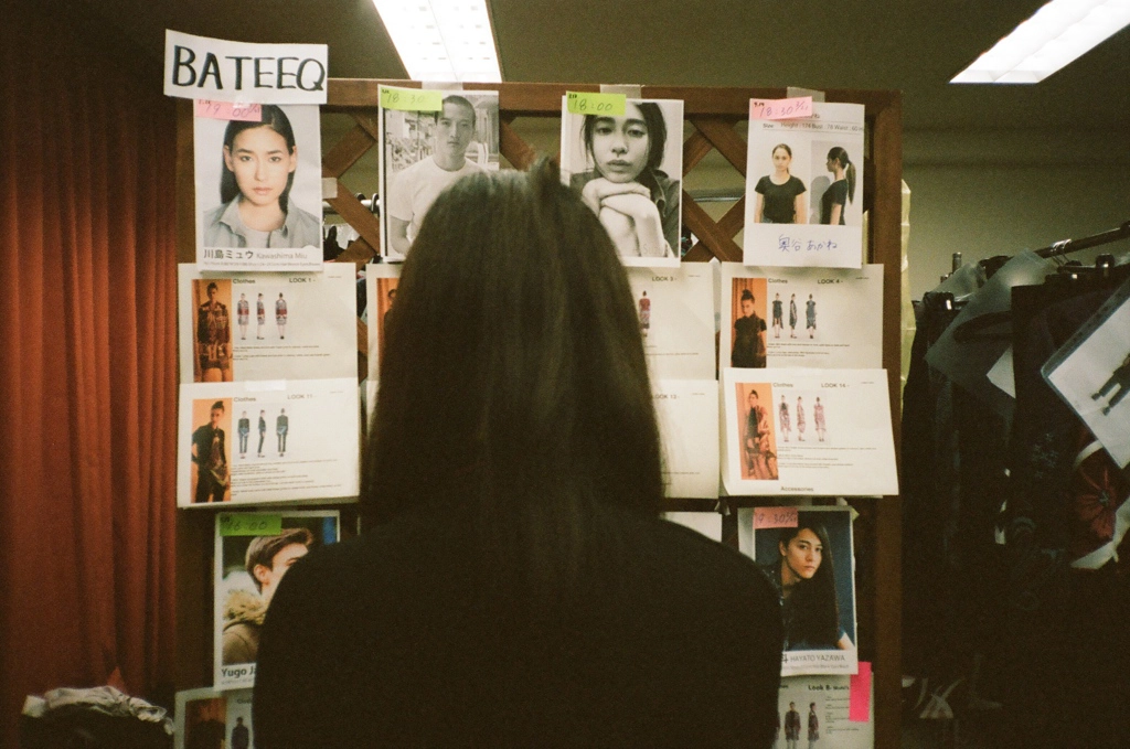
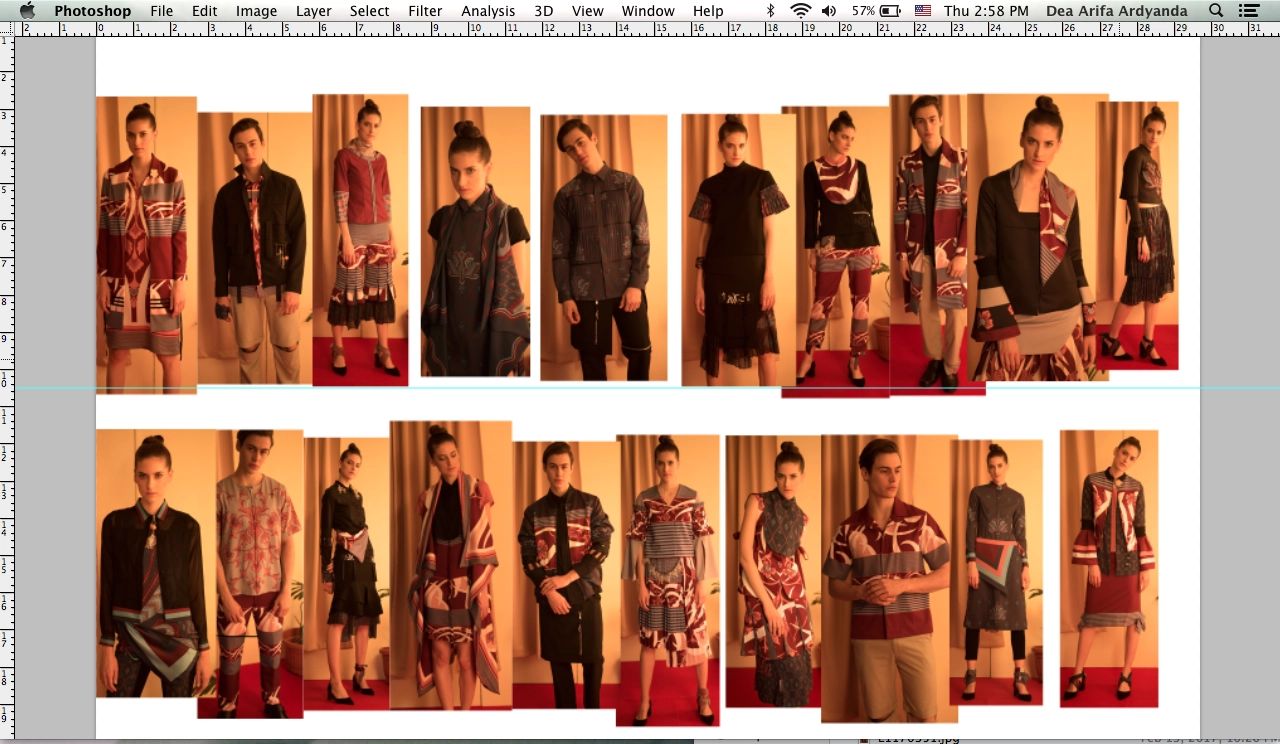
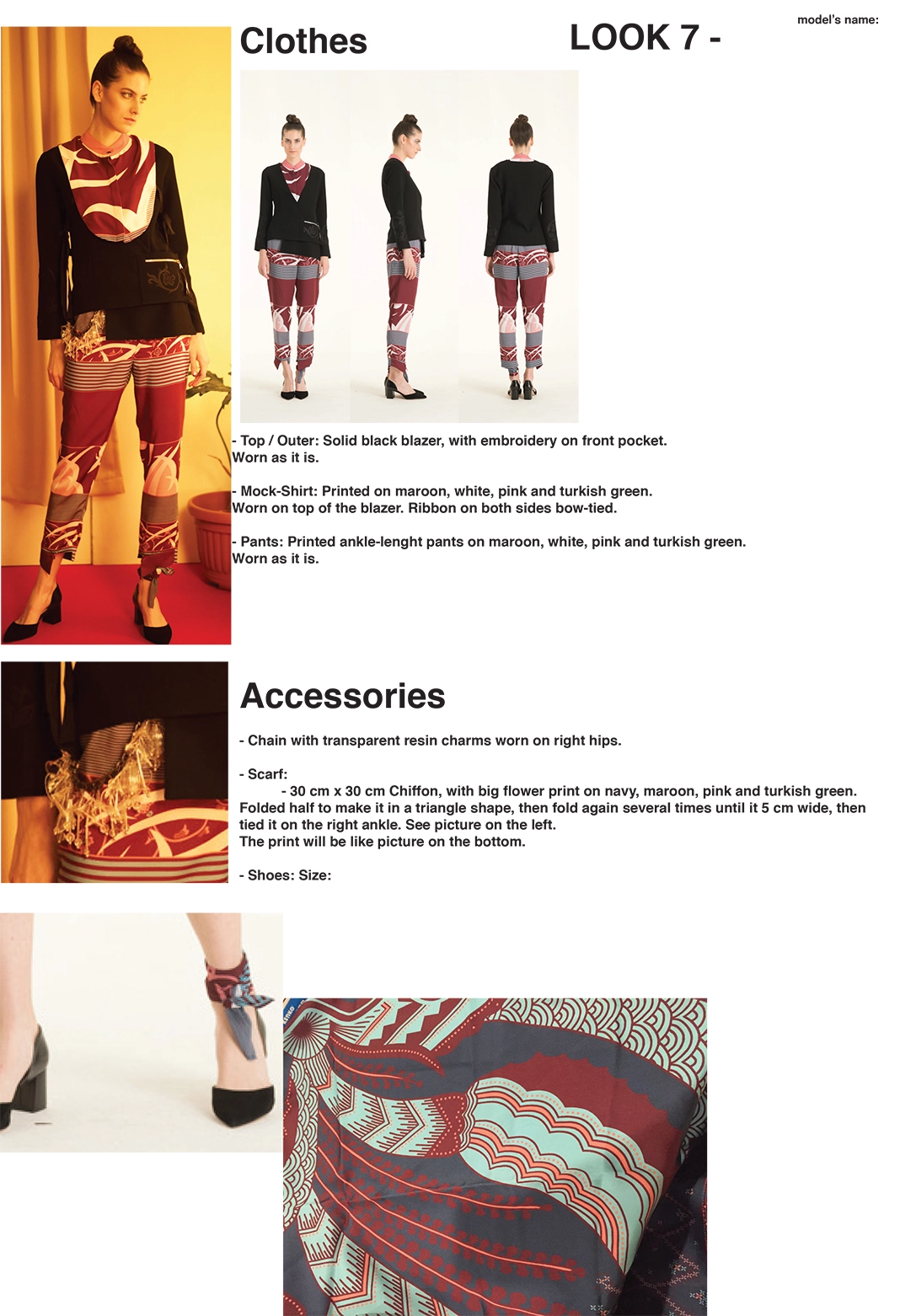
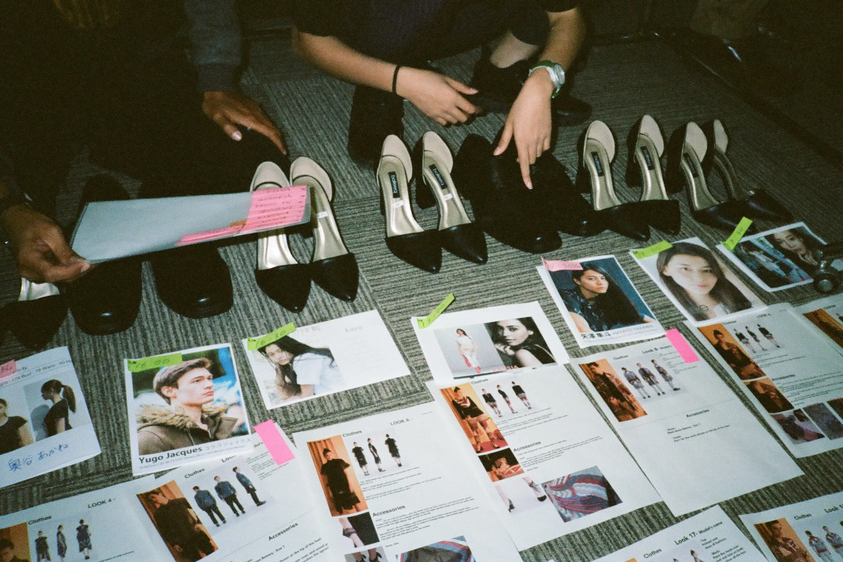
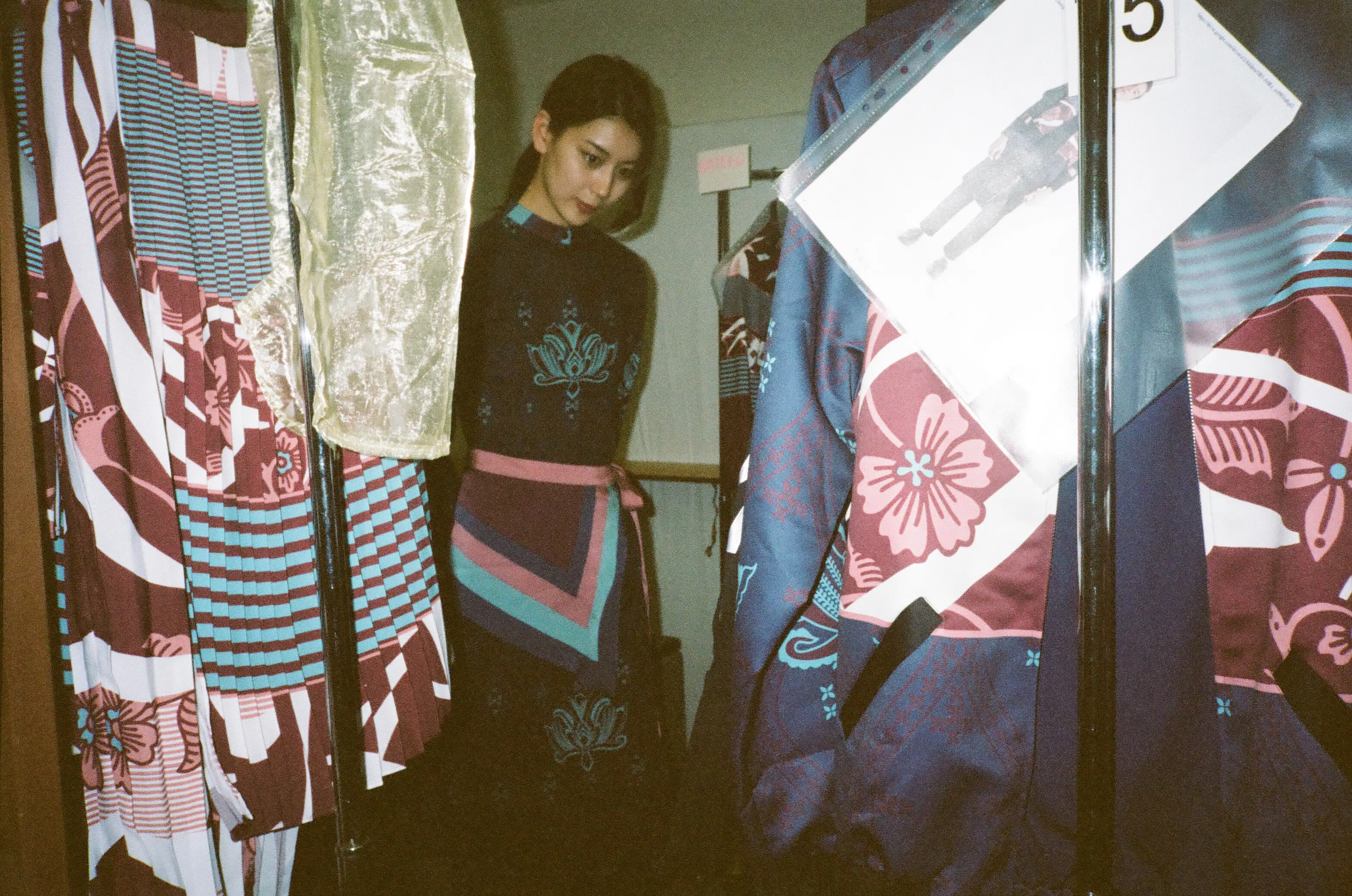
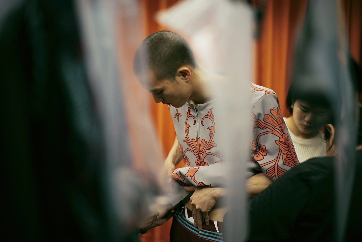
The campaign was not the final form of the collection. Each season continued onto the runway, where the clothes had to work again as a live experience that is shaped by tighter outfit curation, sequencing, fittings, restyling and backstage coordination.
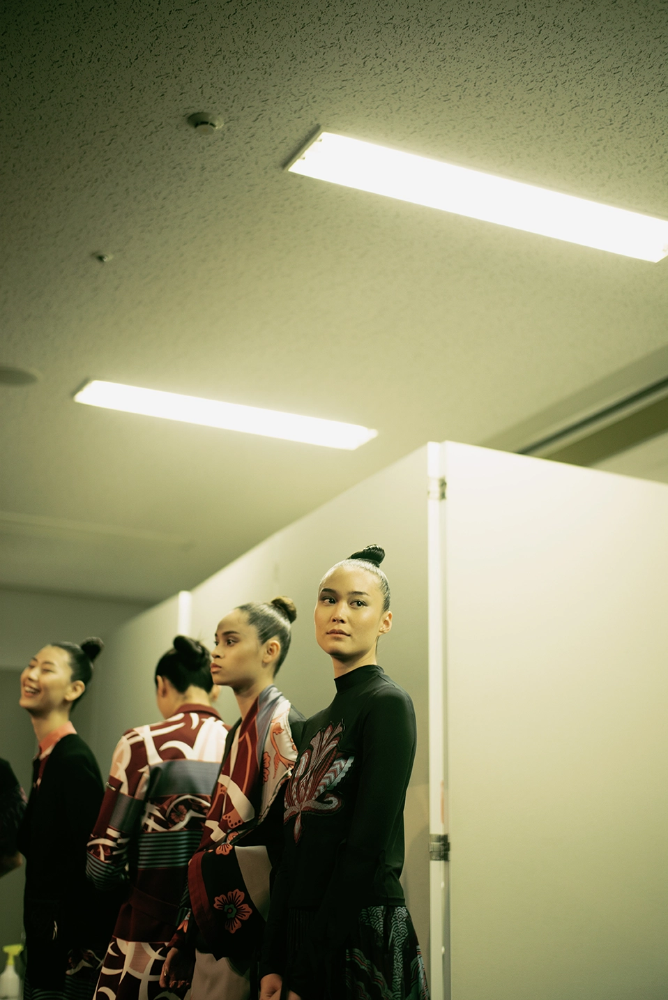
2018–2019
Throughout Seasons
SS18 · Padusan
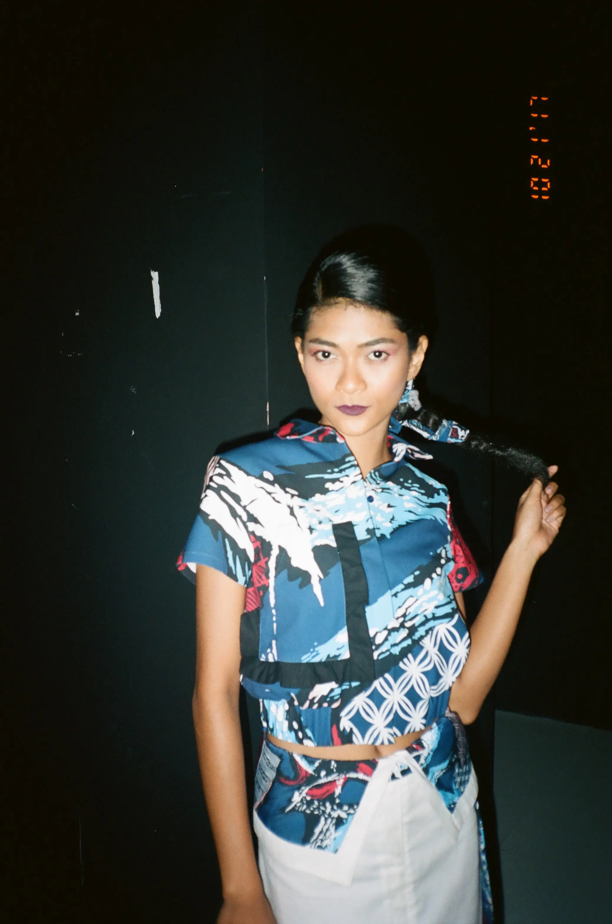
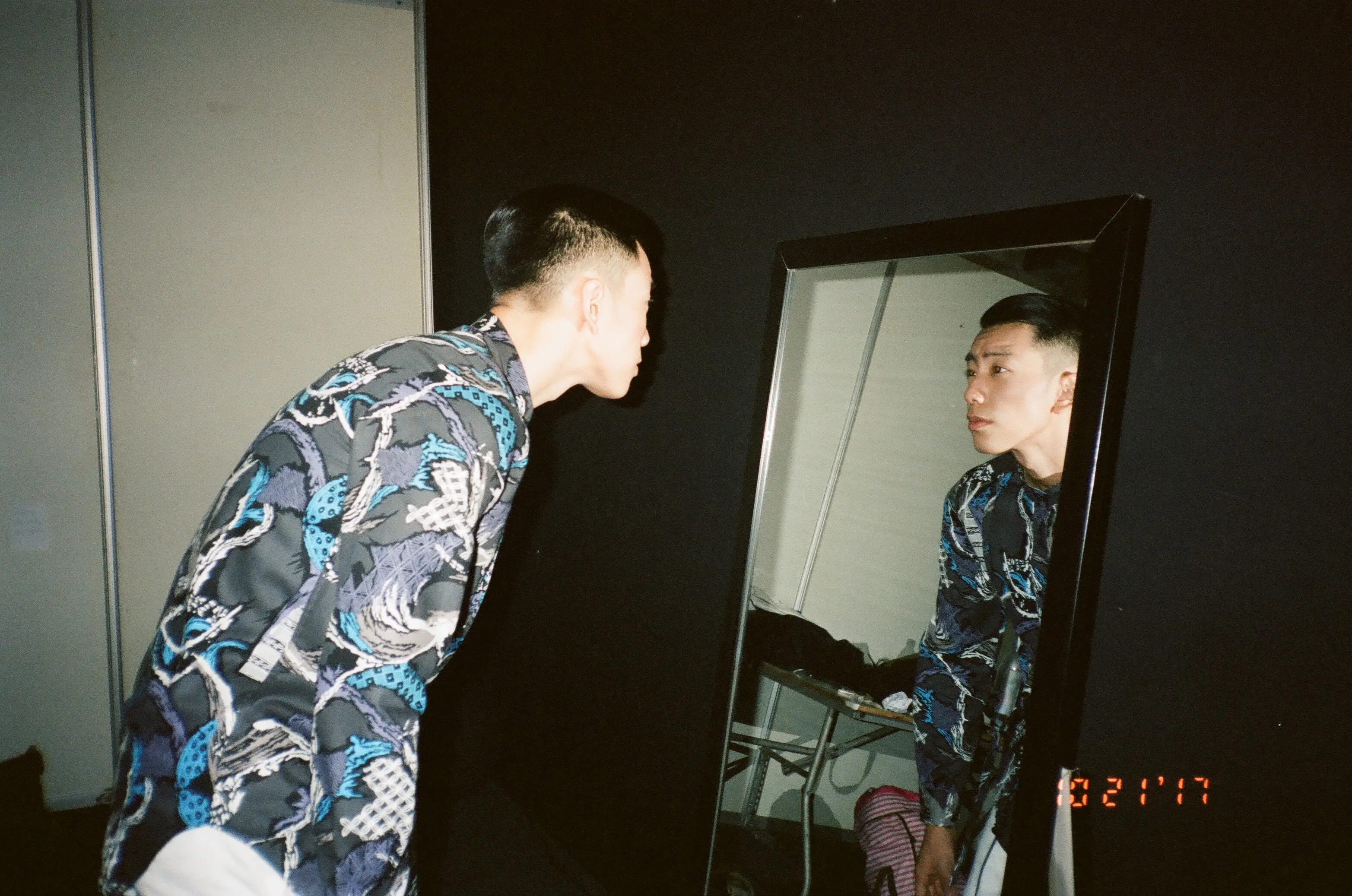
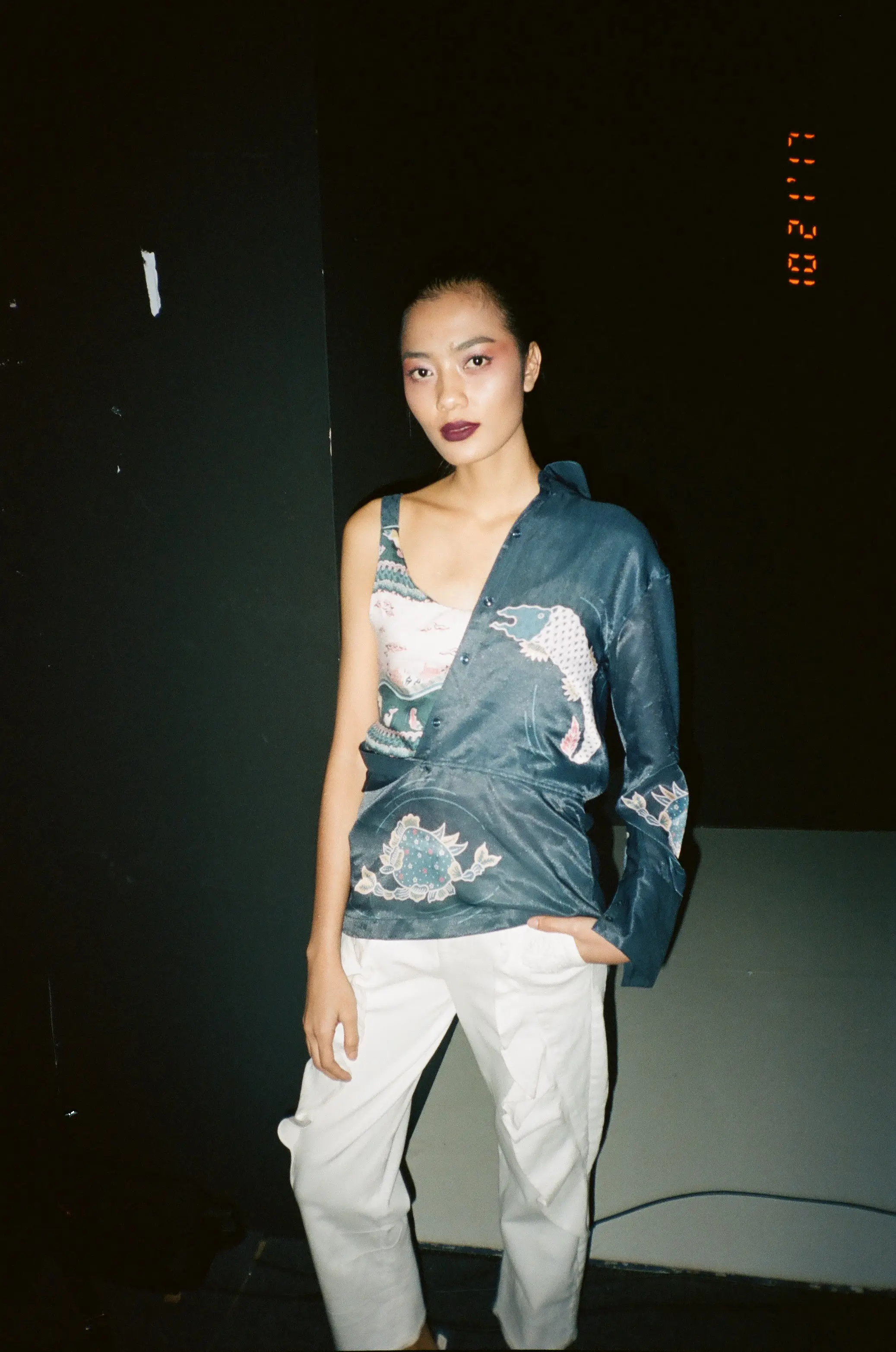
FW18 · Kelir
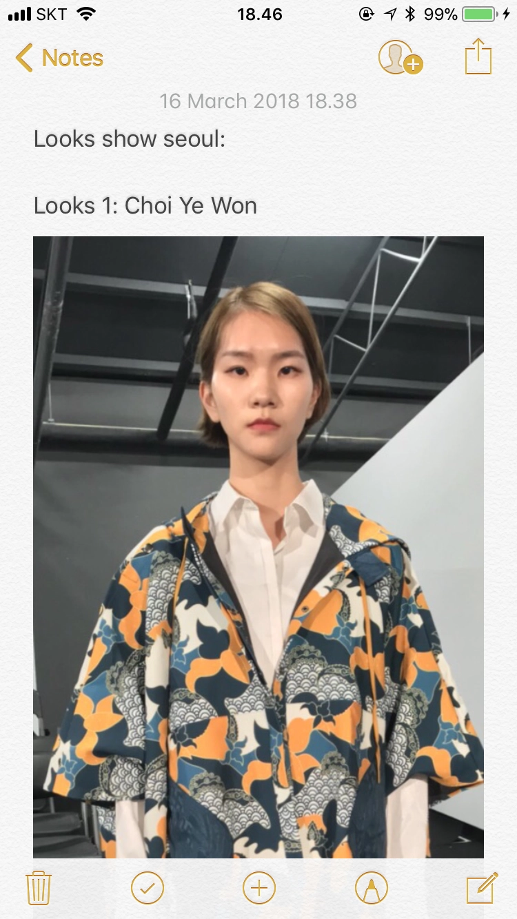
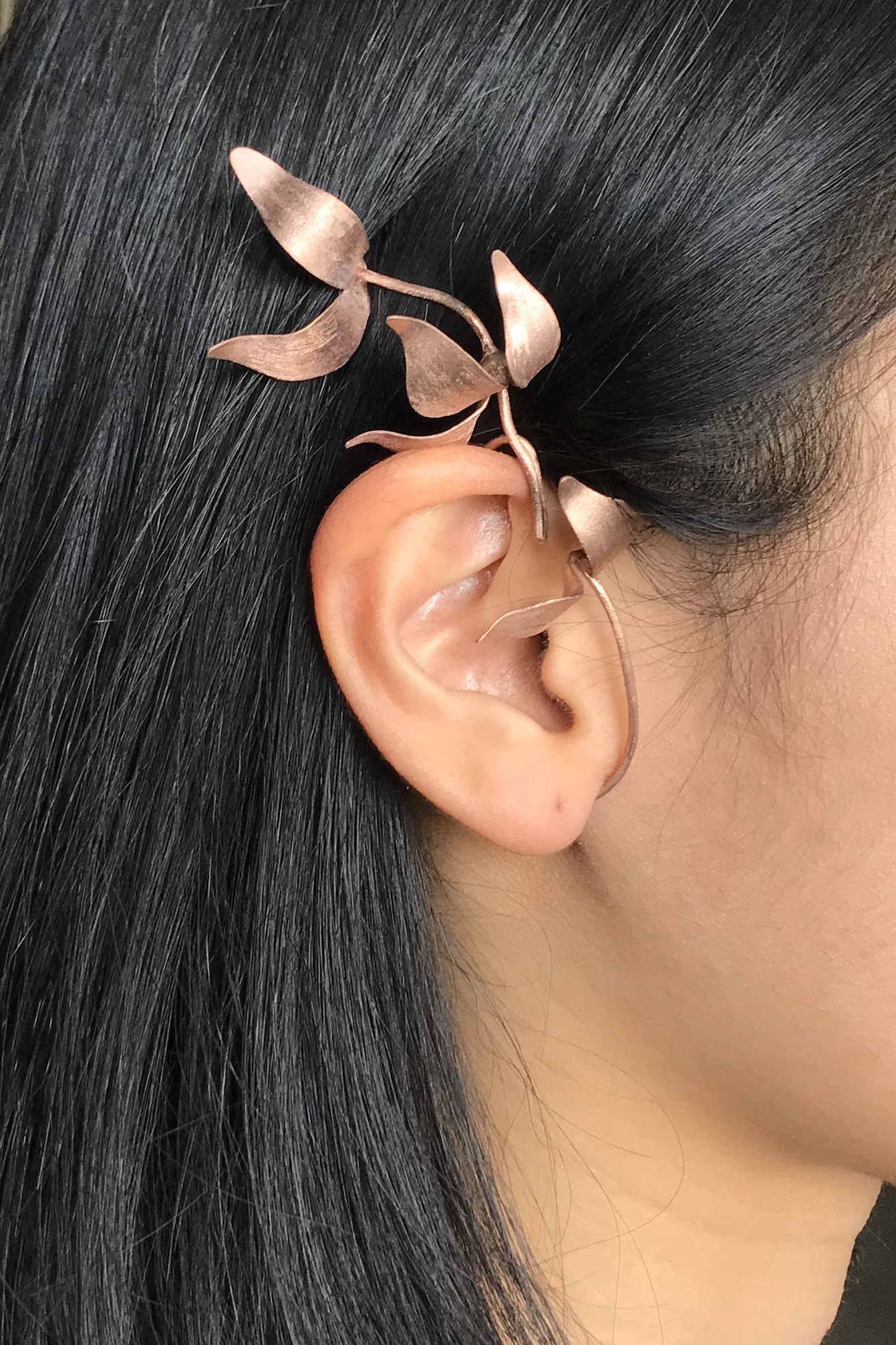
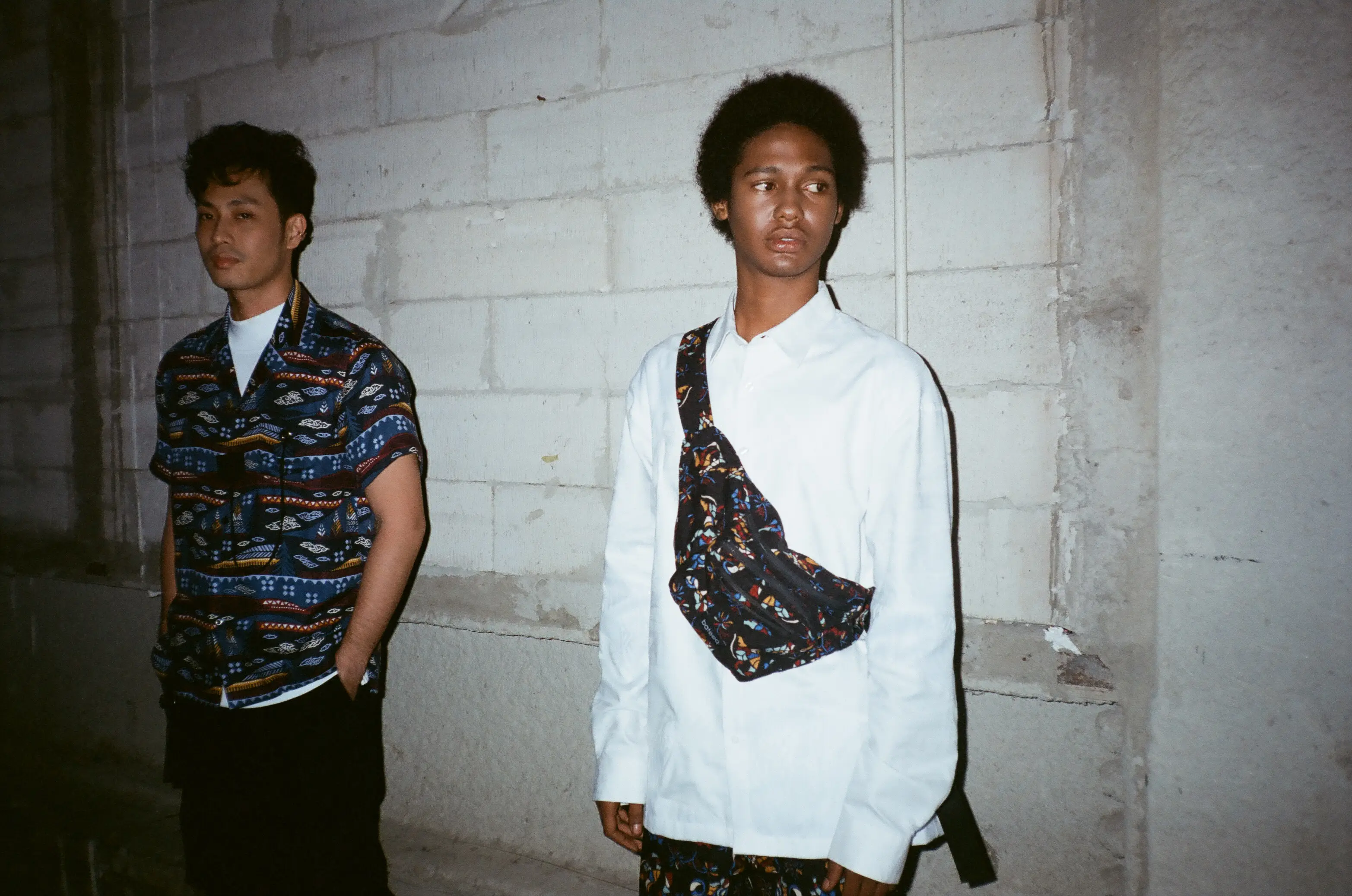
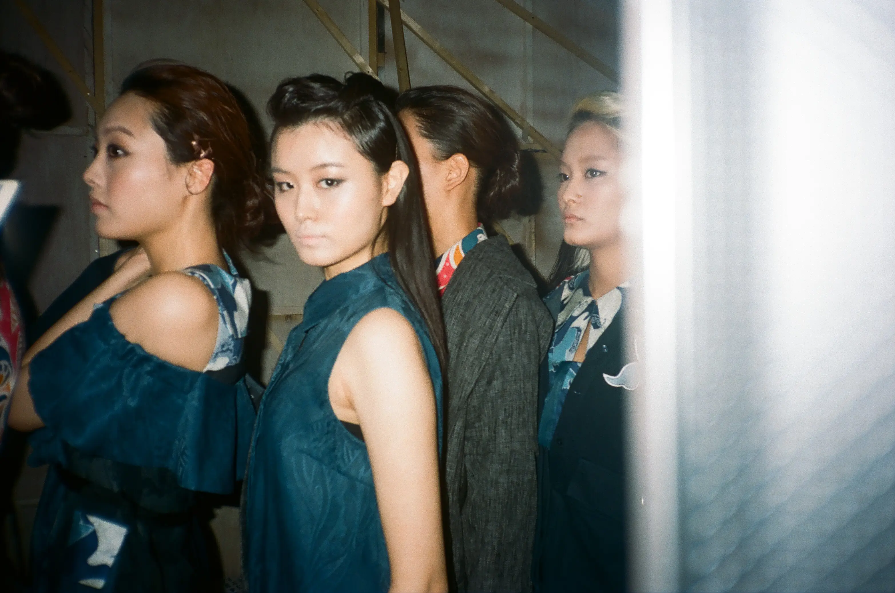
SS19 · Kampong
SS18 · Padusan
In circulation
The collection cycle continued into digital touchpoints.
After the campaign and runway, the collection moved further across Bateeq’s digital chanels. Campaign imagery was adapted for e-commerce, social media and other day-to-day brand communication.
Audience growth during tenure
Instagram extended each collection beyond the main campaign, moving from teasers and runway imagery to behind-the-scenes content, styling ideas, UGC and collaborations with public figures.
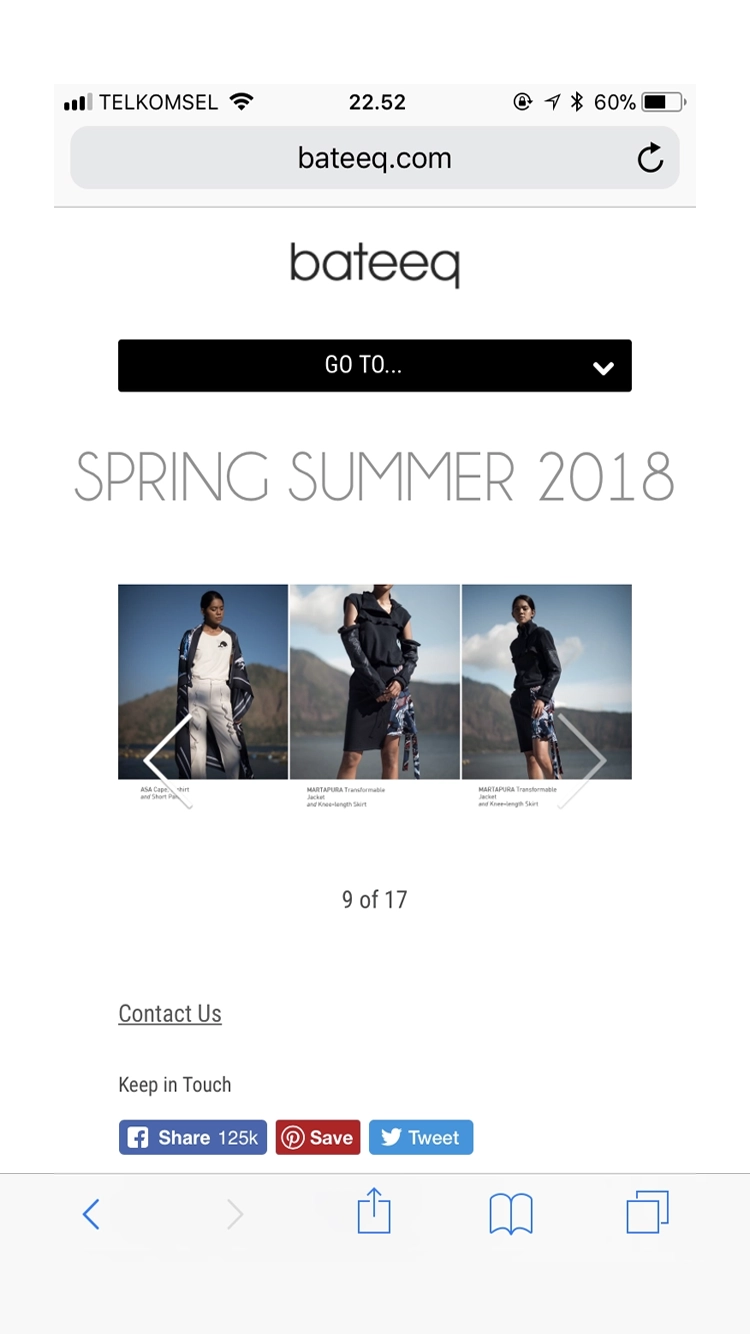
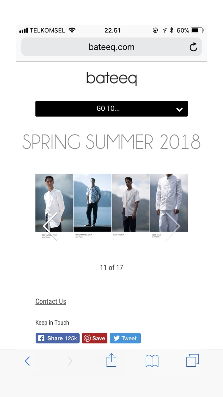

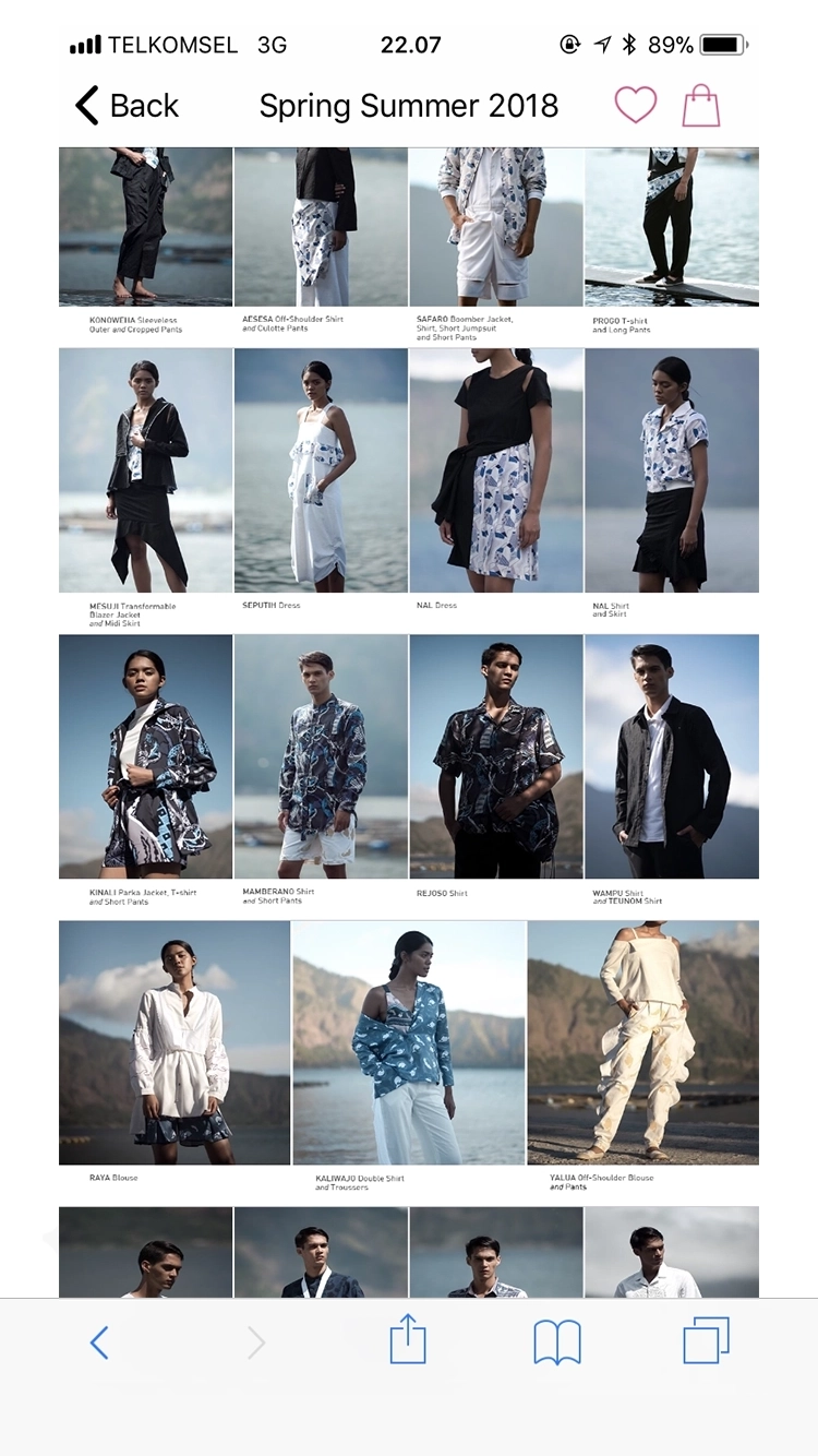


Collection imagery in the online shopping interface
Seasonal collection image assets continued into Bateeq’s mobile storefront, where it supported product discovery and the presentation of each collection. The interface itself was not part of my art direction, but the imagery helped each season keep a consistent presence online.
Wider circulation
The work began appearing in contexts we could no longer fully control.
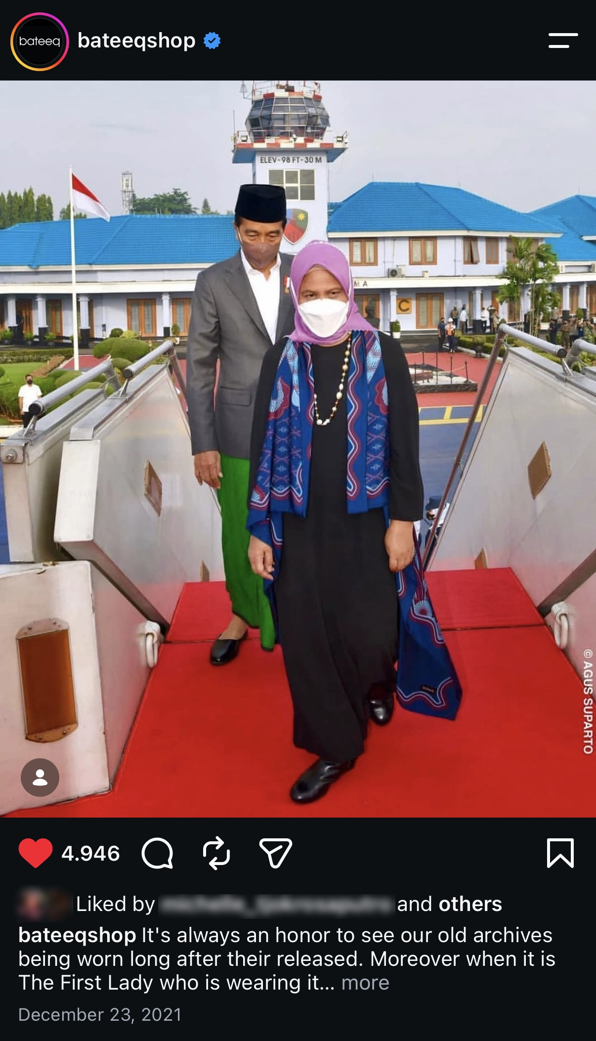
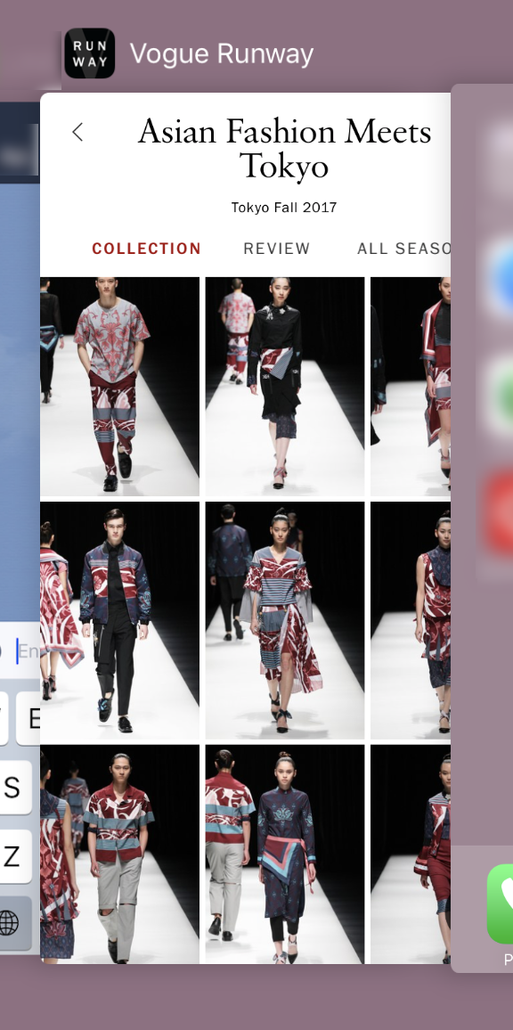
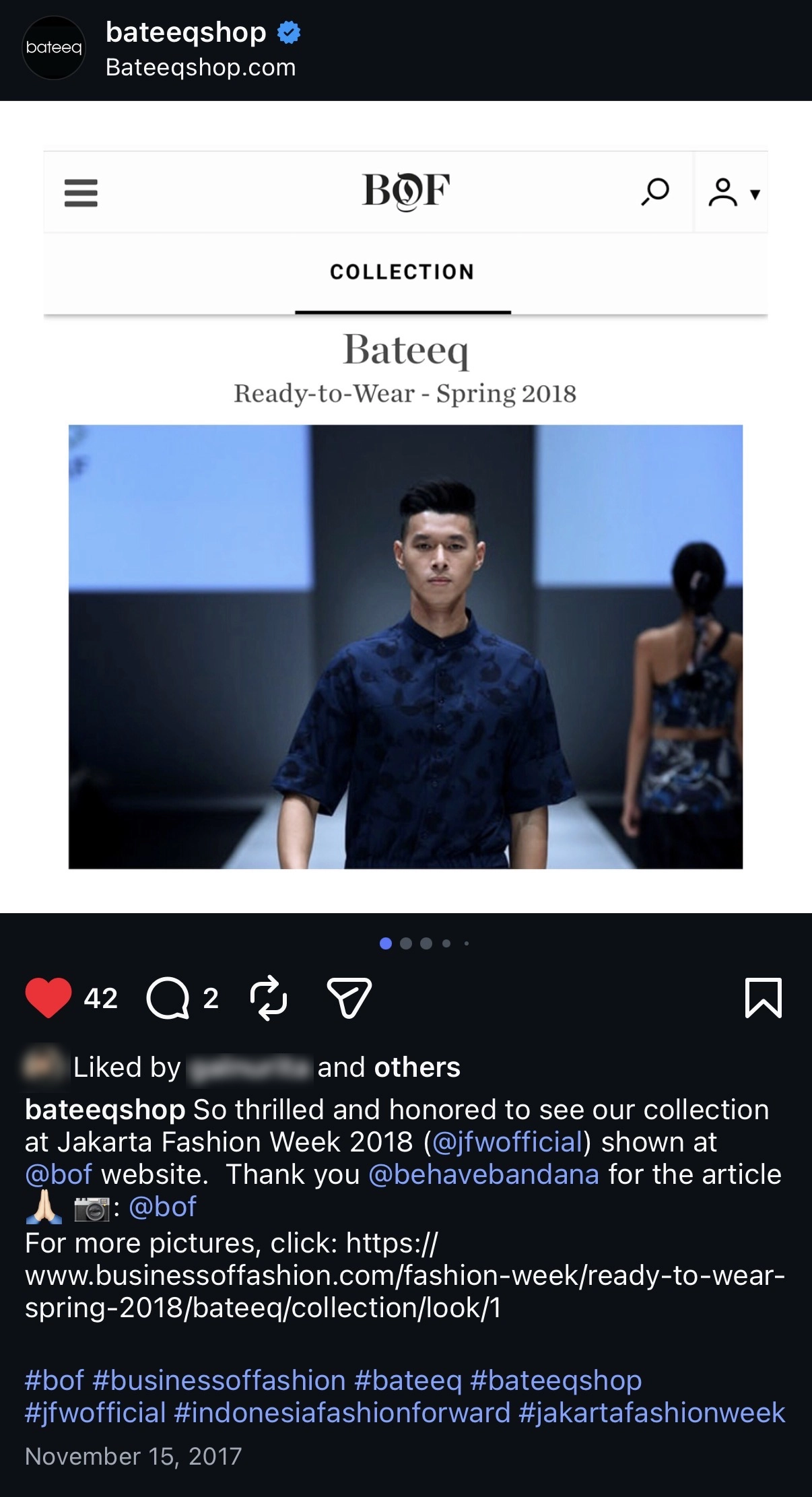
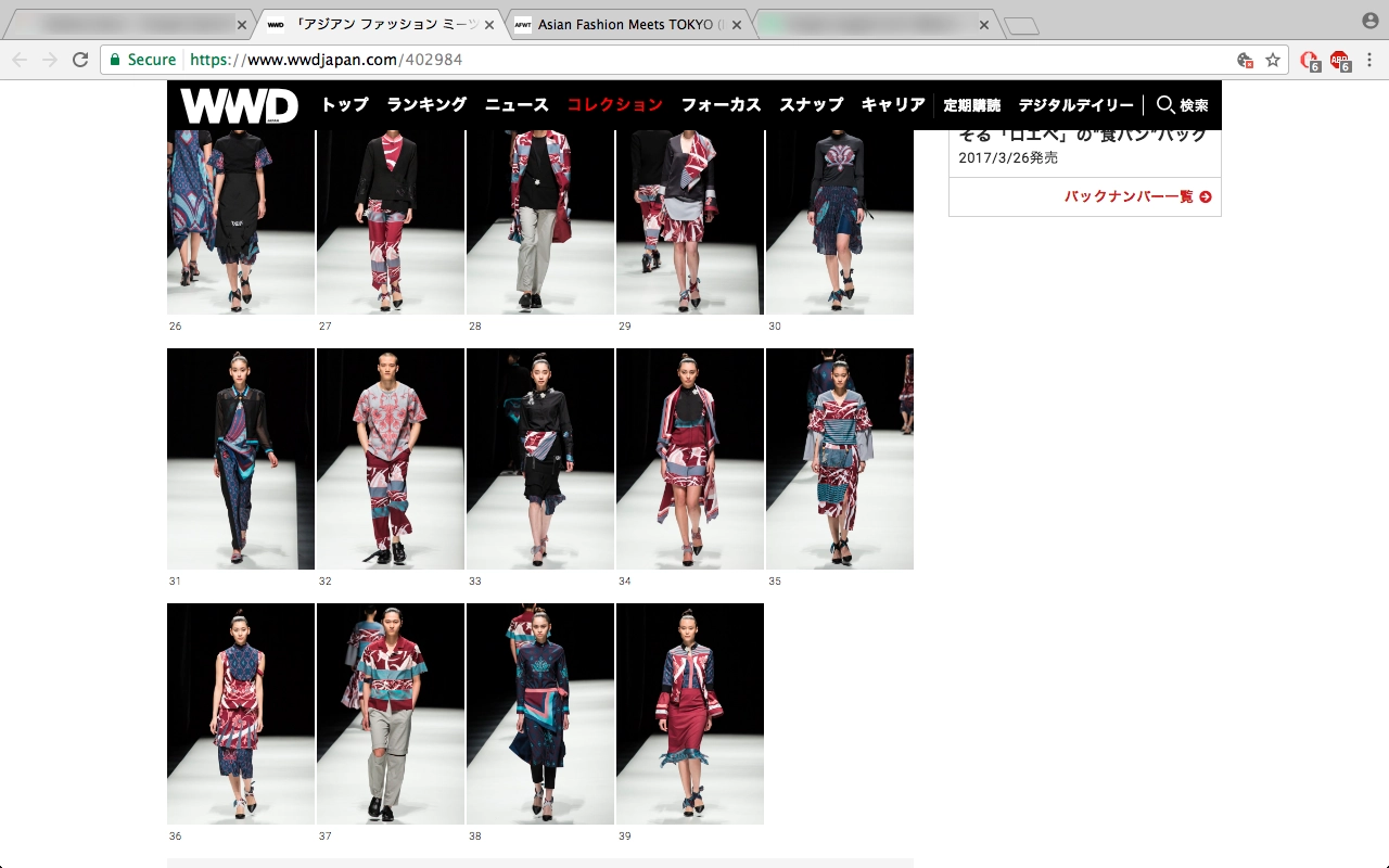
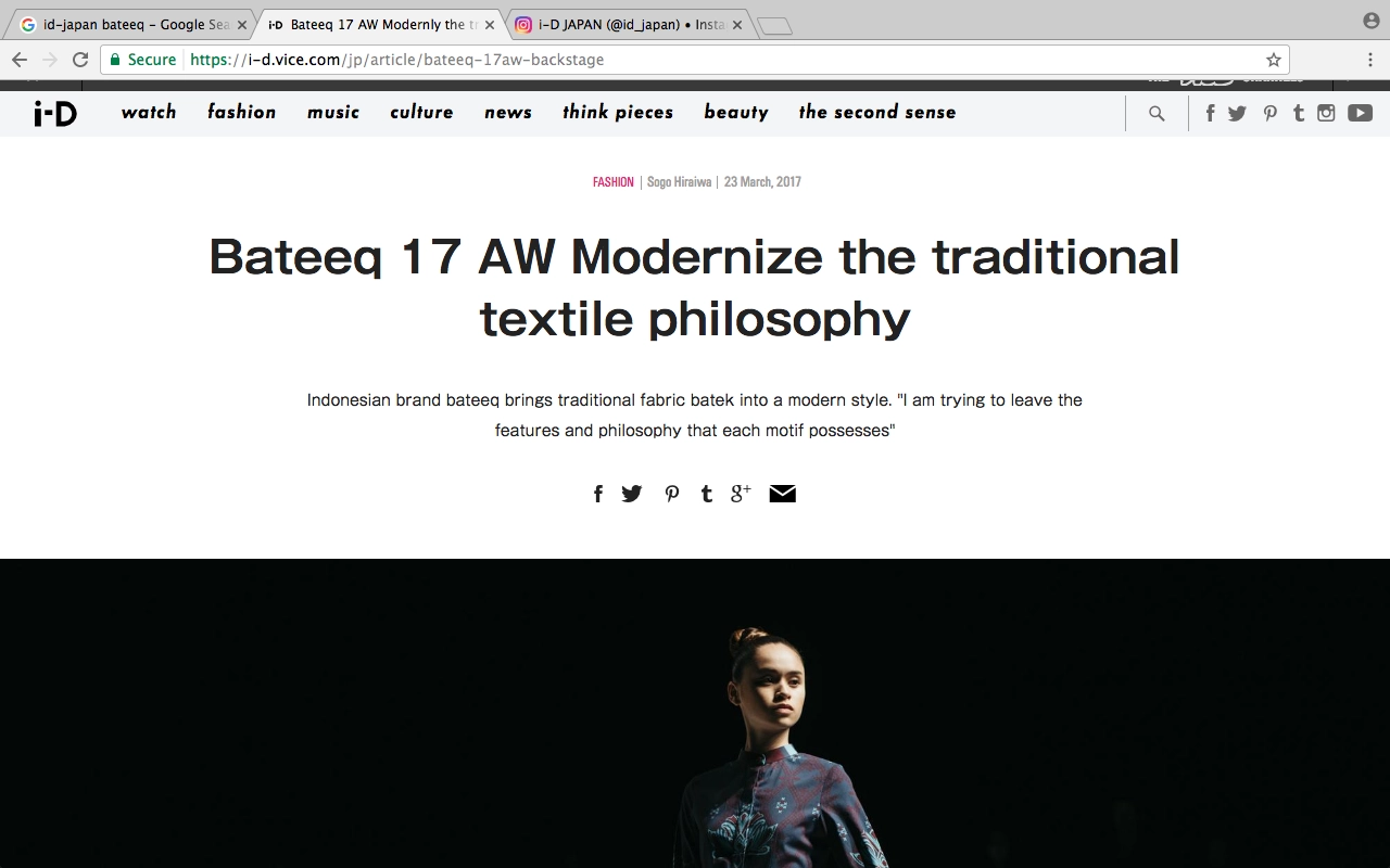
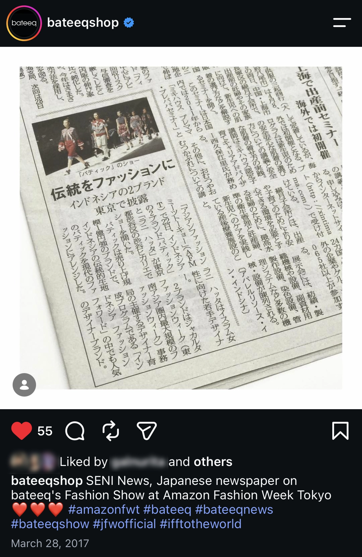
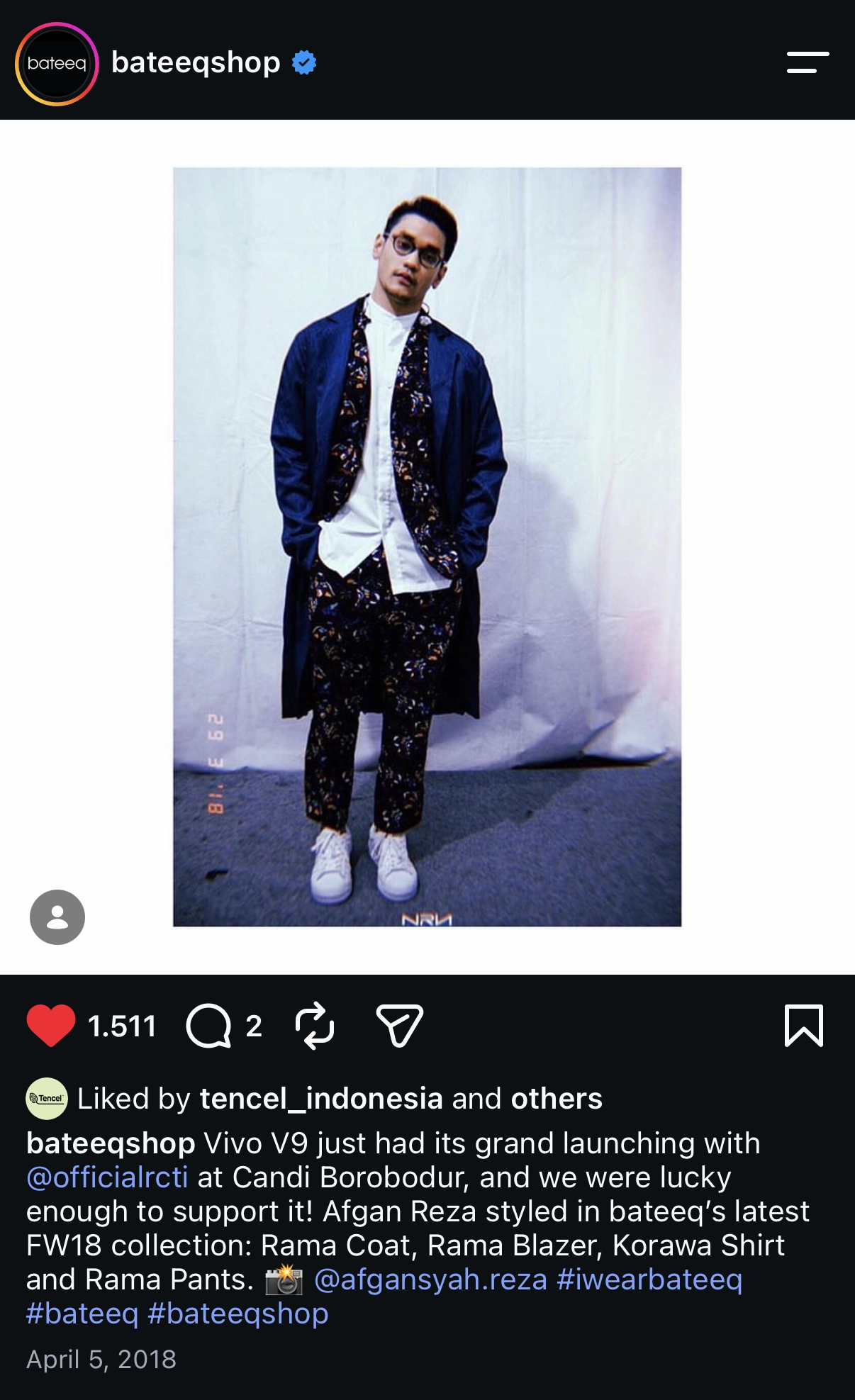
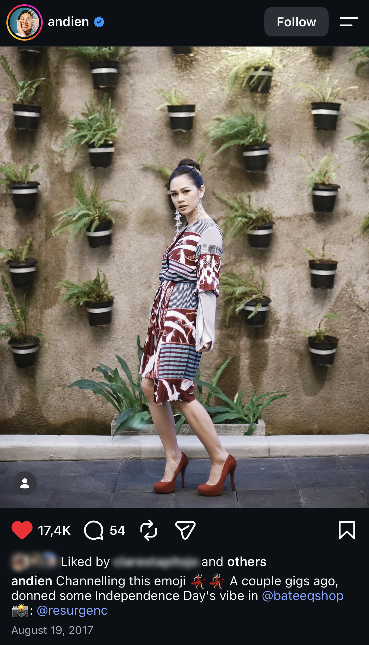
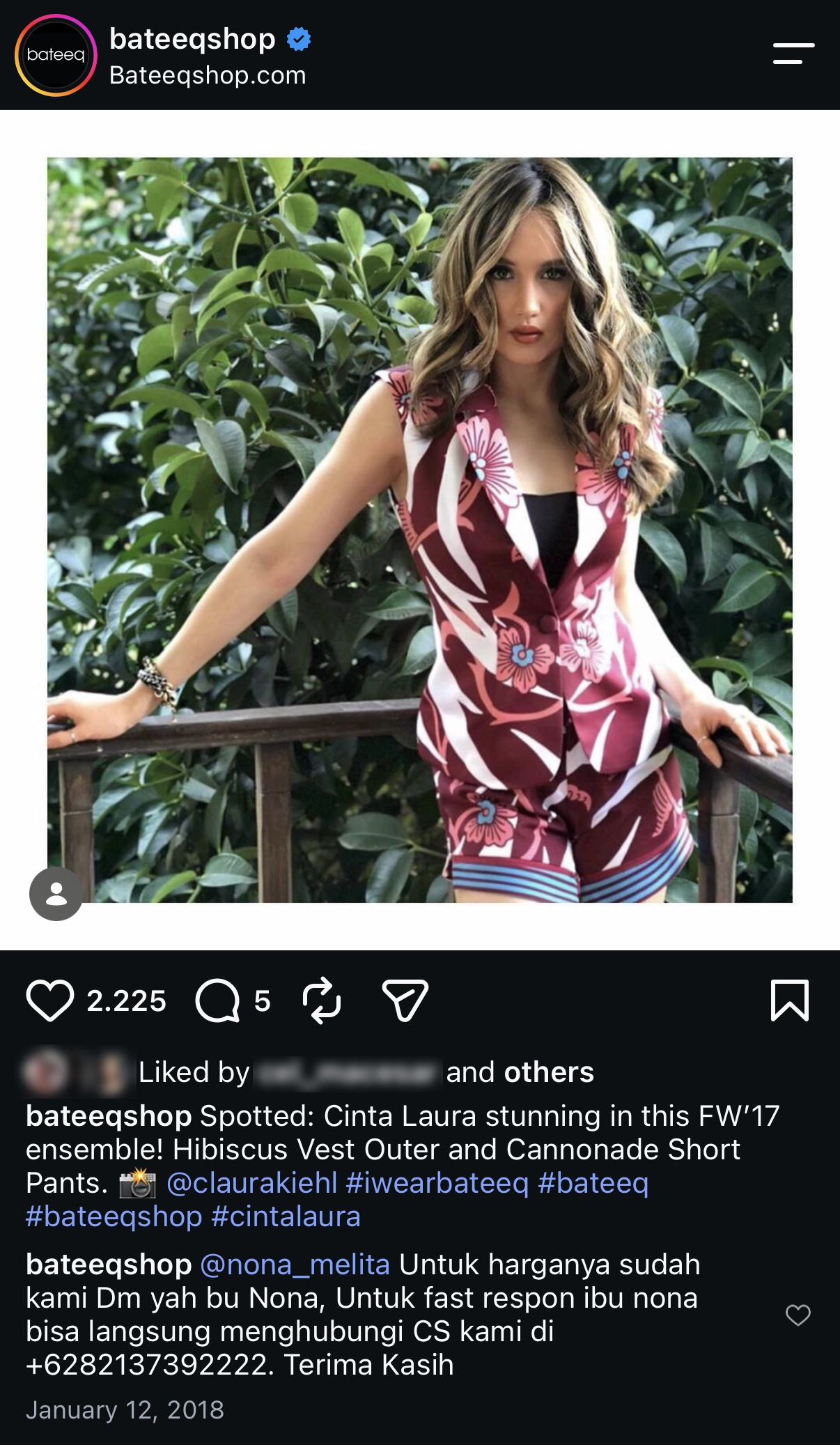
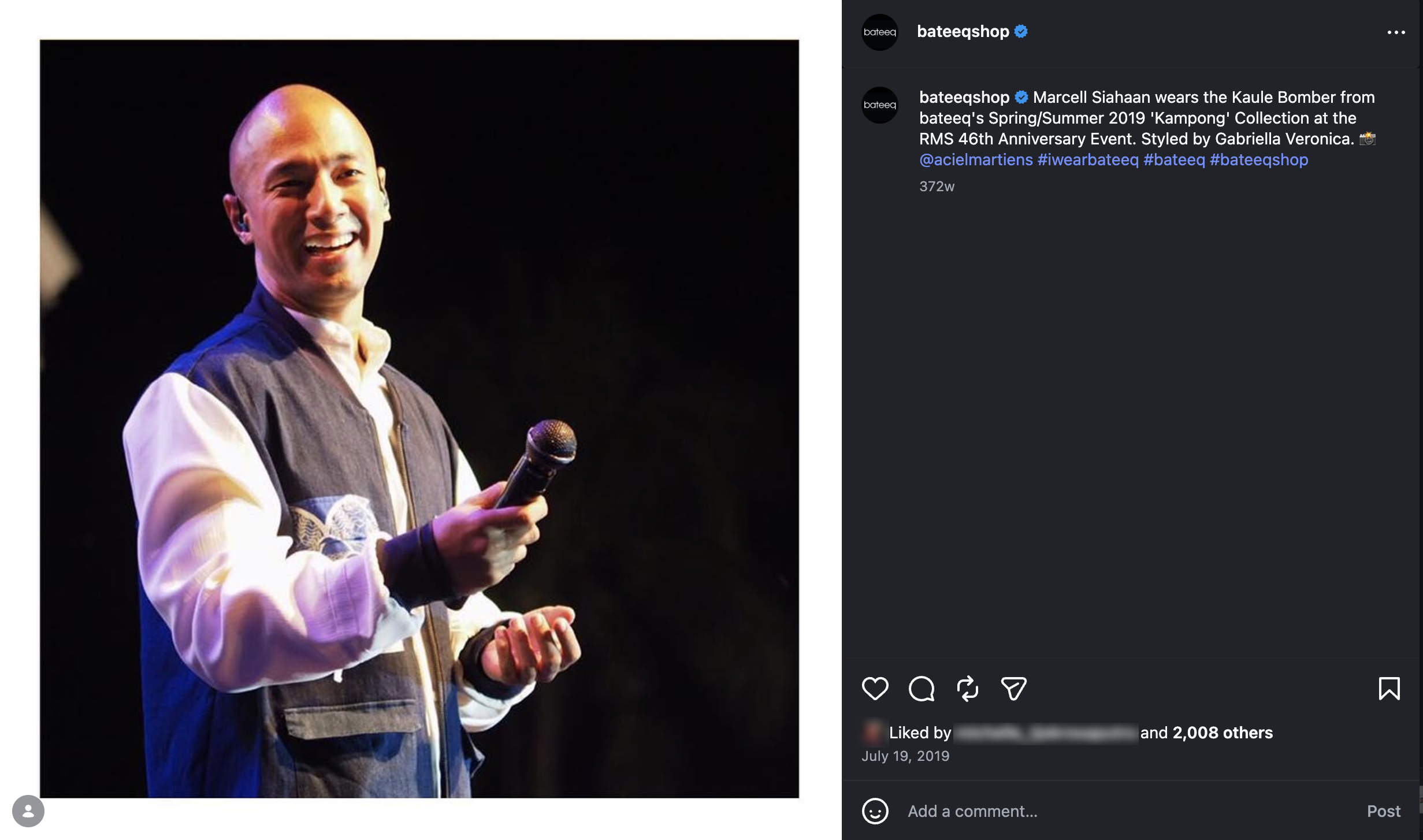
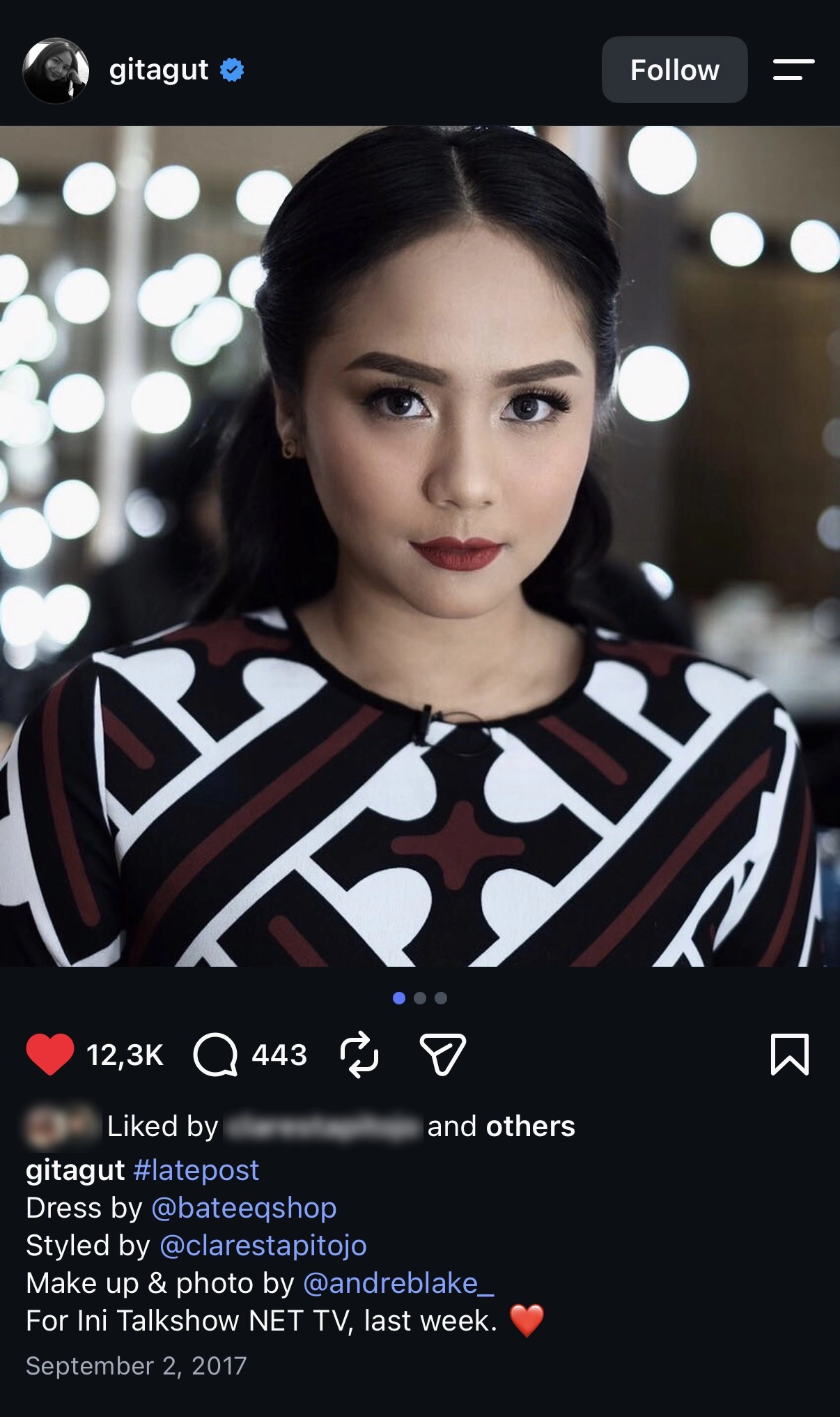
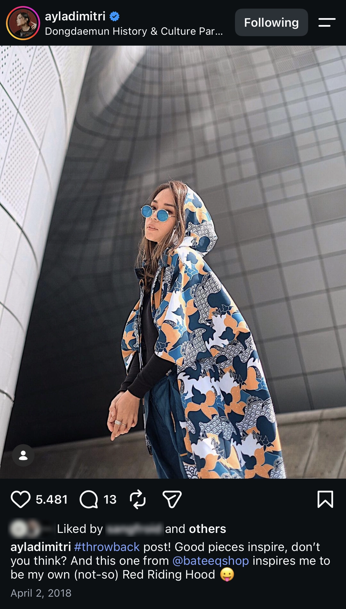
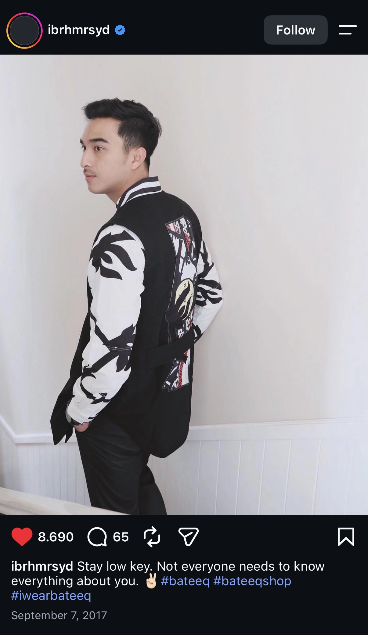
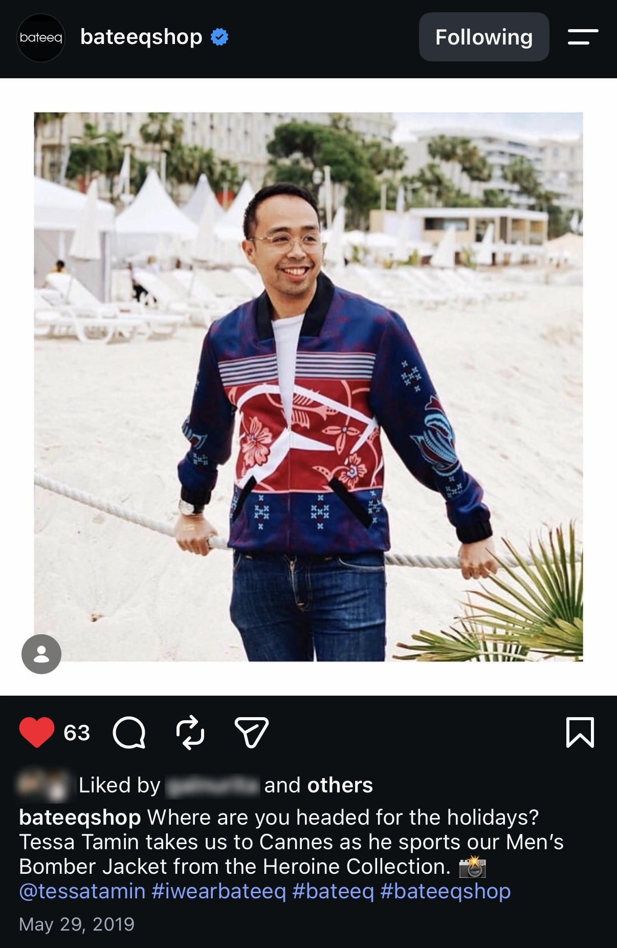
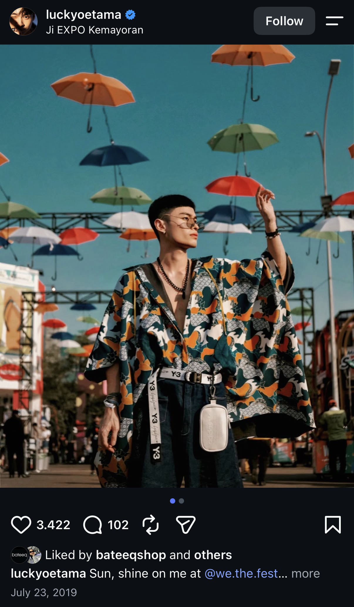
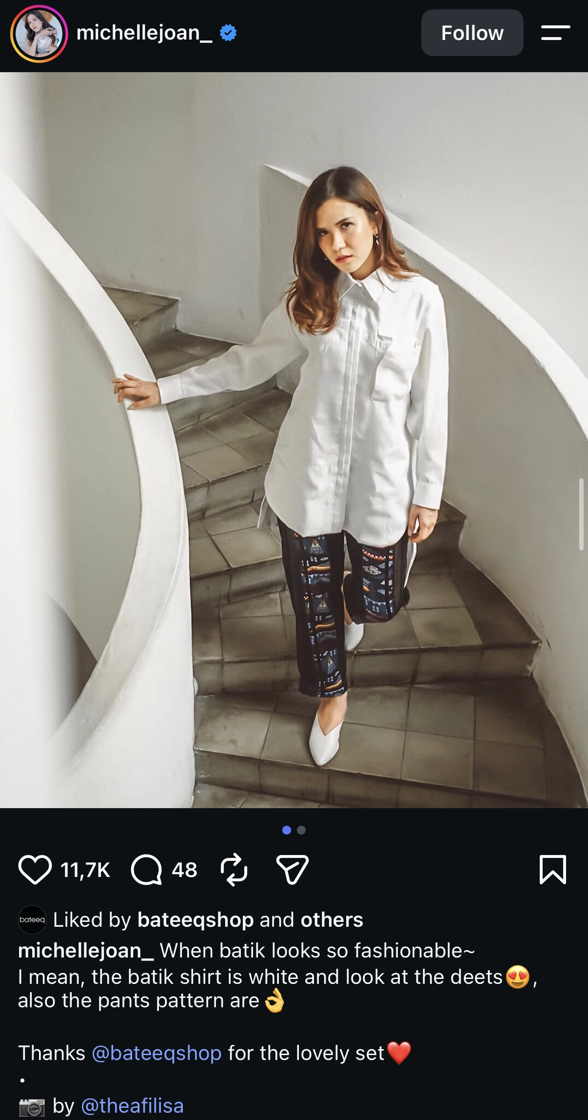
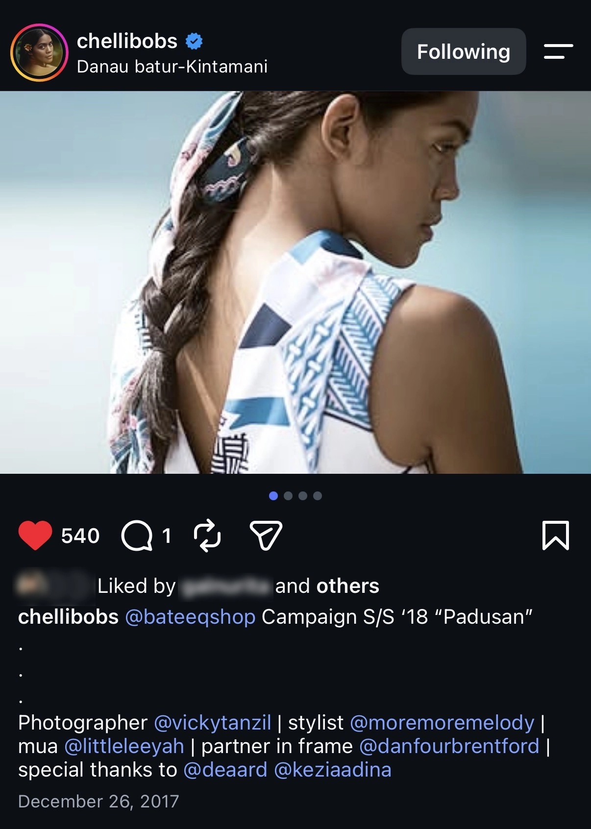
As the collections moved into public circulation, the work began appearing in fashion media, public-figure wear, tagged posts and cultural coverage. These different contexts showed how the clothes and visual direction continued to live beyond Bateeq’s own platforms.
Drag to explore
What stays in motion
The brand entered new cultural networks.
Alongside its existing customer base, Bateeq began gaining visibility among musicians, stylists and fashion communities. Many of these connections grew organically as the clothes appeared in new social settings and were picked up by people with strong influence on style and culture.
That wider circulation created a ripple effect. The more often Bateeq appeared in these circles, the more naturally the brand was read as part of contemporary fashion culture.
What changed
The product became bigger than the clothes.
Over time, Bateeq developed a more distinct visual and emotional world around the collections. The campaigns became slightly dreamlike. While they can be a bit strange and often deliberately unresolved, they offer a distinct point of view.
Familiar Indonesian references appeared inside situations that felt cinematic or just a little unreal.
The clothes were still the literal product, but they were no longer being presented on their own. Wearing Bateeq also meant stepping into the atmosphere the brand had built around them.
My role in the transformation
Building a recognisable visual language through the collections
On multiple collections, campaigns, runway and retail, I helped translate each season into a connected visual expression, so the brand developed a more recognisable language over time.
Expanding from collection design into broader brand stewardship
My role grew beyond individual collections into continuous editing, coordination and visual decision-making across design, campaign, styling and show production, while final creative approval remained with the Creative Director.
Credits
Creative Direction
Michelle T.
Concept Development & Design Direction
Dea A.
Campaign Direction
Dea A.
Fashion Design - Womenswear
Prashasta A., Marsha C., Kelly V., Fanny & Dea A.
Fashion Design - Menswear
Galuh N.
Textile Design
Yunita D.P., Sapto L. & Dea A.
Embroidery Design
Sapto L. & Afiq A.K.
Project Management
Anna M.
Marketing Direction
Bernadetta A.P.
Photography
Vicky T. & Hilarius J.P.
Photography Assistant
Welly D. & Kezia A.
Styling
Lilian N., Melodya L. & Makoto W.
Make Up & Hair Do
Eva, Leeah, Revo
Film
Heru A.
Female Model
Yuke A. - Jim Models, Orsi - Fmodels, Michelle T., Clarita - Balitar, Prashasta A. & Galuh N.
Male Model
Stevan M. - Twentyonemm, Julio - Fmodels, Dan B. & Daniel - 2icons
Jewelry Design & Development
Amanda S. - Ambstamb & Sasha - Tam illi
Soft Accessories Design
Galuh N. & Yunita D.P.
Female Shoes Development
Fauzan Shoes & Sepatukubaru
Male Shoes Design & Development
Kozuki & Hijack
Collaterals
Mokki Design
Music
Double Deer, Gerhan F. & Asa K.
Social Media
Anna M.
Press Relation
Bernadetta A.P, Yoshio Y. & Justine T.O.