
Brand Direction · Corporate Identity
Jatelindo Indonesia
A corporate identity for a Mobility-as-a-Service company preparing for broader B2B growth.
Project Overview
Context
Jatelindo Indonesia develops integrated transport, payment and Mobility-as-a-Service infrastructure. The company operates within a wider network of shareholders and technology partners, while leading the consortium supporting JakLingko.
Jatelindo Indonesia operates within a wider corporate and partnership network, including Jatelindo and Credo Group, and leads a multi-company consortium delivering JakLingko’s integrated mobility service.
What needs to be solved
Its corporate identity was often overshadowed by the more visible Jatelindo and JakLingko brands. As the company expanded its B2B communication, it needed an independent identity that could distinguish it from both its ownership network and one of its client-facing mobility projects.
My Role
As Creative Lead, I led the brand identity development from discovery and personality definition through visual direction and design development. I then carried the system into corporate internal and partner-facing collaterals, as well as digital applications.
Corporate Network
Shareholders and technology partners.
Including Jatelindo and Credo Group.
Jatelindo Indonesia
Independent MaaS technology company
JakLingko
Client-facing mobility partnership
Creative Brief
Serious enough for public institutions. Progressive enough for mobility technology.
The corporate identity needed to build confidence among public-sector decision-makers, transport operators, technology partners and prospective B2B clients. Clarity, reliability and operational credibility were especially important for these audiences.
At the same time, Jatelindo Indonesia needed to feel forward-looking and connected to the people using the systems it supports. The direction had to feel innovative and trustworthy without becoming cold or too institutional.
Creative Strategy
A dependable technology brand, expressed with clarity, progressive forms, and human relevance.
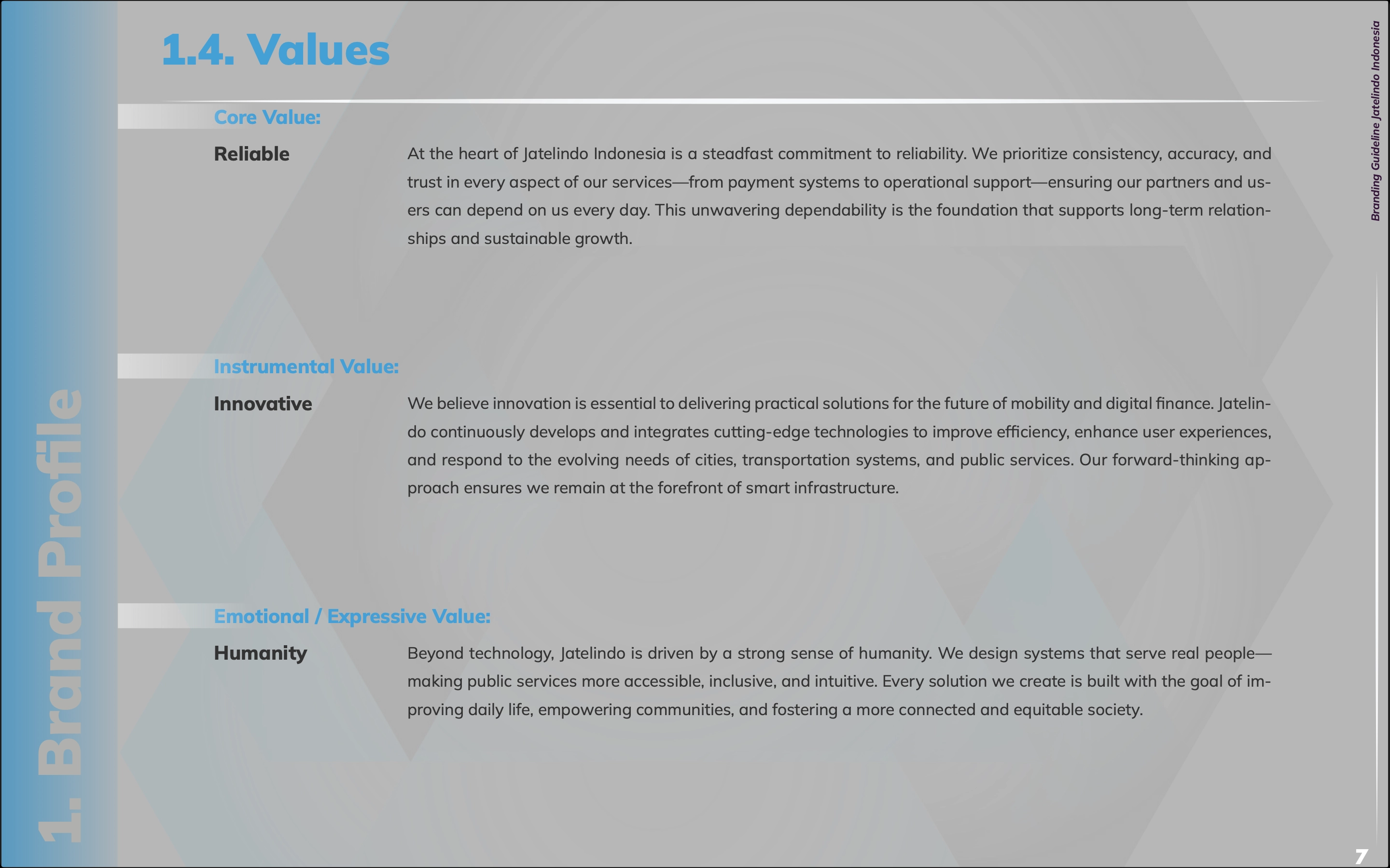
Discovery and stakeholder discussions helped define three brand values: Reliable (Core Value), Innovative (Instrumental Value) and Human (Emotional Value). These became the foundation for the brand personality and overall tone of voice.
I translated the values into a verbal direction, then worked with the copywriter to develop the detailed voice framework and writing rules.
Built from the CEO-defined vision and mission, a discovery questionnaire and stakeholder discussions.
Strategic Principles
01
Reliable
Clarity
Structured hierarchy and repeatable systems make complex mobility information feel dependable.
02
Innovative
Movement
Modular geometry, cyan accents and adaptable compositions communicate technological progress.
03
Human
Connection
People-centred imagery and accessible language connect the technology to everyday journeys.
Personality Spectrum
Design Logic
From strategic language to a modular symbol.
Early exploration translated themes of innovation, infrastructure, connection and trust into visual metaphors. Two ideas became central: ascending steps for progress and structural pillars for stability.
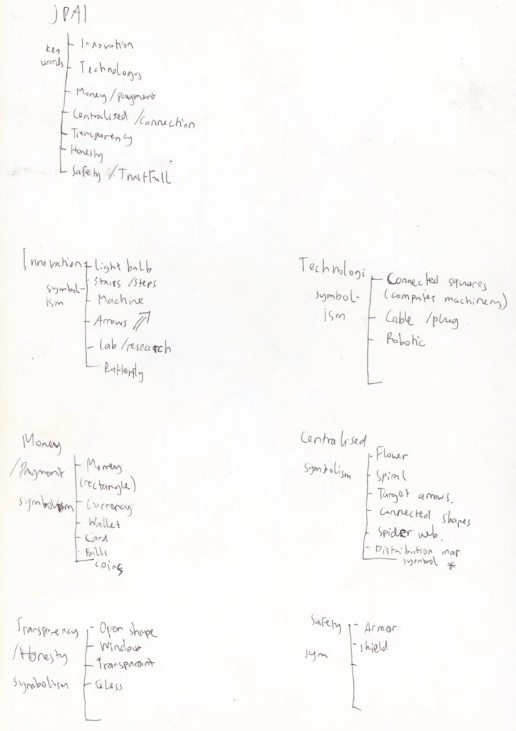
Stakeholder themes were translated into possible symbols and forms.
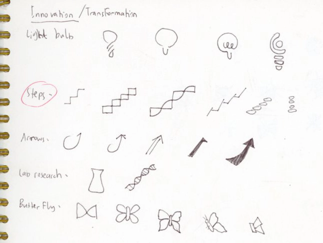
Ascending steps suggested transformation, progress and forward mobility.
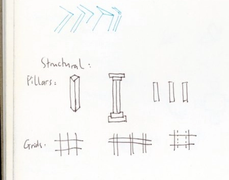
Pillars and grids introduced reliability and stability. It also represents infrastructure and institutional presence.
Directions explored
Early studies considered fluid monograms, directional structures and more literal technology symbols. Stakeholder review helped narrow the development toward a structured architectural form.
An early version established the basic JI-shaped structure, but its single upper plane felt too static and visually unresolved. I developed the form into an ascending sequence of steps, introducing a clearer sense of progress while making the mark more distinctive and generative.


Identity System
A modular identity built around movement, infrastructure and connection.
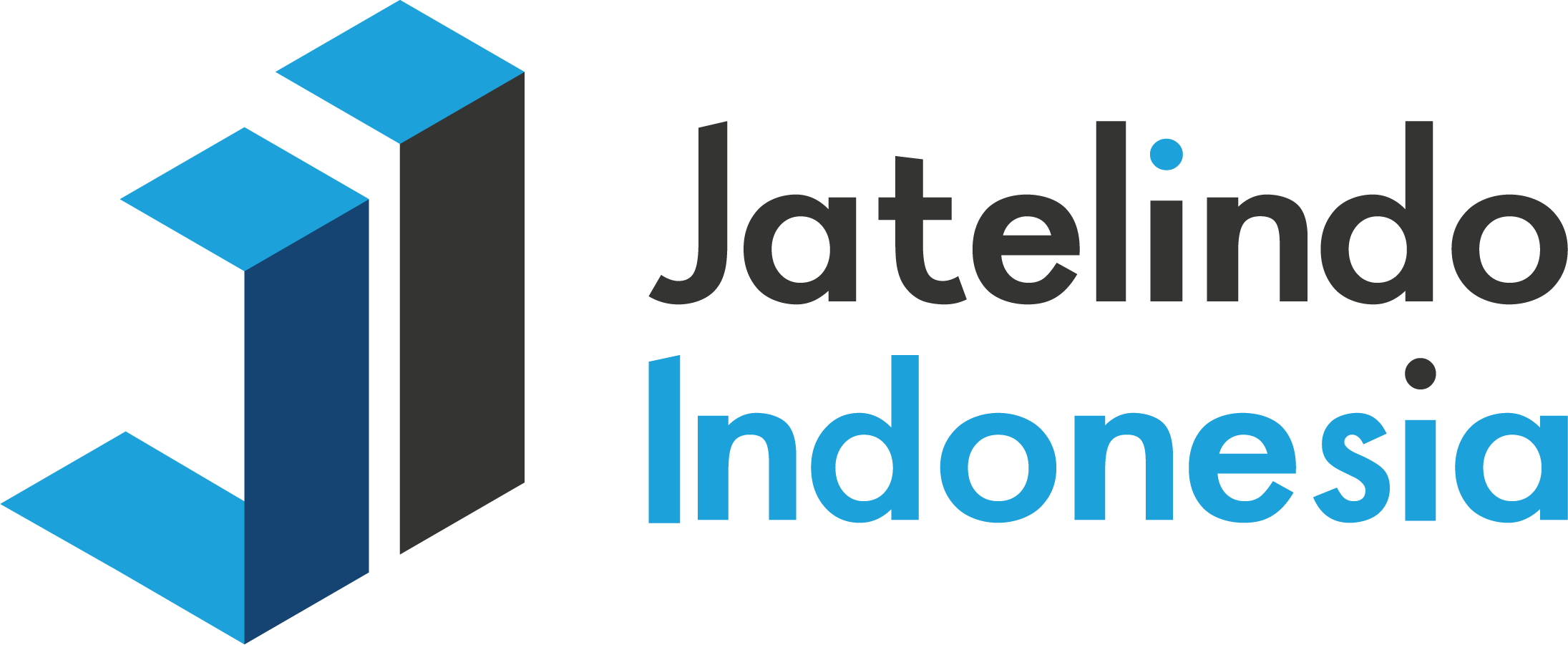
The selected identity combines architectural and directional forms into a system that suggests public infrastructure, upward movement and interconnected journeys. Responsive variations allow the mark to move between formal corporate communication and compact digital applications without losing recognition.
Primary Identity

Logo Variations
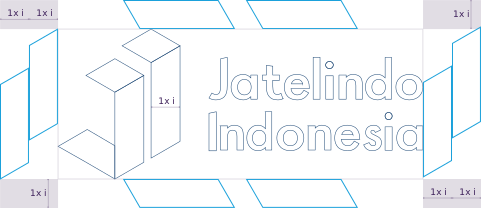
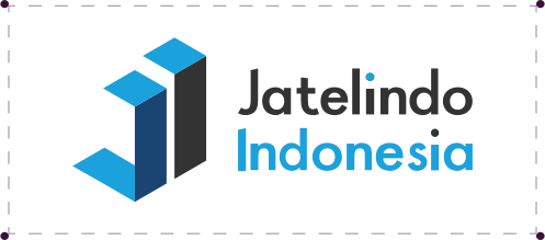
Structural and colour variations extend the identity across different proportions and backgrounds that include different levels of visibility.



Colour System
A controlled corporate palette with a brighter digital register.
Deep neutral and blue tones establish stability and trust, while cyan and lighter values create contrast across digital, corporate and motion applications.
One typeface. A clear hierarchy.
Mulish was chosen for its clarity and legibility across printed and digital applications. Its clean, modernist character supports Jatelindo Indonesia’s functional and dependable tone without feeling overly institutional. Using one family across multiple weights and italics creates a clear hierarchy while keeping communication consistent and easy to apply.

Type Usage
01
Titles & Headings
Mulish Black
Used for primary titles and headings across corporate and digital communication.
02
Subtitles & Subheadings
Mulish ExtraBold
Used for subtitles, subheadings andinline emphasis.
03
Body Text
Mulish Regular
Used for paragraphs and longer information, with Mulish Italic for emphasis.

Modular Elements
A flexible graphic vocabulary built from the icon-logo's structural geometry.
The elements extend the visual language beyond the logo, creating modular components for various design purposes for both printed and digital communication.






Identity in use
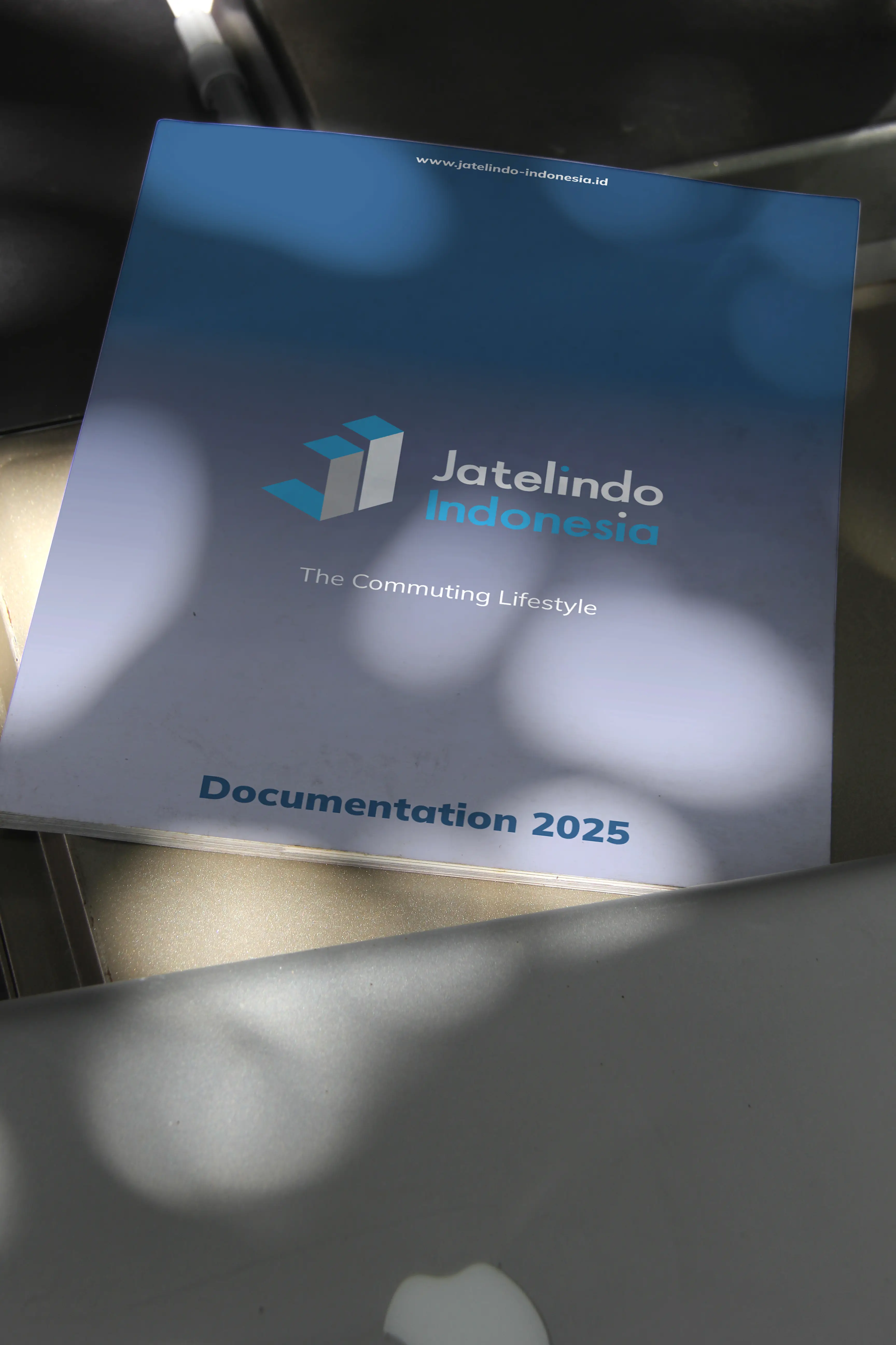
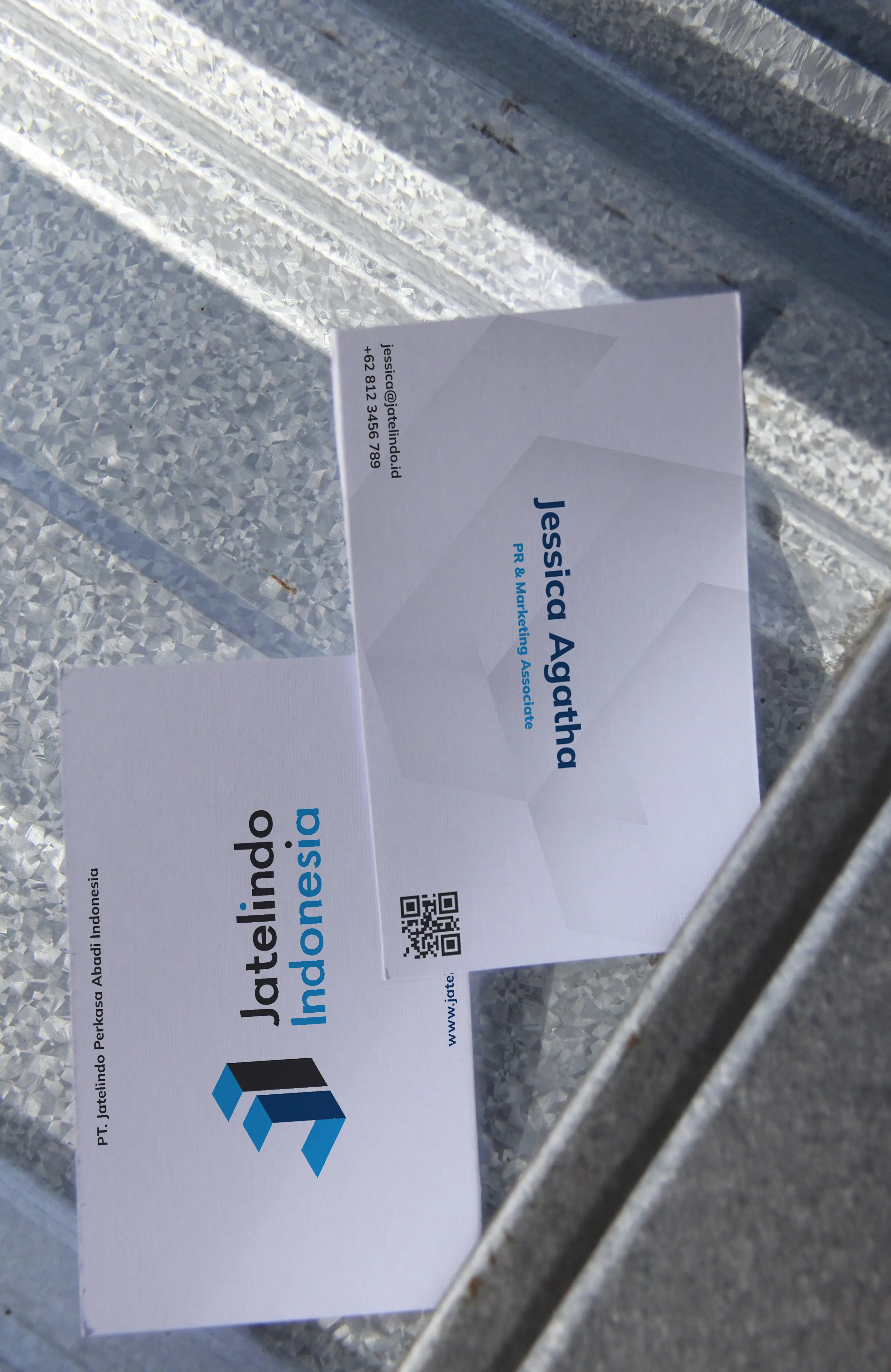
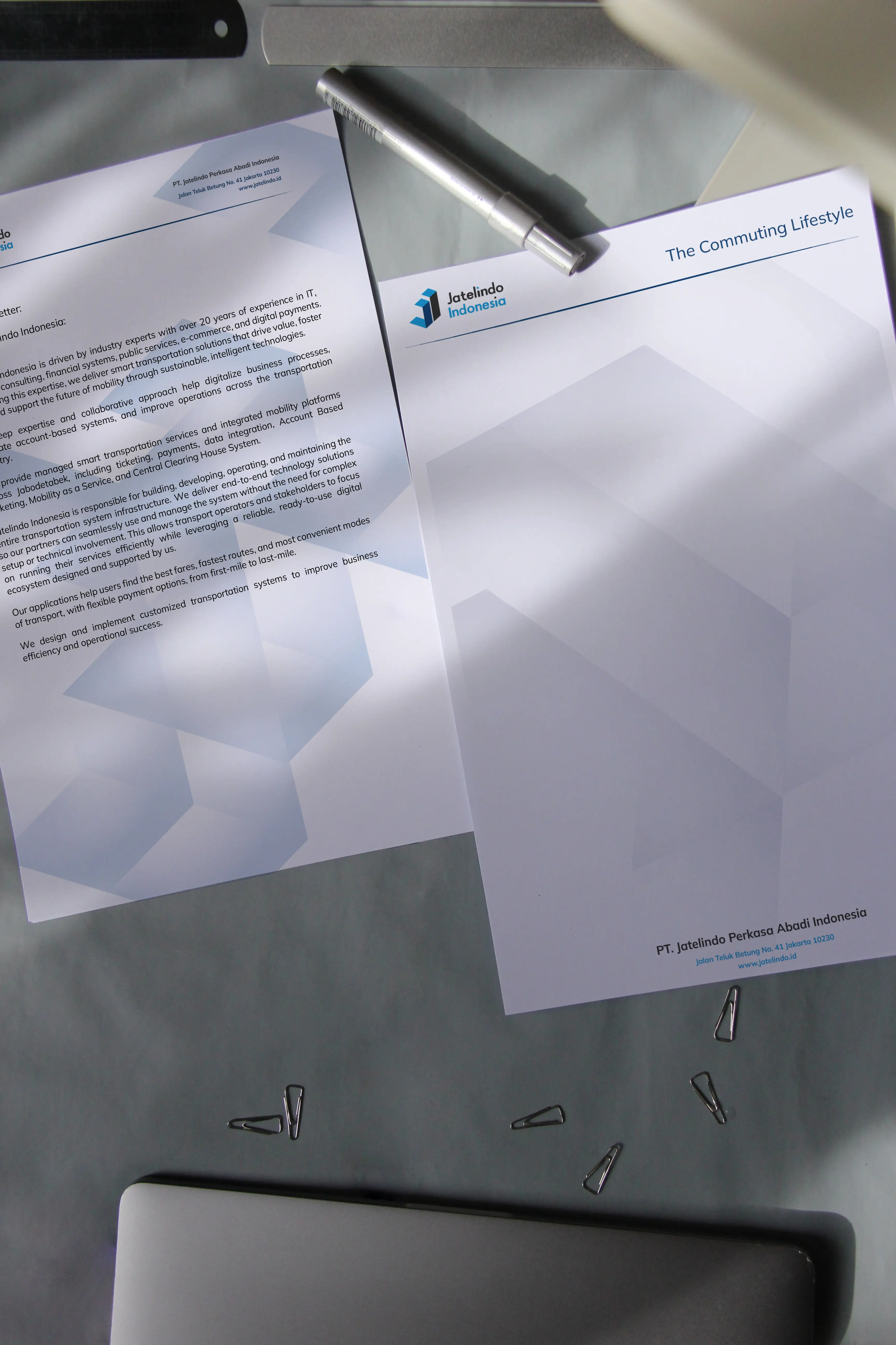
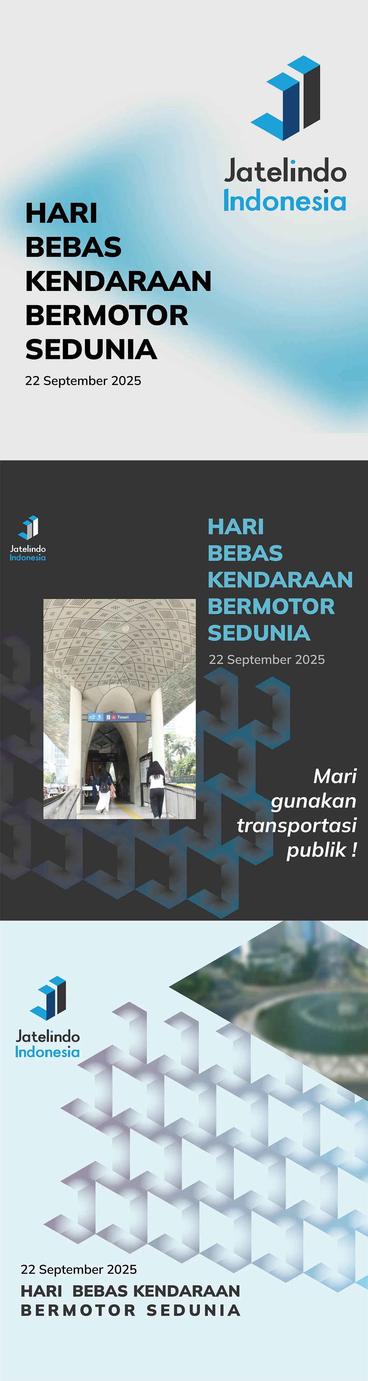
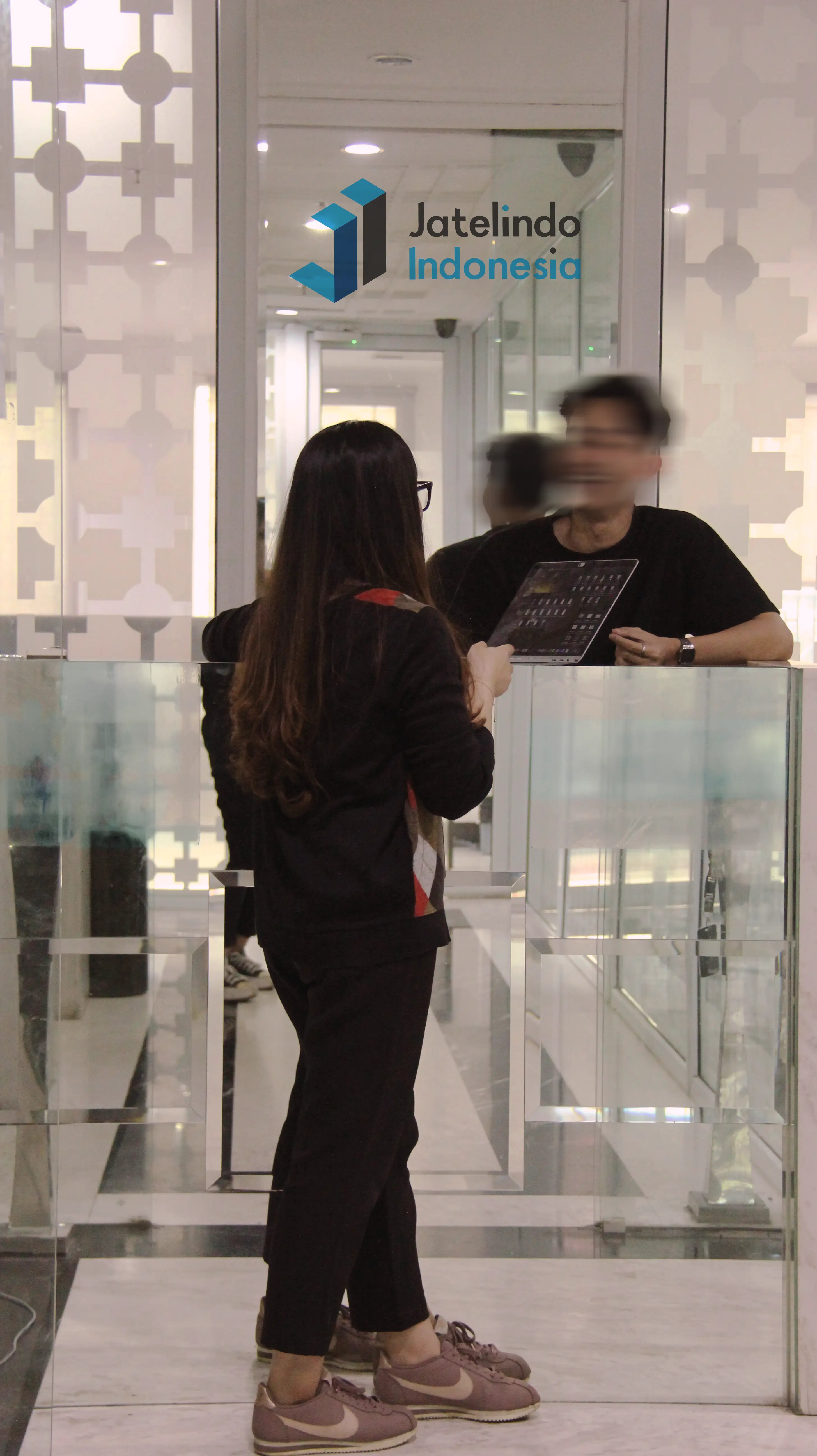
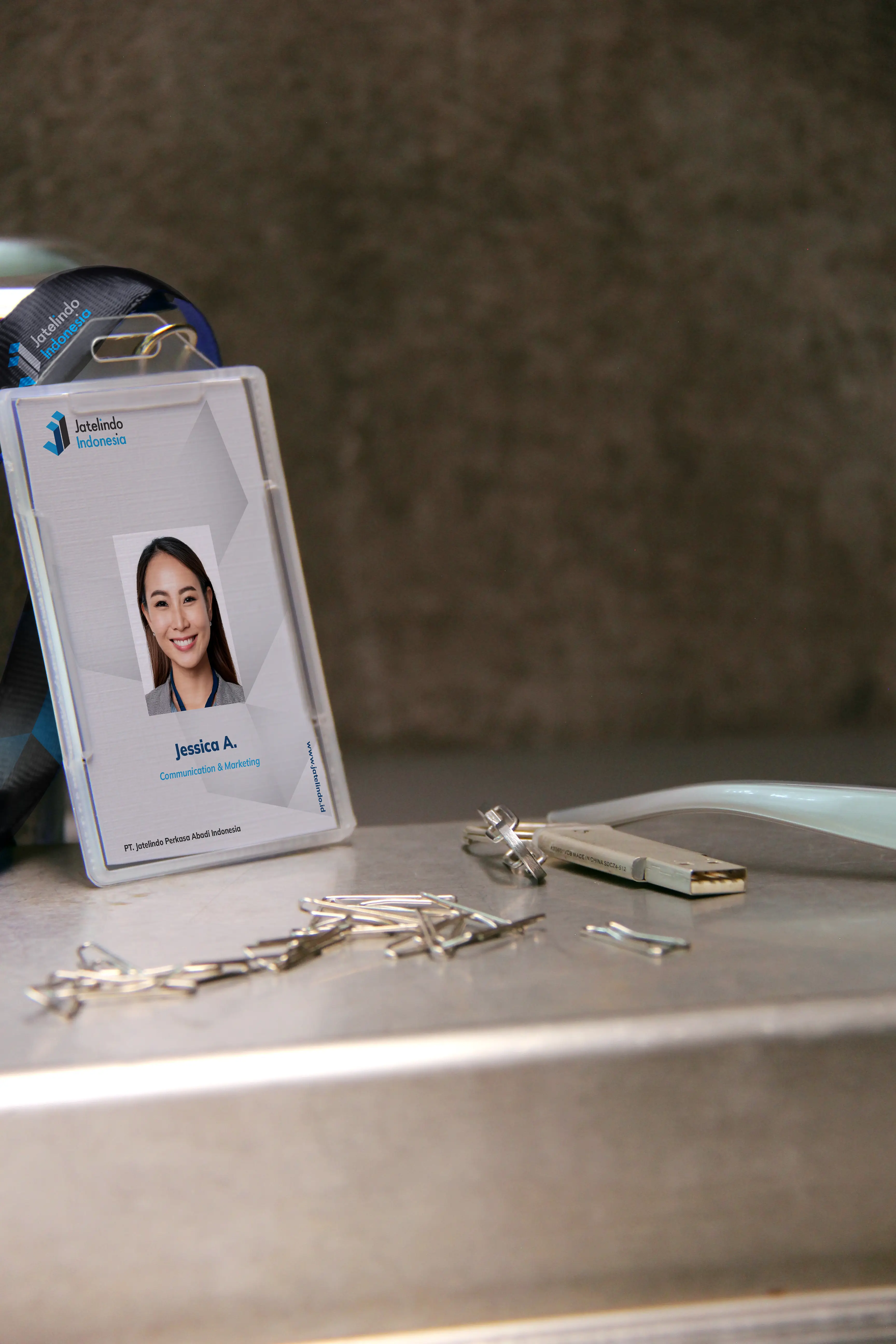
The identity then was elaborated across partner-facing communication, internal corporate collateral and a wider range of brand applications.
Digital Presence
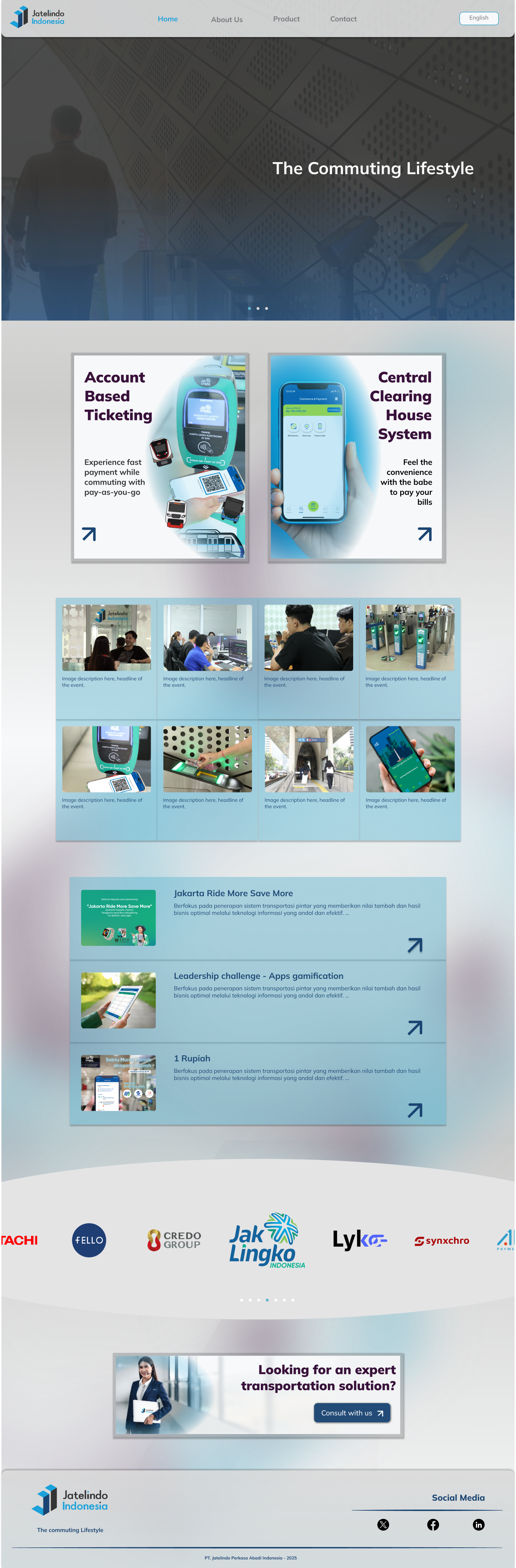
Extending the identity into a corporate digital environment.
The website translates Jatelindo’s identity principles into a structured digital platform for communicating its expertise, provided services, partnerships, and other information about the company.

Social communication
Credits
Company Concept, Vision, & MissionJatelindo Indonesia
Creative DirectionDea A.
Brand Strategy & Visual IdentityDea A.
Graphic Design & Image-makingDea A.
Website Direction & UI DesignDea A.
Brand ImplementationJatelindo Indonesia Creative Team