%20--%3e%3cdefs%3e%3cstyle%3e%20.st0,%20.st1%20{%20fill:%20%23d78a29;%20}%20.st1%20{%20mix-blend-mode:%20multiply;%20}%20.st2%20{%20opacity:%20.3;%20}%20.st2,%20.st3%20{%20isolation:%20isolate;%20}%20.st2,%20.st4%20{%20fill:%20%23f5f5f5;%20}%20%3c/style%3e%3c/defs%3e%3cg%20class='st3'%3e%3cg%20id='Layer_2'%3e%3cg%20id='Layer_1-2'%3e%3cg%3e%3cpath%20class='st1'%20d='M28.4,0h14c15.7,0,28.5,12.8,28.5,28.5h0c0,15.6-12.6,28.2-28.2,28.2h-14.3V0h0Z'/%3e%3cpath%20class='st1'%20d='M138.2,49.6h25.5c1.6,0,2.8,1.3,2.8,2.8v8.5c0,1.6-1.3,2.8-2.8,2.8h-25.5v-14.2h0Z'/%3e%3cpath%20class='st1'%20d='M258.7,56.7h26.3c3.1,0,5.7,2.5,5.7,5.7v8.5h-31.9c-1.6,0-2.8-1.3-2.8-2.8v-8.5c0-1.6,1.3-2.8,2.8-2.8h-.1Z'/%3e%3cpath%20class='st1'%20d='M470.6,56.8h39.7v14.2h-39.7c-1.6,0-2.8-1.3-2.8-2.8v-8.5c0-1.6,1.3-2.8,2.8-2.8h0Z'/%3e%3cpath%20class='st1'%20d='M360.8,0h34c3.1,0,5.7,2.5,5.7,5.7v8.5h-39.7c-1.6,0-2.8-1.3-2.8-2.8V2.8c0-1.6,1.3-2.8,2.8-2.8Z'/%3e%3c/g%3e%3c/g%3e%3cpath%20class='st2'%20d='M49.6-100.3h14c15.7,0,28.5,12.8,28.5,28.5h0c0,15.6-12.6,28.2-28.2,28.2h-14.3v-56.7h0Z'/%3e%3cpath%20class='st4'%20d='M121.5-143h22.7V-29.6h-22.7c-3.1,0-5.7-2.5-5.7-5.7v-102.1c0-3.1,2.5-5.7,5.7-5.7h0Z'/%3e%3cpath%20class='st0'%20d='M191.2-143h14c15.7,0,28.5,12.8,28.5,28.5h0c0,15.6-12.6,28.2-28.2,28.2h-14.3v-56.7h0Z'/%3e%3c/g%3e%3c/g%3e%3c/svg%3e)
Accessible Boldness
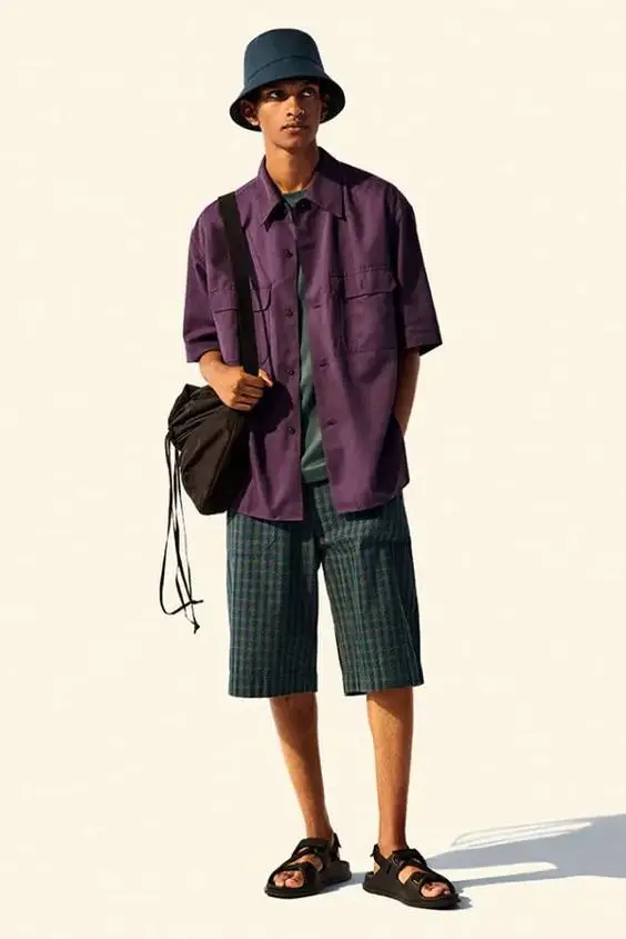
A directional visual language translated for a broader audience without flattening its identity.
%20--%3e%3cdefs%3e%3cstyle%3e%20.st0%20{%20fill:%20%23d78a29;%20}%20.st1%20{%20fill:%20%23231f20;%20}%20.st2%20{%20fill:%20%234e6ab2;%20}%20%3c/style%3e%3c/defs%3e%3cg%20id='Layer_1-2'%3e%3cg%3e%3cg%3e%3cpath%20class='st1'%20d='M5.7,0h22.7v113.4H5.7c-3.1,0-5.7-2.5-5.7-5.7V5.7C0,2.6,2.5,0,5.7,0Z'/%3e%3cpath%20class='st2'%20d='M28.4,56.7h14c15.7,0,28.5,12.8,28.5,28.5h0c0,15.6-12.6,28.2-28.2,28.2h-14.3v-56.7h0Z'/%3e%3c/g%3e%3cg%3e%3cpath%20class='st1'%20d='M109.9,0h28.4v113.4h-22.7c-3.1,0-5.7-2.5-5.7-5.7V0h0Z'/%3e%3cpath%20class='st2'%20d='M138.2.1h39.7c1.6,0,2.8,1.3,2.8,2.8v8.5c0,1.6-1.3,2.8-2.8,2.8h-39.7V.1h0Z'/%3e%3cpath%20class='st2'%20d='M138.2,85.1h36.8c3.1,0,5.7,2.5,5.7,5.7v17c0,3.1-2.5,5.7-5.7,5.7h-36.9v-28.3h0Z'/%3e%3c/g%3e%3cg%3e%3cpath%20class='st1'%20d='M248.1,0h0v113.4h0c-15.6,0-28.4-12.7-28.4-28.3V28.4c0-15.6,12.7-28.3,28.4-28.3Z'/%3e%3cpath%20class='st2'%20d='M290.6,28.4v8.5c0,3.1-2.5,5.7-5.7,5.7h-17c-3.1,0-5.7-2.5-5.7-5.7v-8.5h-14.2V0h14.2c15.6,0,28.3,12.7,28.3,28.3h0Z'/%3e%3cpath%20class='st2'%20d='M290.6,70.9v14.2h0c0,15.7-12.7,28.3-28.4,28.3h-14.2v-28.3h14.2v-14.2h28.3Z'/%3e%3c/g%3e%3cg%3e%3cpath%20class='st2'%20d='M510.3,28.4v28.4h-28.3V0c15.7,0,28.3,12.7,28.3,28.3Z'/%3e%3cpath%20class='st2'%20d='M482,70.9h28.3v36.8c0,3.1-2.5,5.7-5.7,5.7h-17c-3.1,0-5.7-2.5-5.7-5.7v-36.8Z'/%3e%3cpath%20class='st1'%20d='M467.8,28.4v79.4c0,3.1-2.5,5.7-5.7,5.7h-17c-3.1,0-5.7-2.5-5.7-5.7V28.4c0-15.7,12.7-28.4,28.3-28.4h14.2v28.3h-14.2,0Z'/%3e%3crect%20class='st0'%20x='510.3'%20y='56.8'%20width='0'%20height='14.2'/%3e%3c/g%3e%3cg%3e%3cpath%20class='st1'%20d='M372.1,14.2h28.4v71c0,15.6-12.7,28.3-28.4,28.3h0V14.2h0Z'/%3e%3cpath%20class='st2'%20d='M372.1,85.1v28.3h-14.2c-15.6,0-28.3-12.7-28.3-28.3h0v-8.5c0-3.1,2.5-5.7,5.7-5.7h17c3.1,0,5.7,2.5,5.7,5.7v8.5h14.2,0Z'/%3e%3c/g%3e%3c/g%3e%3c/g%3e%3c/svg%3e)
Brand Identity · Art Direction
A contemporary furniture brand developed from the ground up, starting from naming and identity to art direction and launch materials.
Project Overview
Context
Begja was developed as Roda Jati’s move from manufacturing furniture for international clients toward building a consumer-facing brand for the local market. The ambition was to create a younger, more accessible furniture label with products suited to contemporary living: more compact, easier to store and ship, and influenced by a modular product principle.
What needs to be solved
Turn Roda Jati’s existing manufacturing capability and product concept into a distinct furniture brand with its own audience and personality. Begja also needed a contemporary, approachable identity that could still reflect the quality and craft behind the production.
My Role
I led the brand development from discovery through naming, visual identity creation and art direction. I interviewed the CEO and product designer, defined the brand DNA, and developed the name and identity system. I also helped structure the collection through a merchandising framework, then directed the visual world for Volume I, including product groupings, styling and set composition.
The furniture was designed by the company’s product designer, while camera angle and lighting were developed by the photographer.
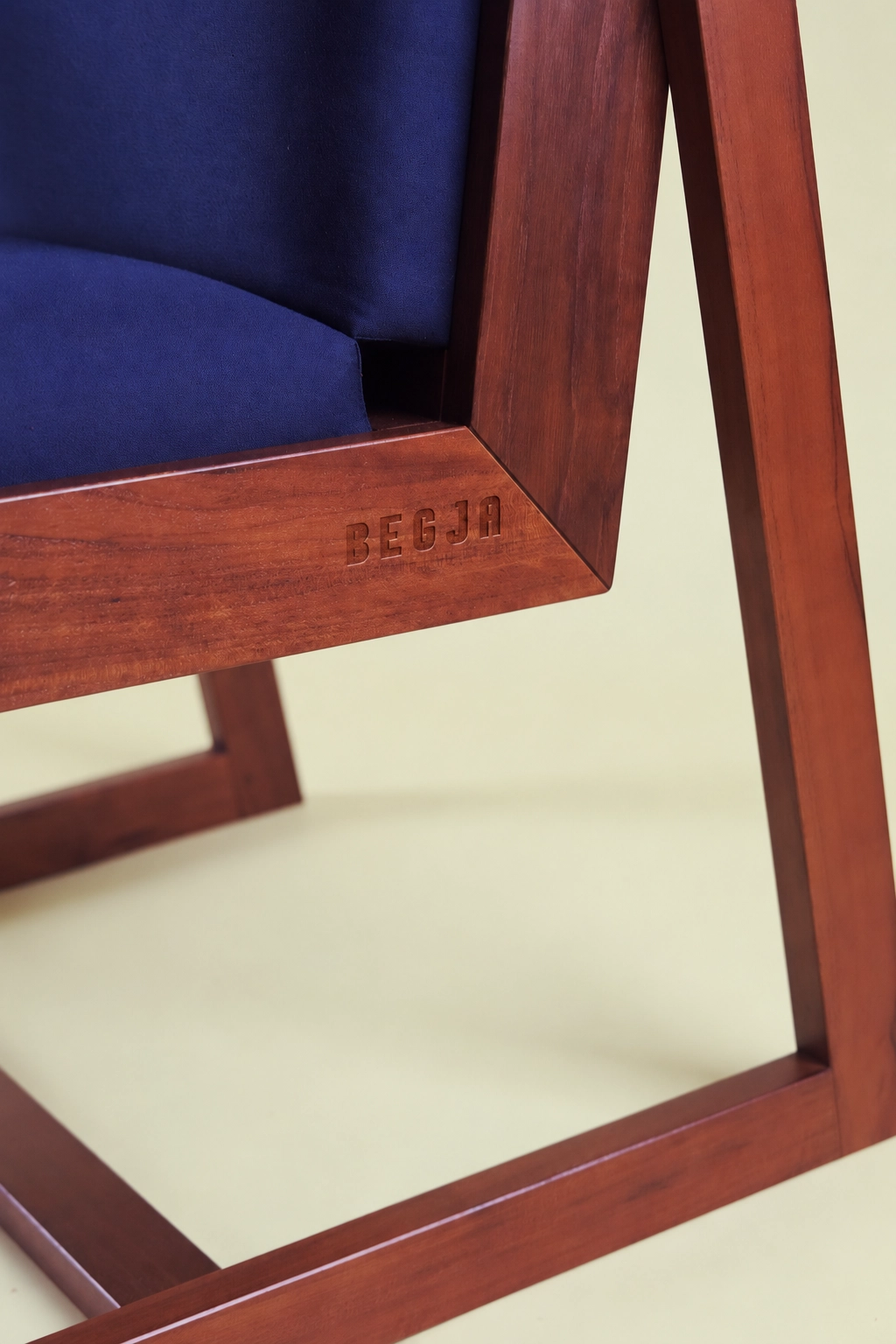
The identity, product photography and launch direction were developed for Begja before the brand had been publicly launched.
DESIGN PROPOSITION
Audience
Urban consumers around 25–35 who had begun building independent lives: young professionals, newly married couples, junior managers, also higher-budget entry-level professionals and students living in more compact spaces.
Visual Direction
Minimal and functional in a warm tone, with colour and geometry used to give the brand a younger and more playful character. The overall direction should still feel considered and design-conscious.
Design Tension
Keep the brand broadly relatable and approachable while making it distinctive enough to move beyond conventional furniture branding.
Creative Research
Accessible Boldness
A directional visual language translated for a broader audience without flattening its identity.
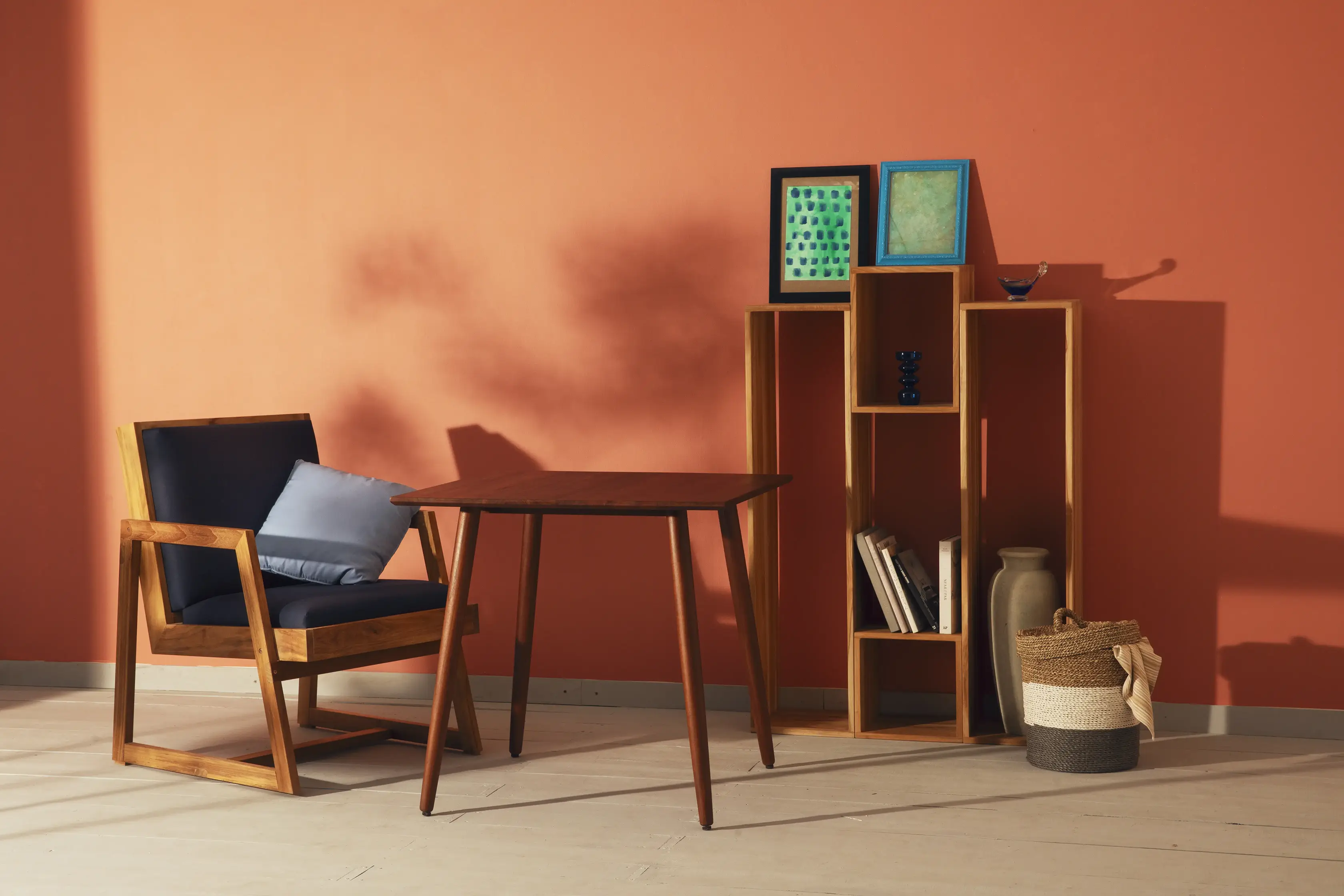
Warm Modernism
Warm colour tone and domestic comfort balanced with sharper modernist forms.
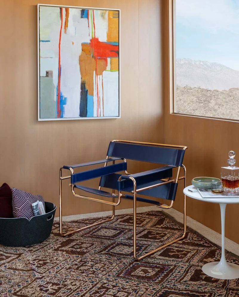
Joyful Living
Neutral foundations brought to life through colour, playful forms and small details that make everyday spaces feel more expressive.
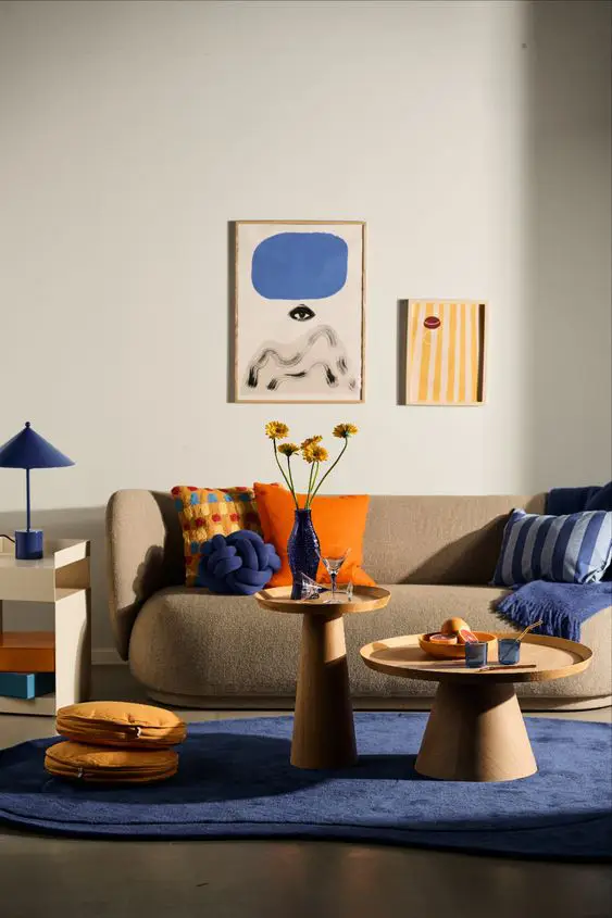
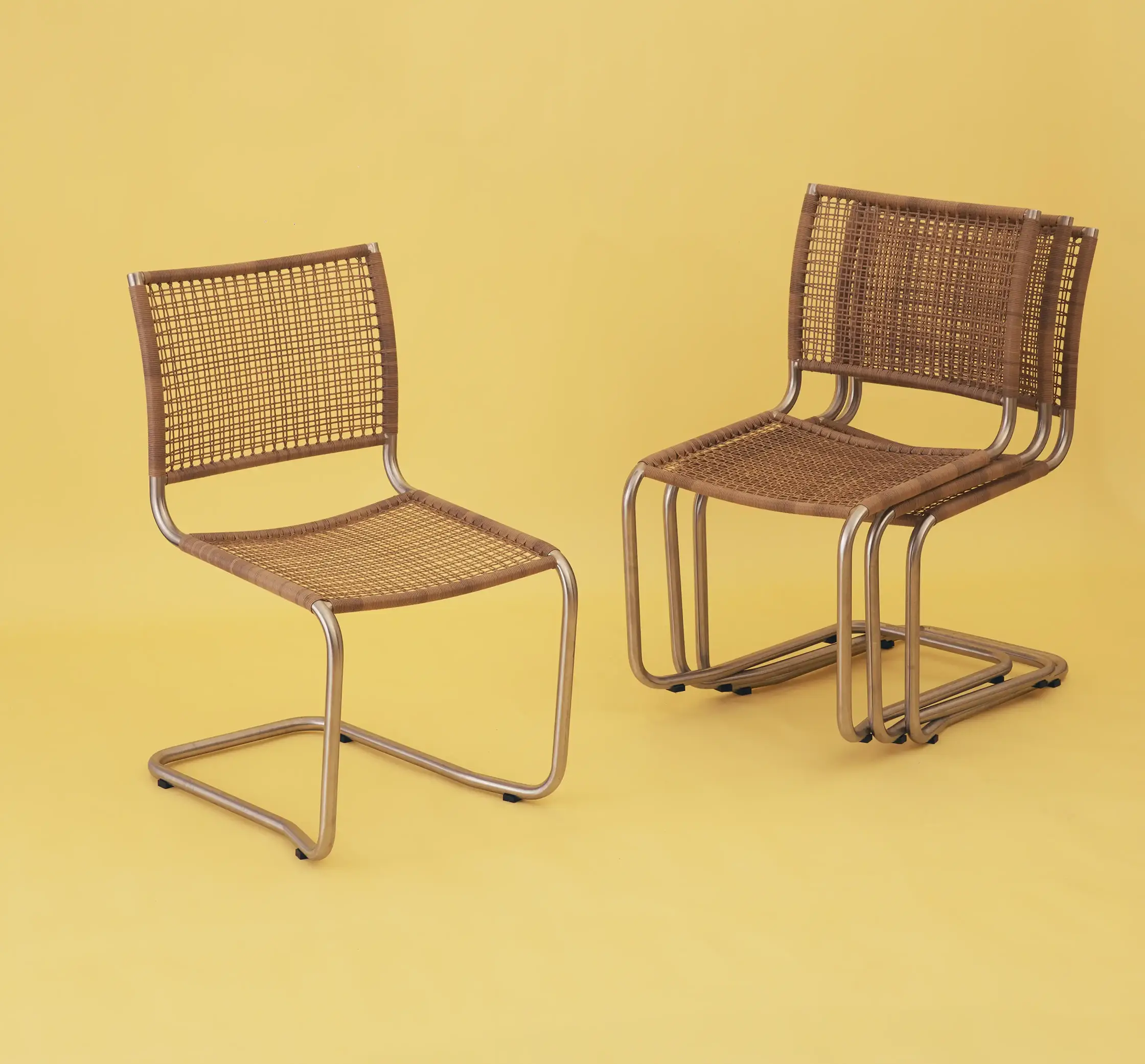
Elemental Construction
Repeated geometric parts that reflect the logic of assembly, showing how simple elements can be combined into a larger structure.
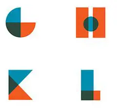
Manufacturing Foundation
Everyday Expectation
Process
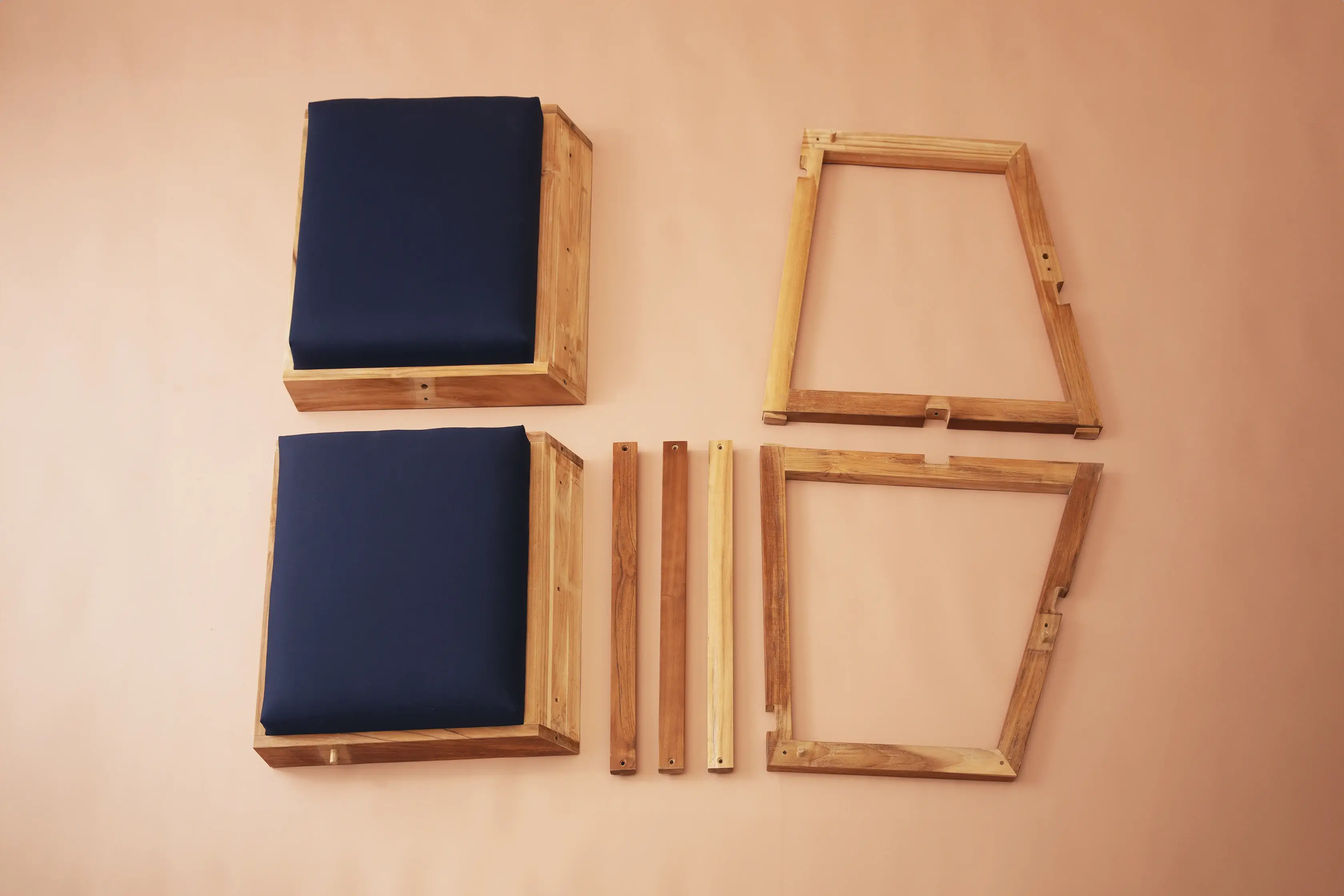
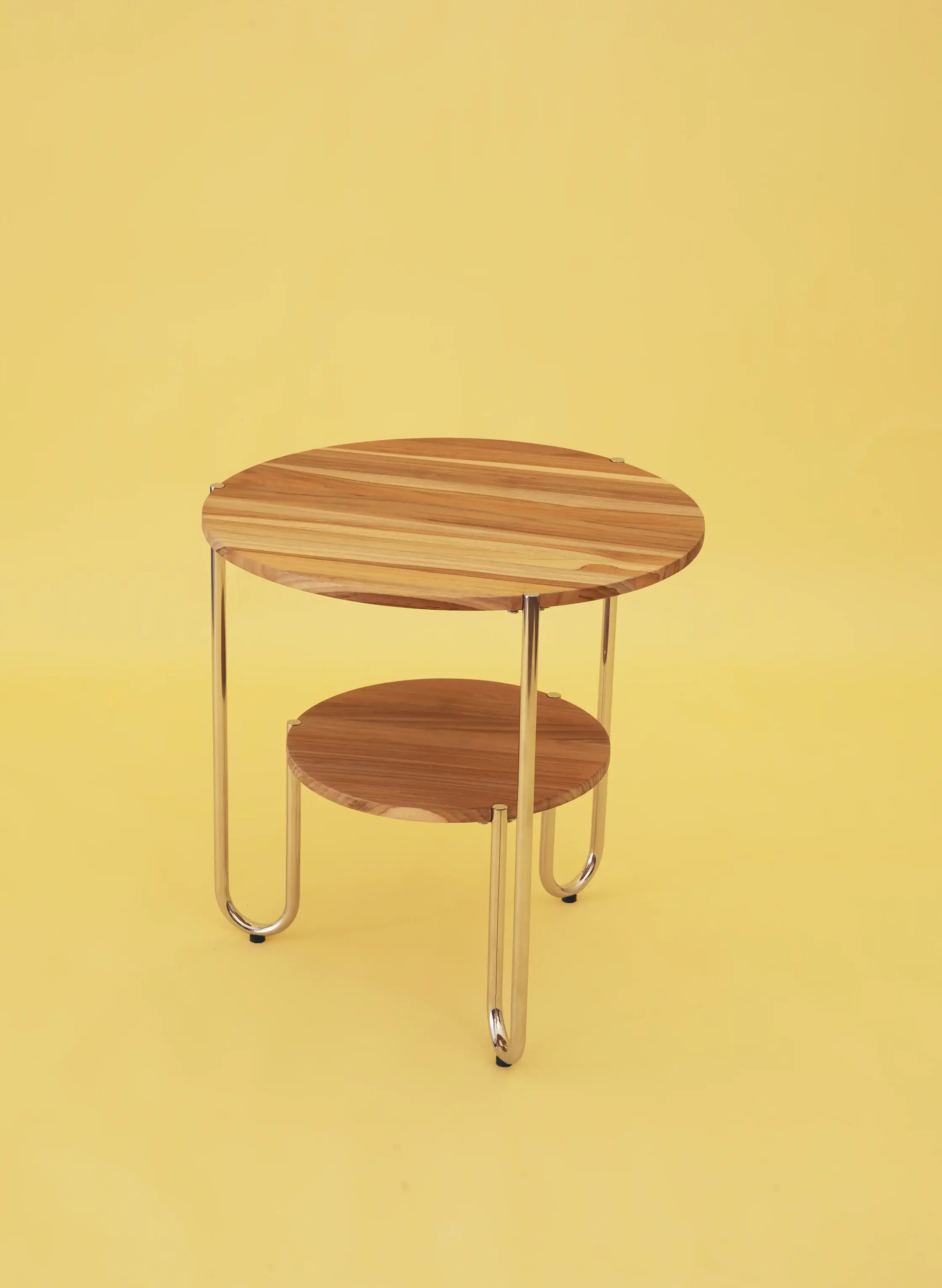
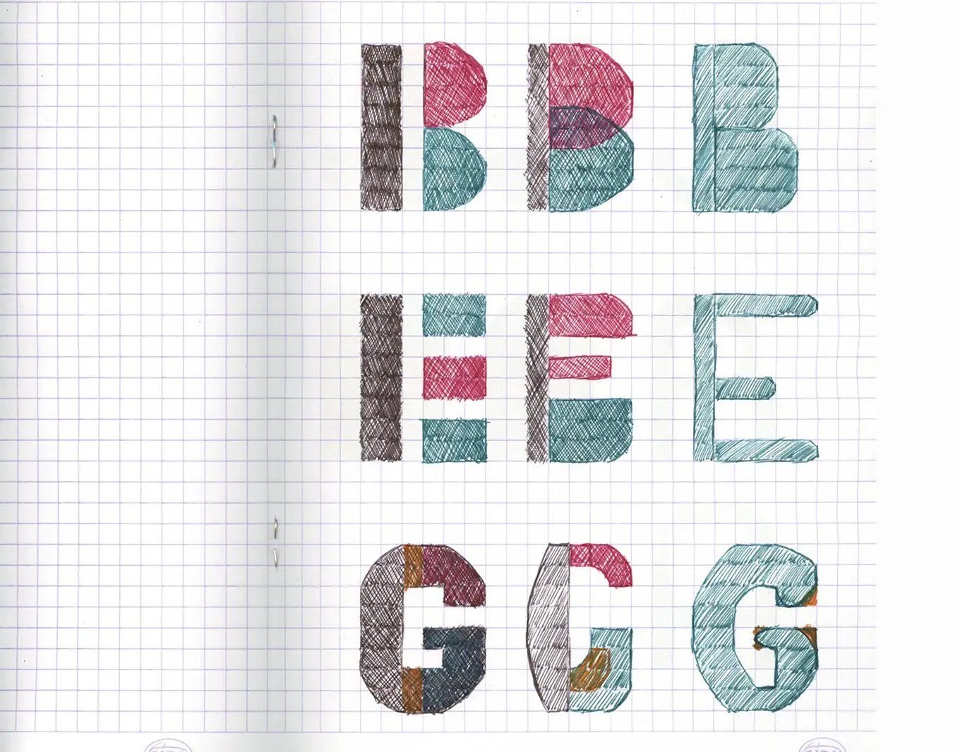
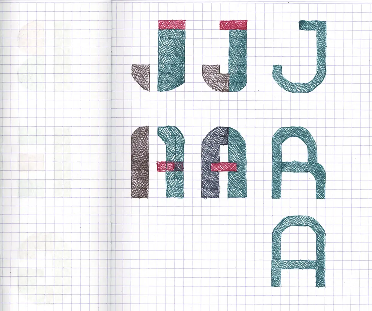
Taking inspiration from the product: modularity and geometry.
Naming
Begja comes from an older Javanese form of beja / bejo, associated with luck or good fortune. The name carries a small wish for something positive to enter the home with the furniture.
Logo Logic
The letterforms translate the furniture’s construction logic into repeated geometric parts. Curves and rounded corners soften the modular structure, giving the mark a friendlier and more approachable character.
Brand DNA
Begja’s brand DNA was developed using the Jungian personality archetype framework, combining three archetypes to define how the brand should feel and behave. The Everyman to bring openness and familiarity, the Sage to add informativeness and curiosity, and the Creator to give the brand its expressive tone.
Together, they shape a brand that feels practical, approachable and design-conscious, with enough personality to make everyday furniture that prioritise functionality and practicality feel more fun.
Dark logo mark on light


Light logo mark on dark


Colour System
Primary and secondary colours combine warm neutrals colours and brighter accents for a system that can shift between practical and playfulness.
Typography
Both Montserrat and Monaco give the brand a practical and approachable tone that feels easy to understand. Used together, they also leave room for more playful moments through layered compositions and a more graphic use of type.
H1 · Montserrat Light
H2 · Monaco
Smaller supporting text can sit across the heading.
It can read like annotation or body text.
Subtitle 1 · Montserrat SemiBold
Subtitle level one comes here
Subtitle 2 · Monaco Bold
Secondary label comes here
Body · Montserrat Regular
Body text is used for supporting descriptions and explanations. It should stay clean and readable, while still feeling aligned with the brand’s practical yet expressive personality.
Caption · Montserrat Regular
Caption text is used for notes, figure descriptions and smaller supporting information.
Numbering · Monaco
Used for page numbers, section markers, indices and small system labels.
Brand Applications
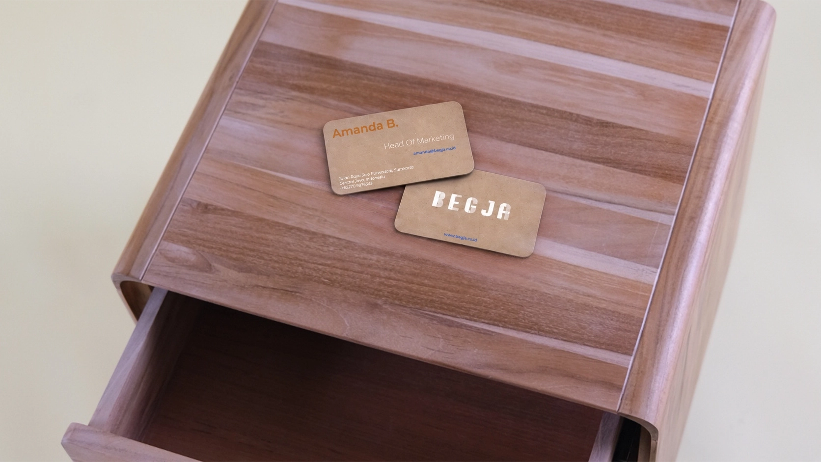
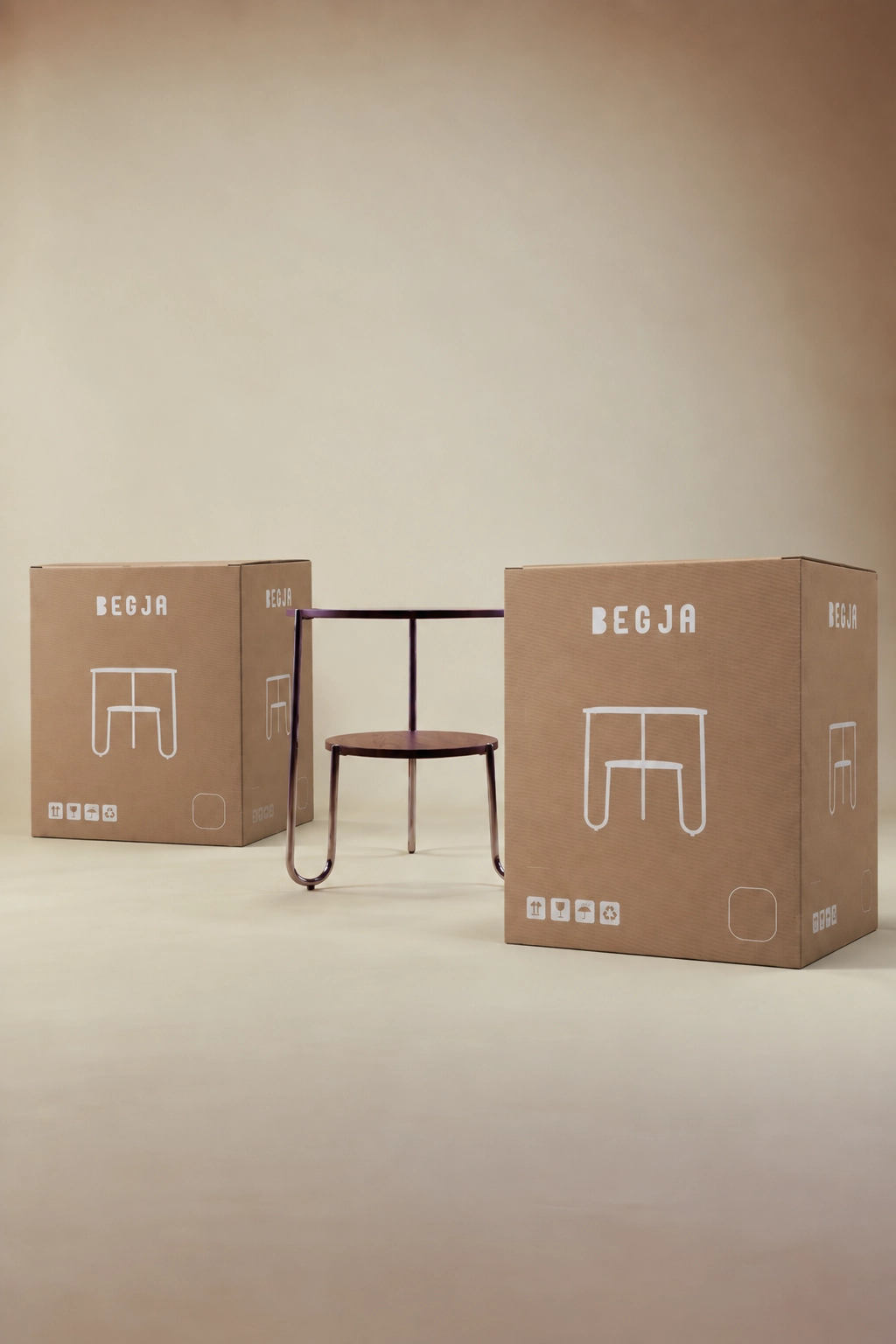
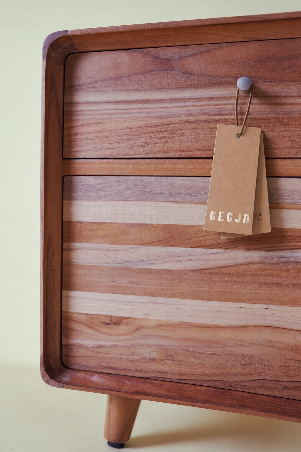
The identity extends across packaging and everyday brand touchpoints, keeping the system practical while retaining its warm and expressive character.
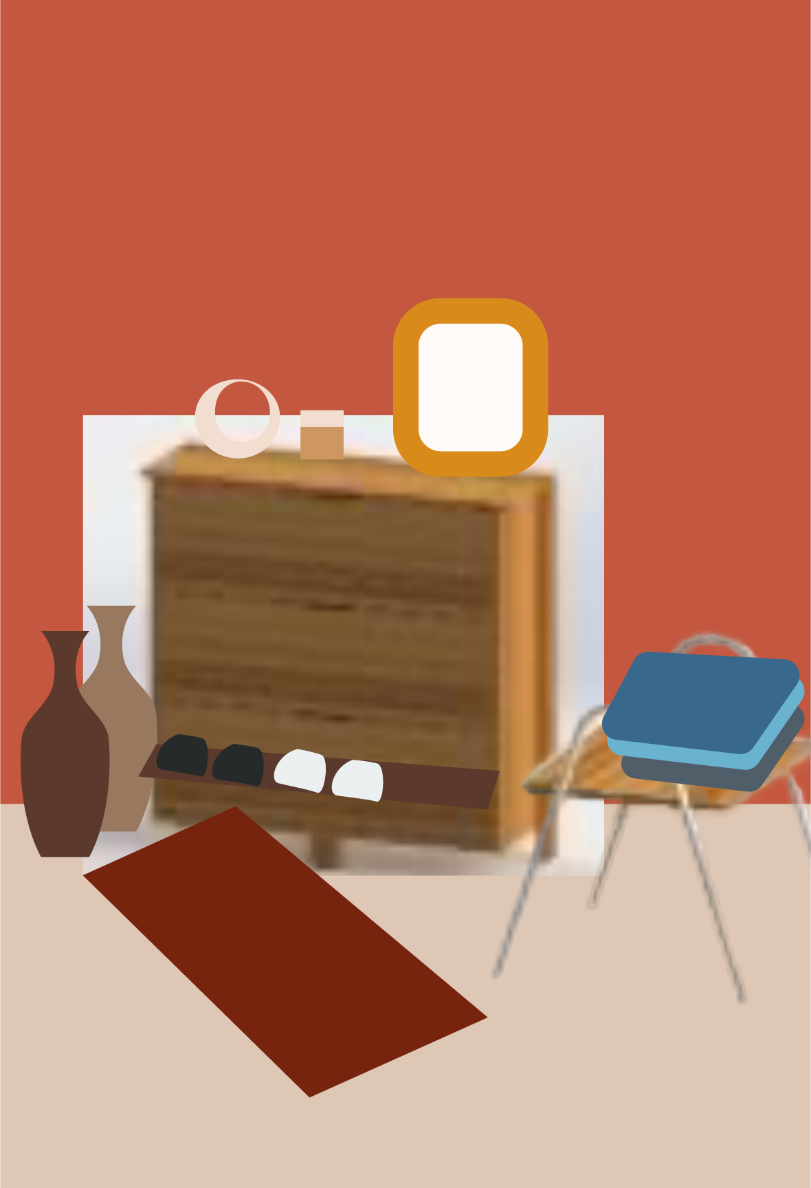
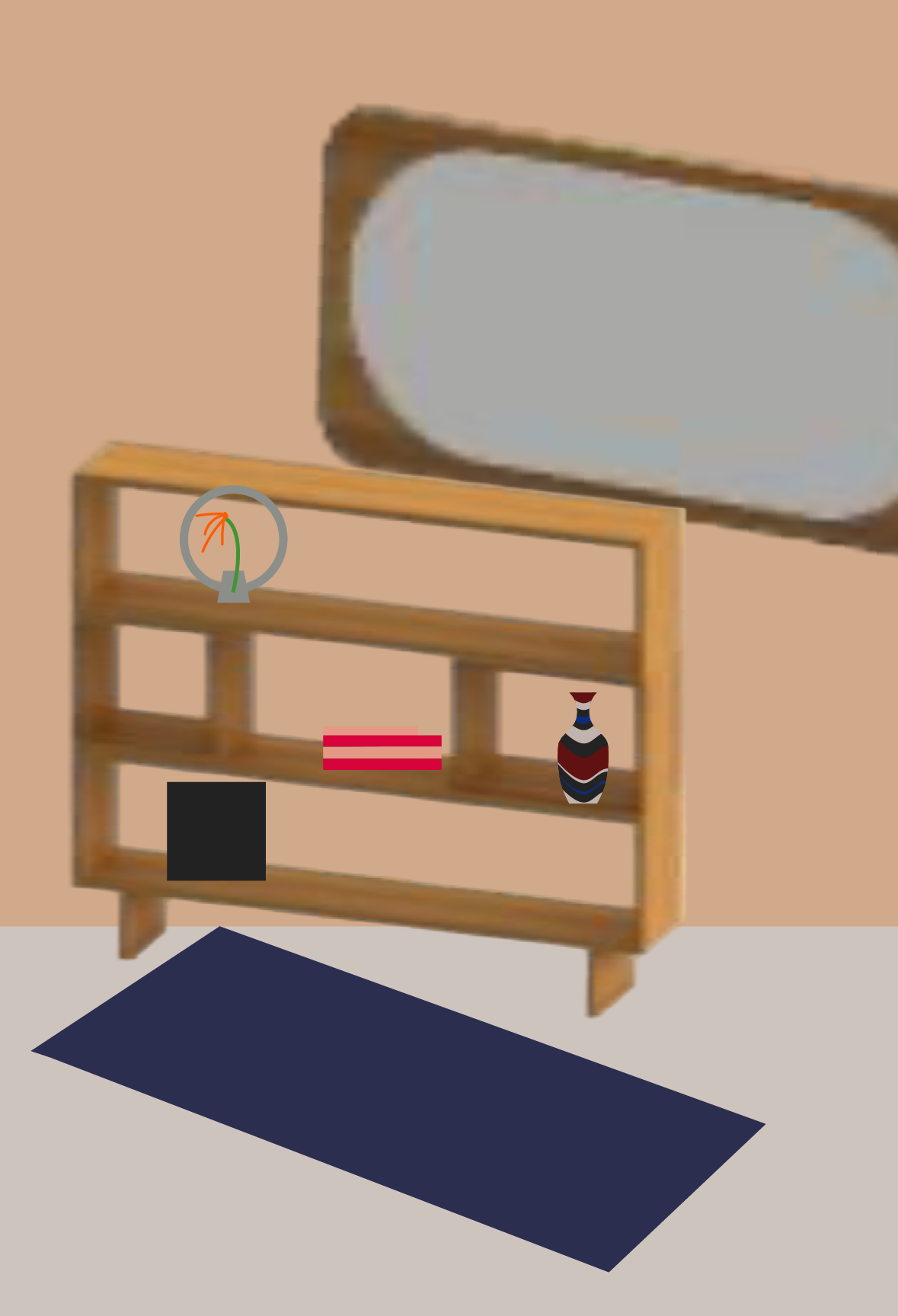
Volume I · Shoot Planning
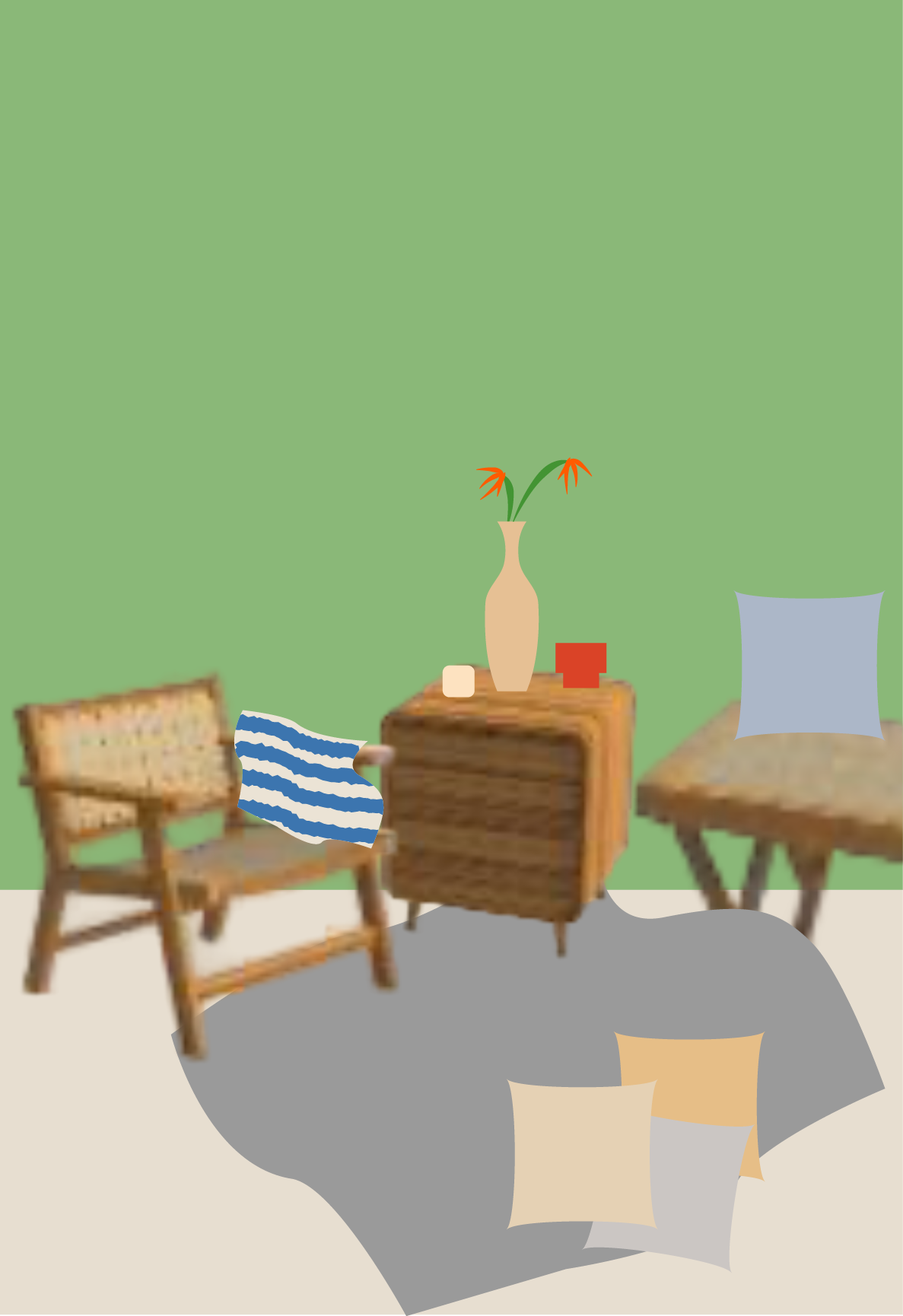
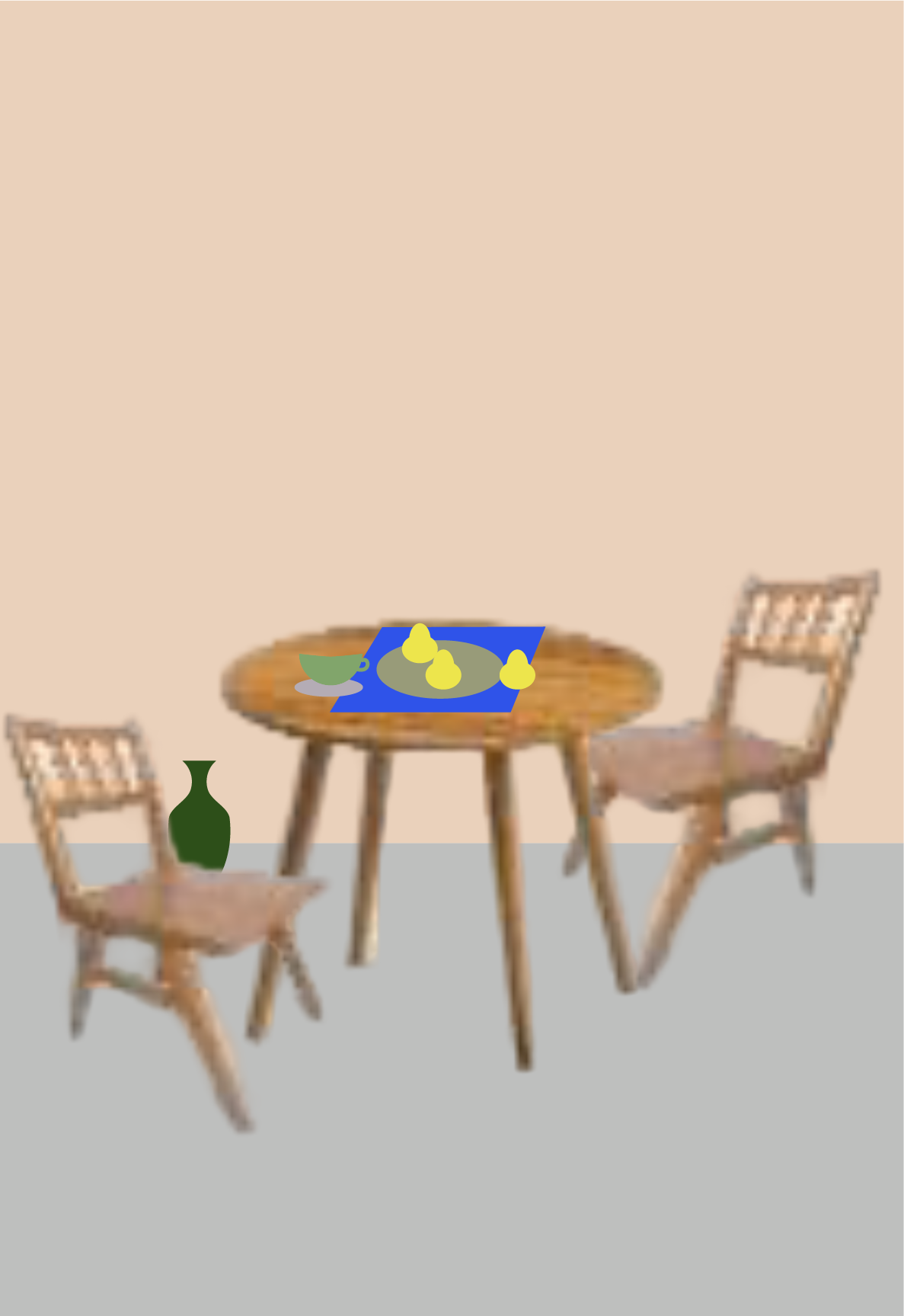
The shoot was planned before every final sample was complete. I built these collages in Adobe Illustrator to define product groupings, prop selection, wall colours and the overall set composition for each frame. Some product images were low-resolution factory references and the finishes were still provisional, but the models and visual direction were already established. The sets were then built around these plans, using parquet flooring and painted temporary walls.
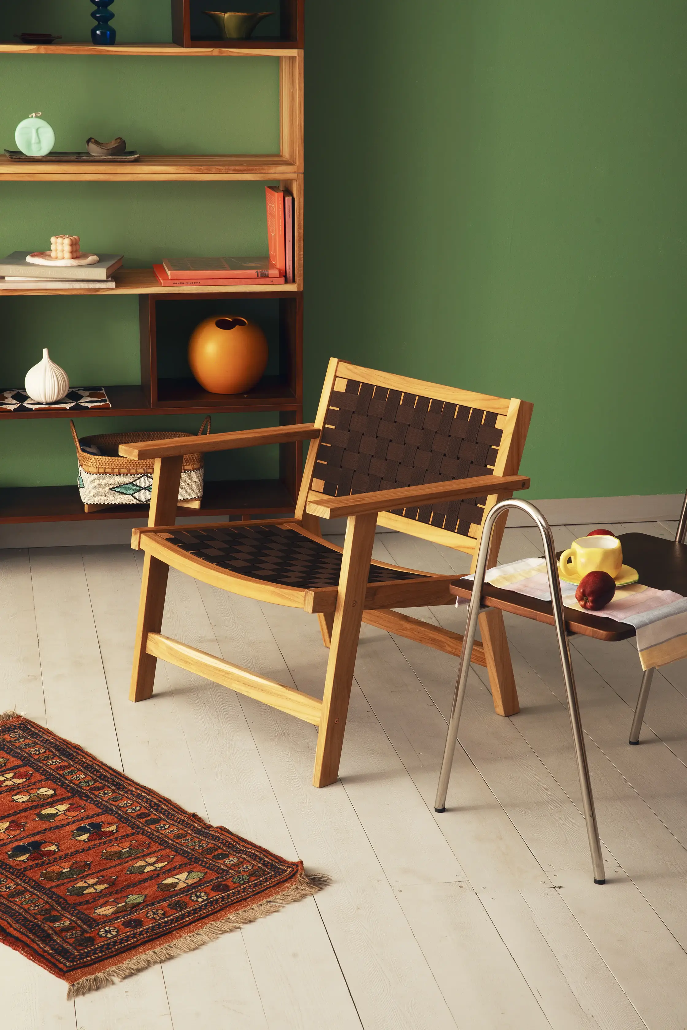
Volume I · Final Images
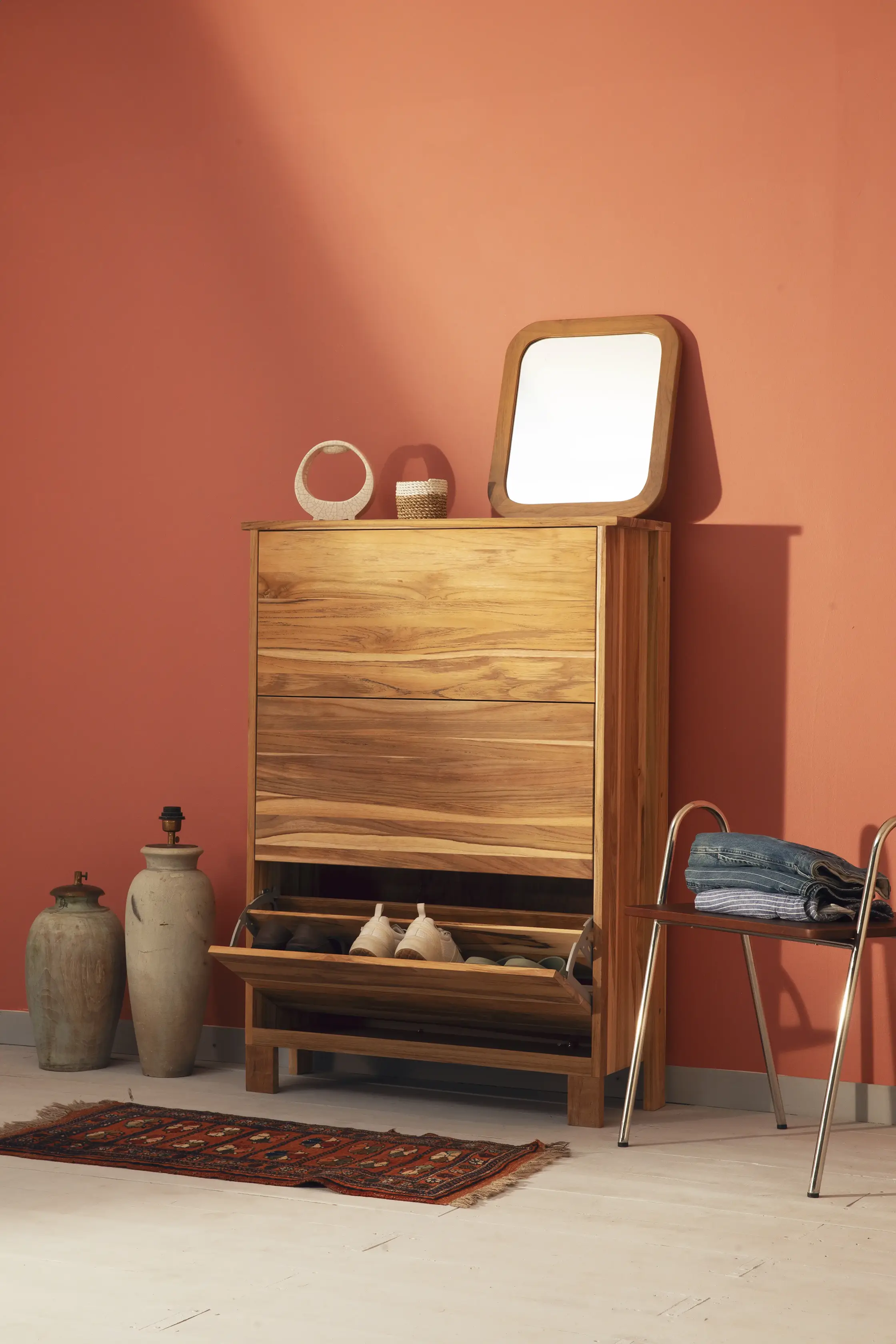
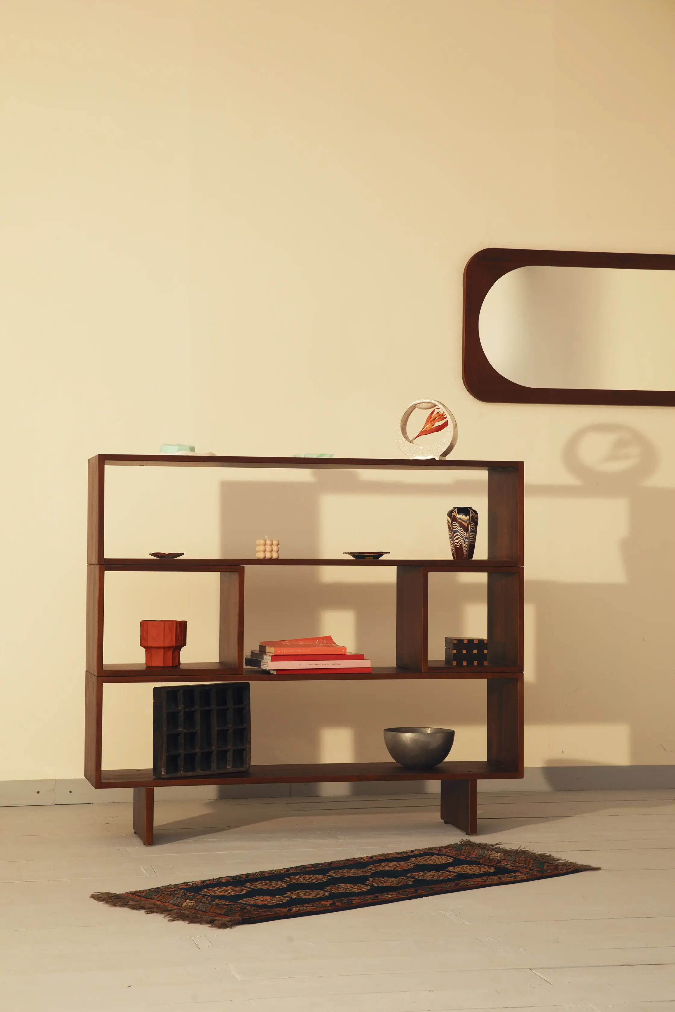
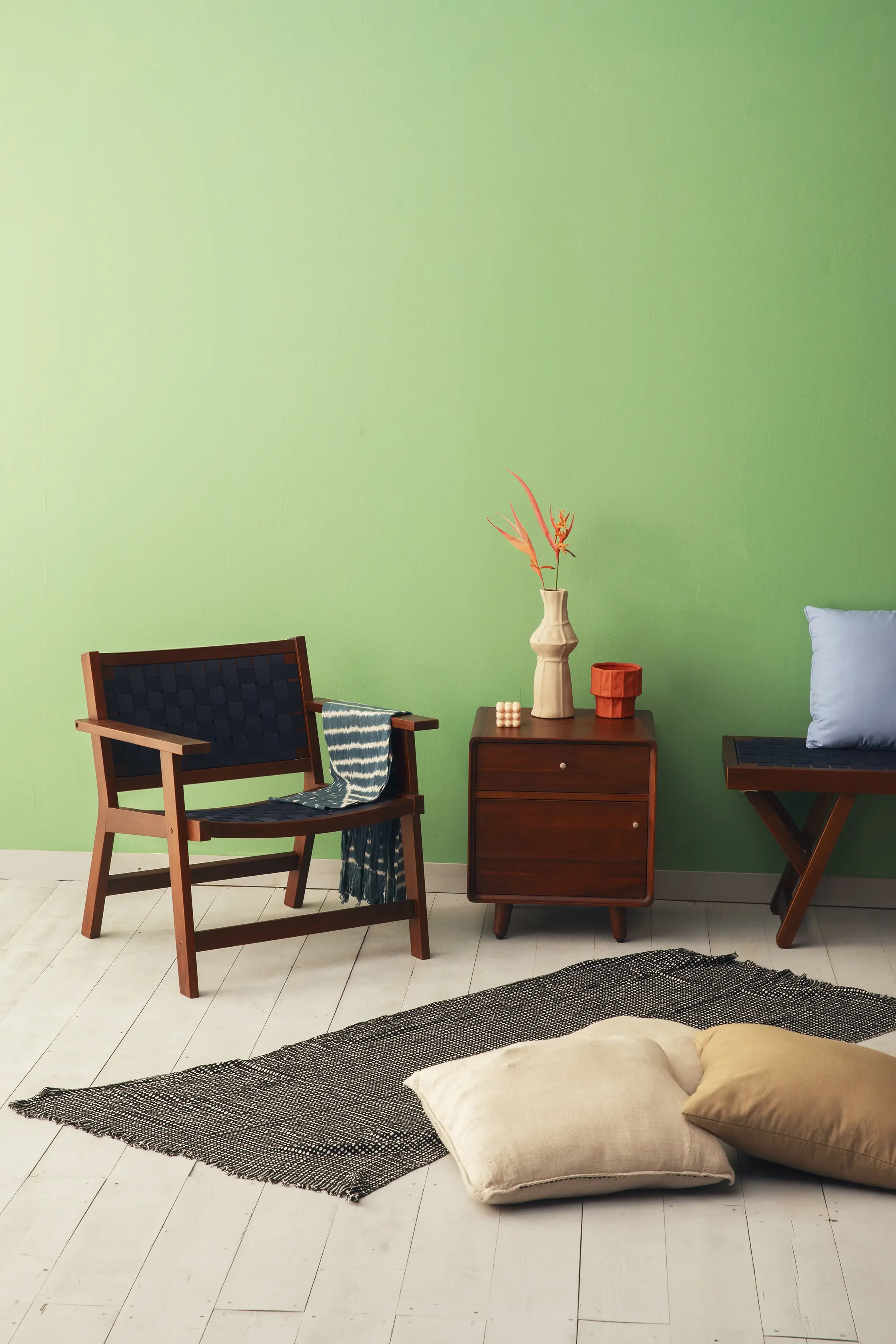
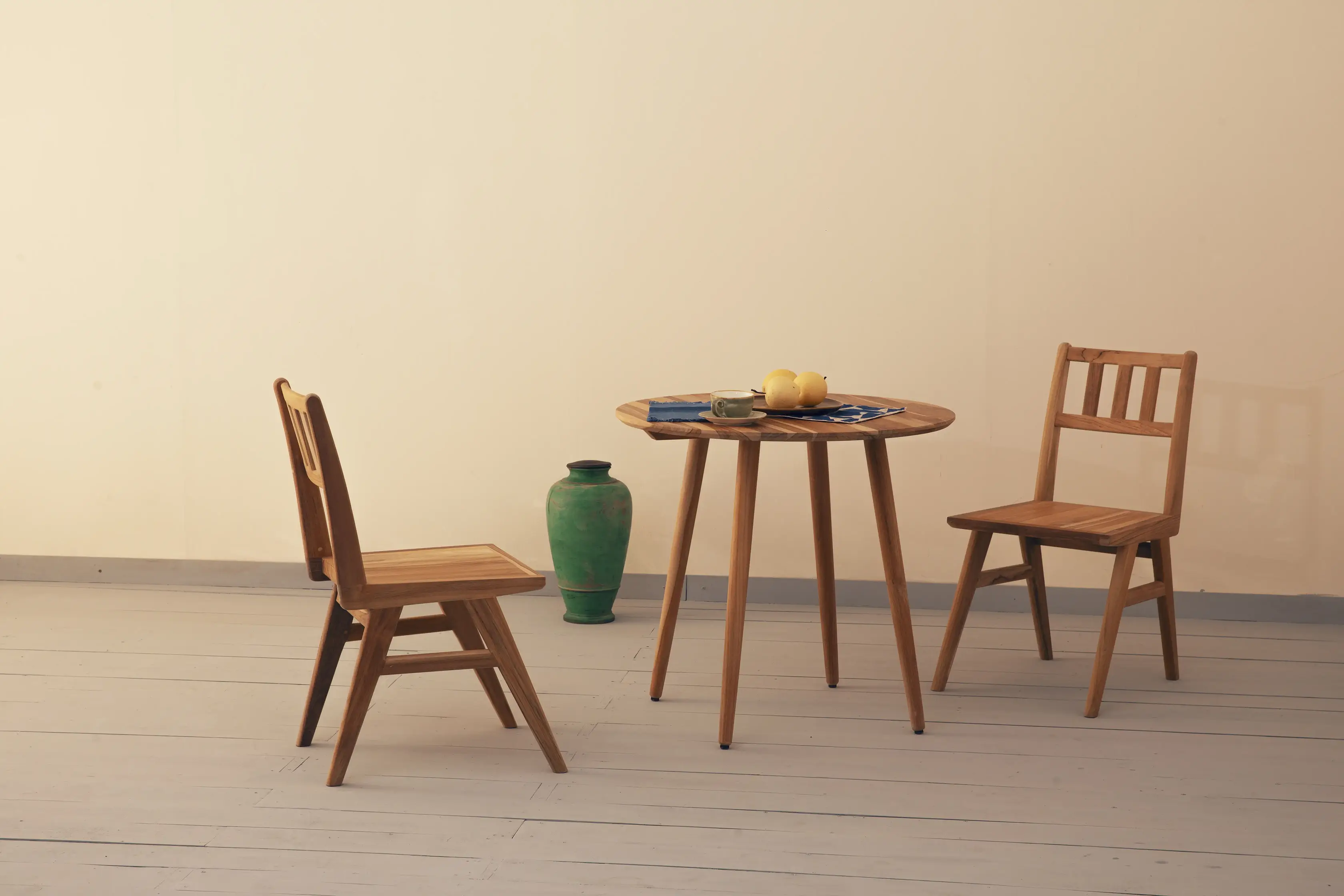
The planned product groupings and overall set atmosphere were translated into the final shoot. The styling was refined once the completed pieces were in the space.
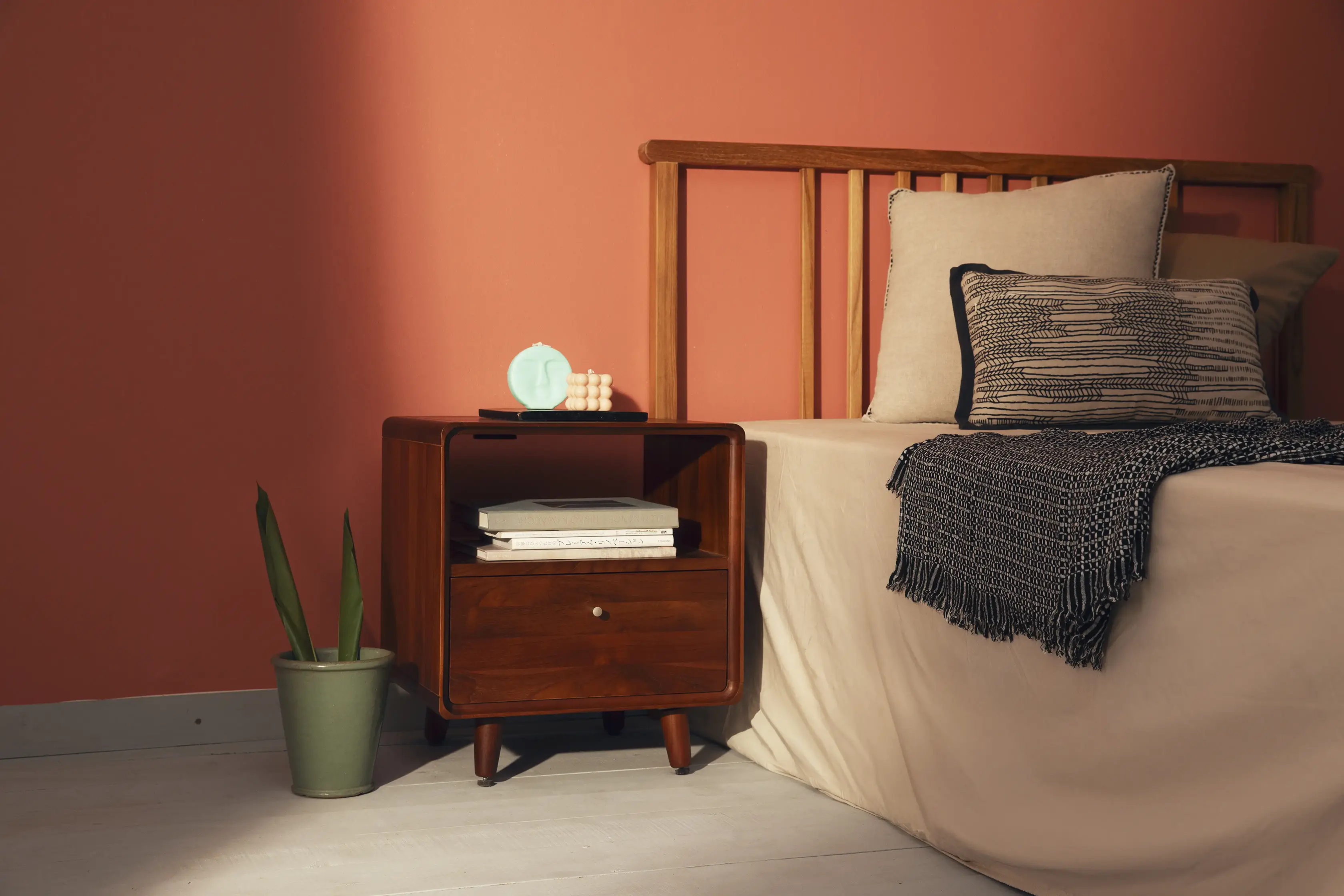
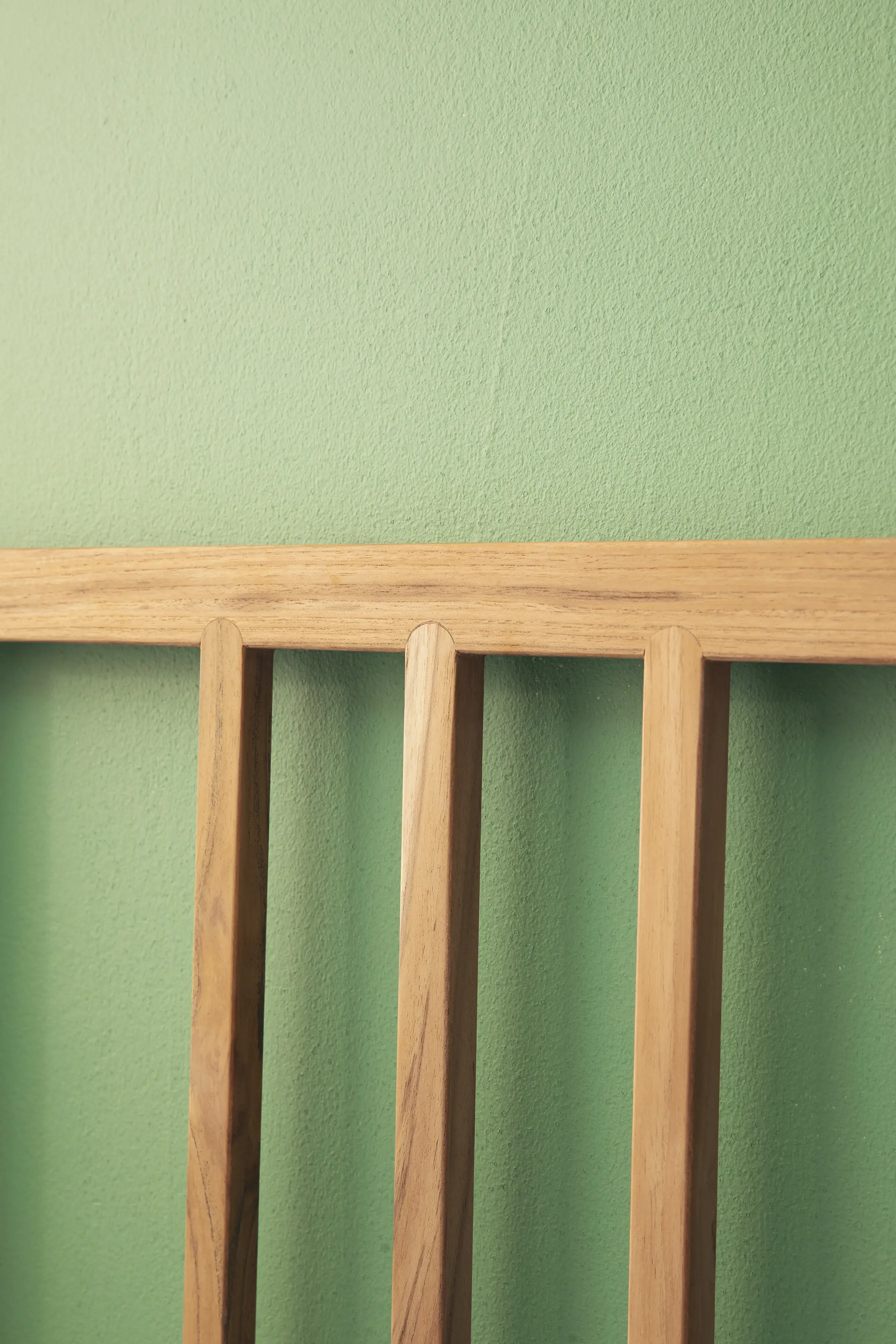
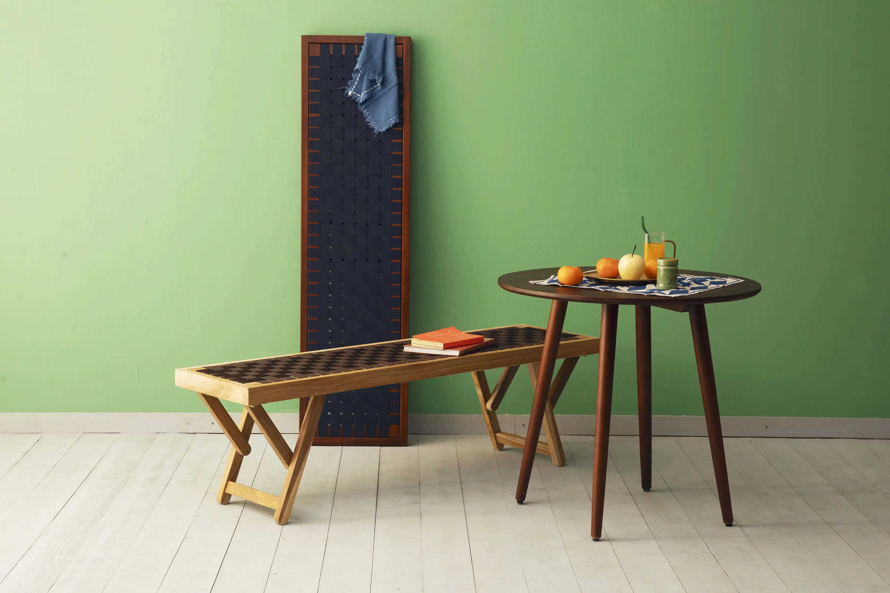
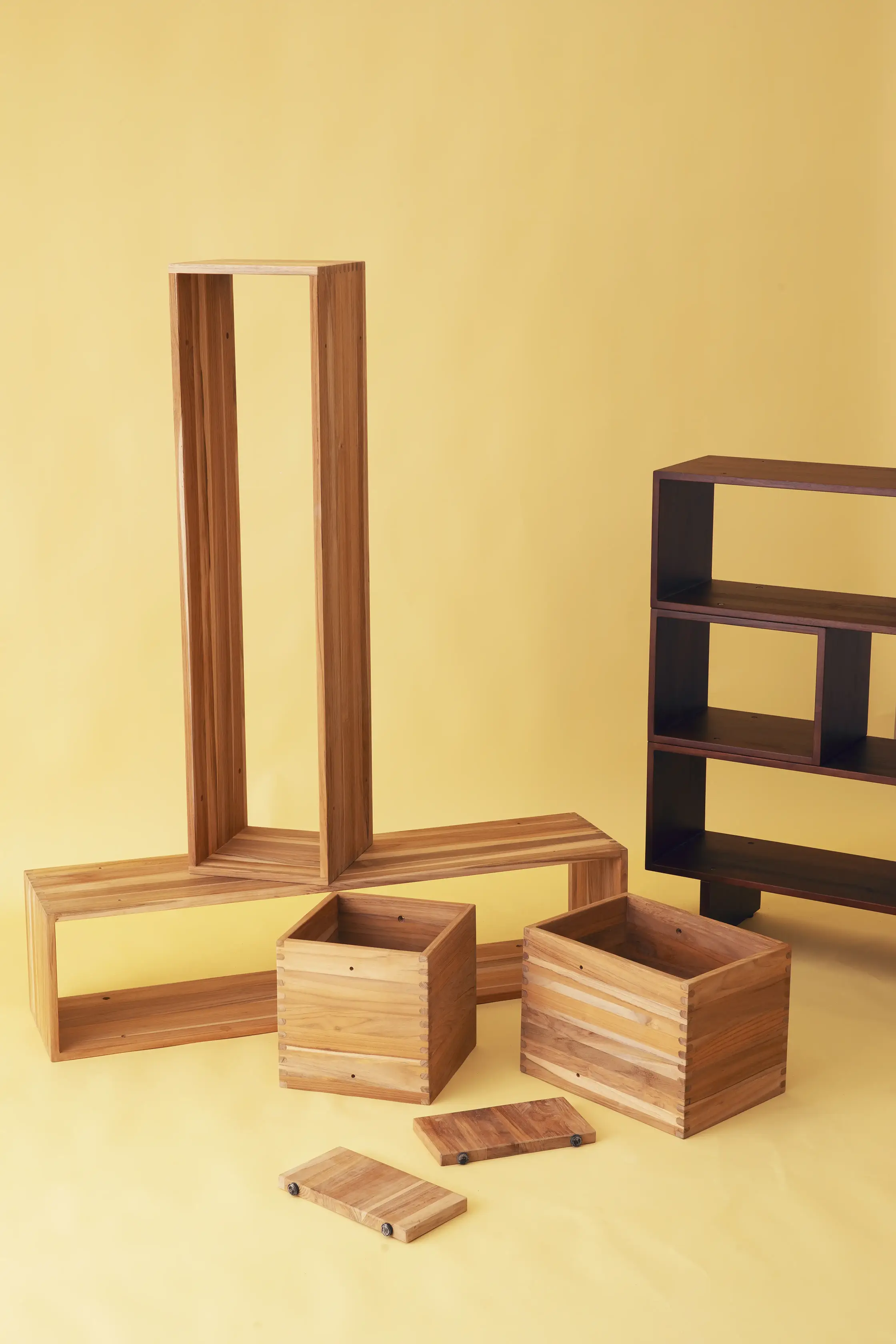
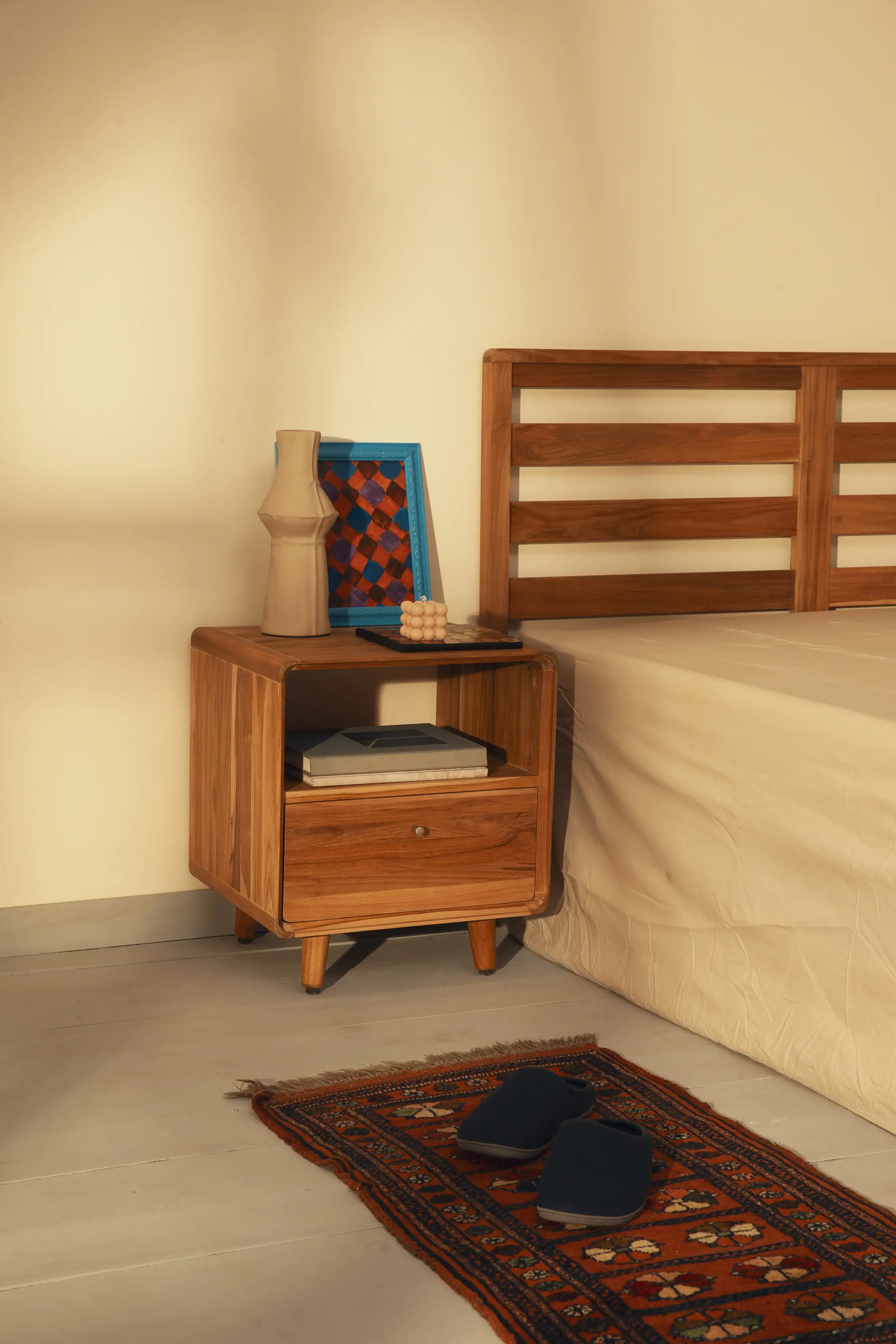
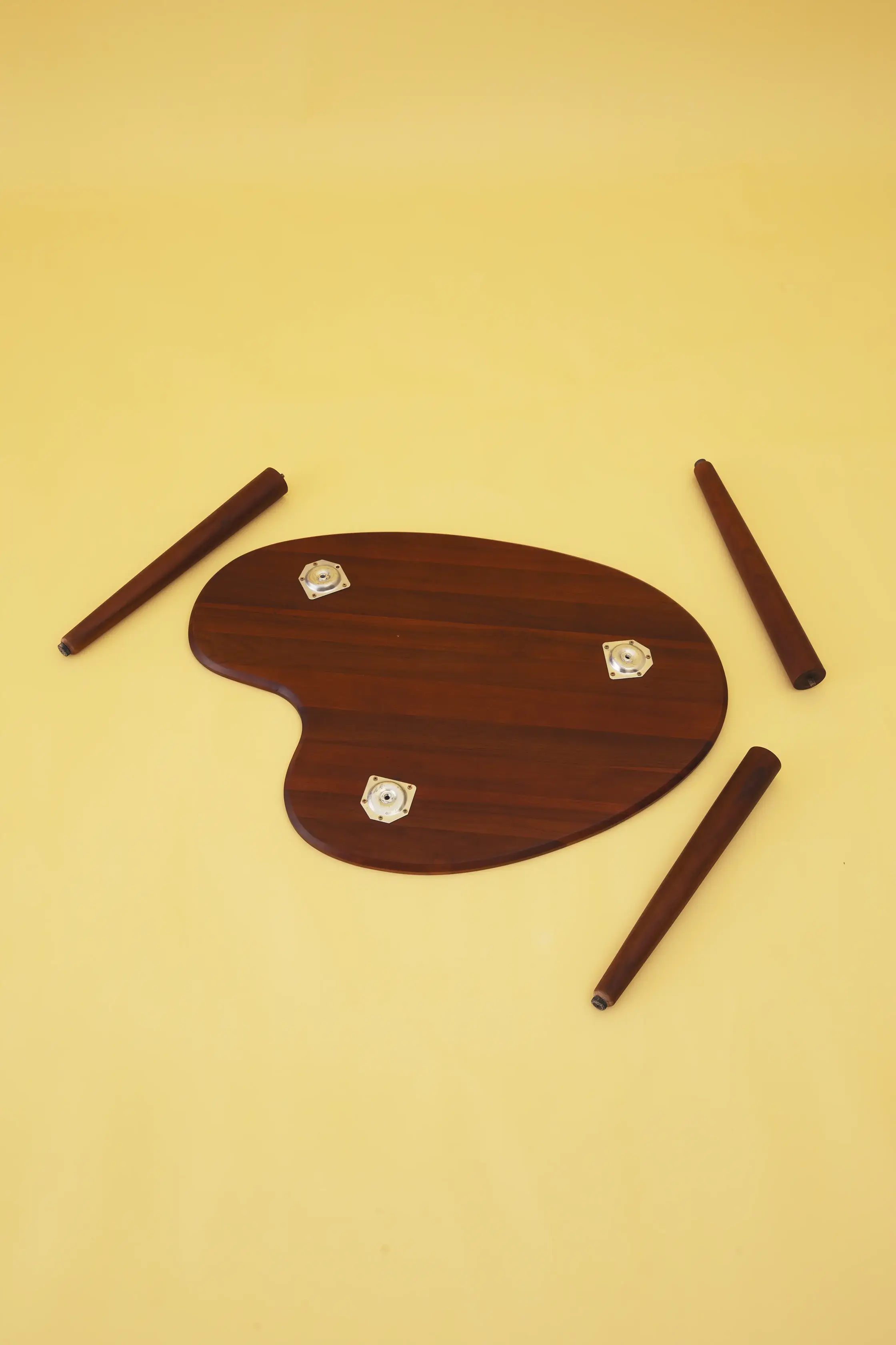
Only have a few seconds? Click and drag through the gallery.
Credits
Brand Development & NamingDea A.
Brand Strategy & Visual IdentityDea A.
Art Direction & Set StylingDea A.
Product DesignRoda Jati Product Design Team
Volume I Photography
& RetouchHilarius J.P.
Mockup Photography
& AI-assisted Image EditingDea A.
ProductionRoda Jati